Fashion Snoops is widely known for their revolutionary forecasting centering all things design from aesthetics and colors to lifestyle and cultural influence. At Crimson Design Group, we pride ourselves on our research and intentional design. We were inspired by Fashion Snoops’ color combinations and our designers gave their input on some of their favorite trends for the Spring and Summer 2021.
Color Combination #1
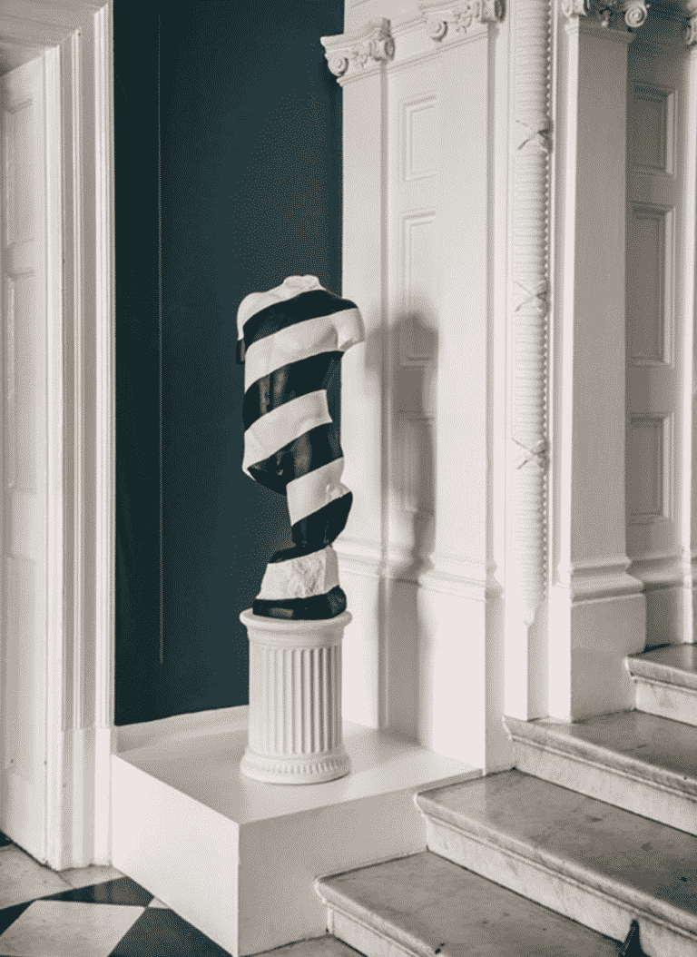
Photo by Fashion Snoops
This color combination was favored by two of our senior designers — no surprise as the deepness of the tones reflects Crimson Design Group’s bold aesthetic.
Senior Residential Interior Designer, Sara, enjoys this combo. She enjoys the mixture of class forms and materials. Its European flair mixed with the modernity of the deep teal brings out a level of sophistication. The striped statue contrasts with the deep tone, which wouldn’t be classified as classical.
Senior Commercial Interior Designer, Dunia, favored the warmness of the singular line along the teal and the boldness of the overall color scheme. These colors are comfortable to the eyes. Did you know that they’re neighbors on the color wheel?
The designers recommended this combination for the bold ones. People who do not shy away from either being artistic or enjoying artistic flair. If this sounds like you, these colors would be perfect for your space. Pop art and wall art can enhance your space, even sculptures as we saw before. Whimsy and fun? Although these colors may not resonate with the brightness you thought of while reading those words, you can use these colors for accent walls or pops of color.
Color Combination #2
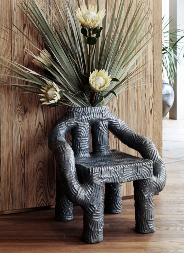
Photo by Fashion Snoops
Dunia chose this color combo almost immediately. She enjoyed the texture and black and camel tones. The greenery adds a natural, fresh feel while also providing a clean look.
Are you drawn to these colors? These colors would be perfect for someone who is warm and down to earth. If you enjoy the fun with some reservations but have been known to also be spontaneous, this color combination would be right up your alley.
Color Combination #3
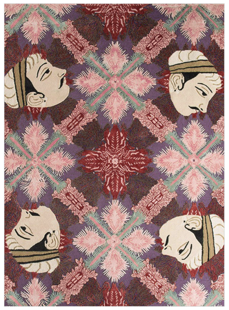
Photo by Fashion Snoops
Talk about fun! Residential interior designer, Lauren, was drawn to this design for many reasons. The faces immersed amongst these colors add a multicultural essence to the combination and aesthetic.
It’s fun. It’s different. It’s unique. The use of red and green as contrast is used beautifully. The combination of colors both contrast and compliment the forest green, dark fuchsia, and white to the dusty red and eclectic rose. Your eye is drawn to every corner of the canvas.
Do you like incorporating bohemian elements or other multicultural influences within your spaces? This could be a great palette for you. This combination is perfect for people who like to travel, are outgoing, confident, energetic, and have a big personality.
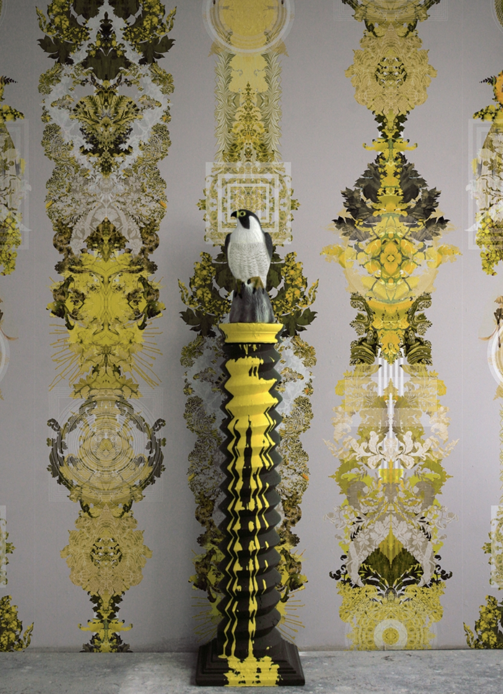
Color Combination #4
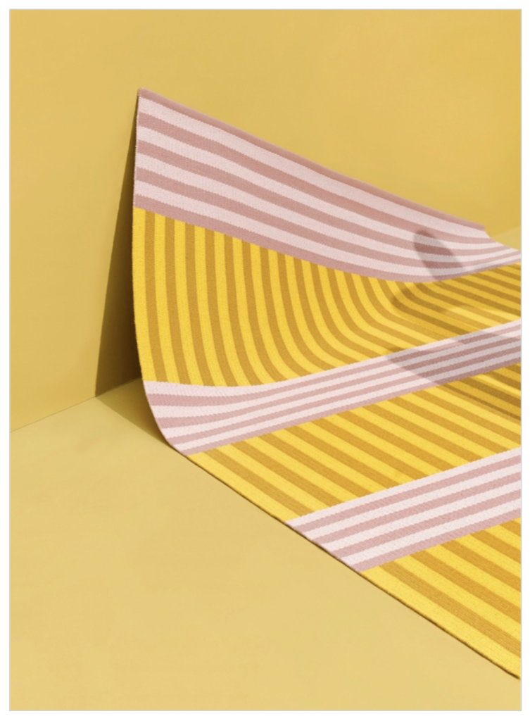
Photo by Fashion Snoops
Lauren loves color. Not only does it match her bubbly personality, but it also prepares us to enjoy the spring and summer. As we get lighter on the color wheel, this combination is bright and has high contrast. Don’t you love the boldness of the yellow, pink, and white?
Have a sunny personality? This color combo would be great for you. It is perfect for a bubbly personality who likes light and airy photos on Instagram and being the life of the party. Adding these color combinations to your space would be great in bedrooms, powder rooms, and for adding accessories within your main areas (living room and kitchen).
Color Combination #5
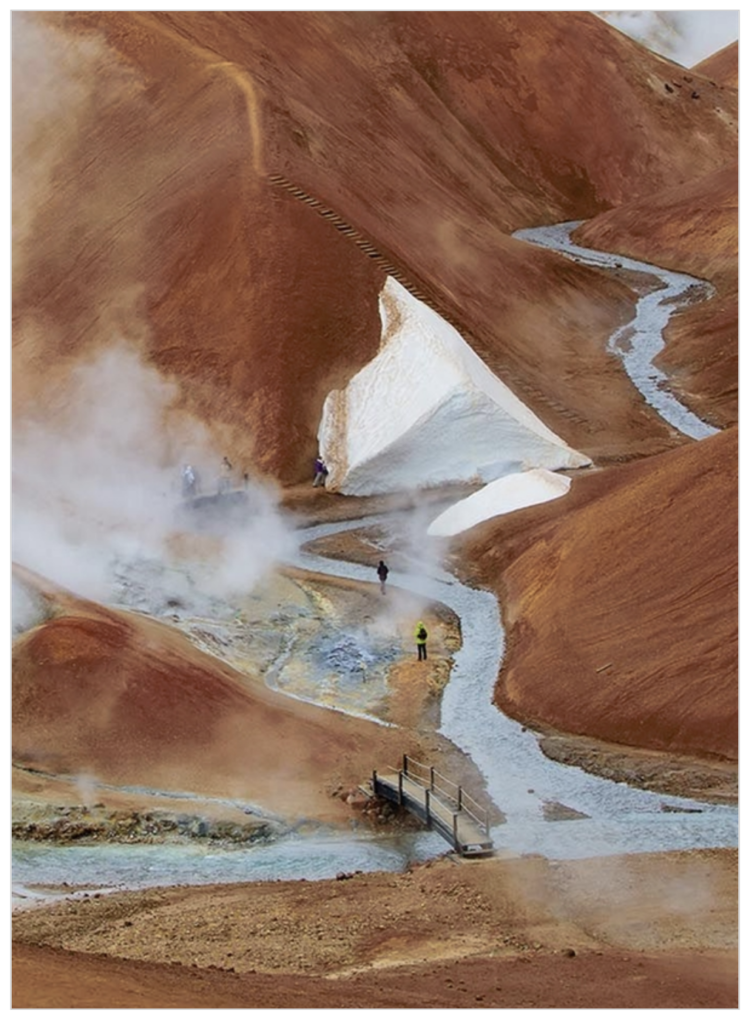
Photo by Fashion Snoops
Our last color combination was also chosen by Lauren. This depiction features an amazing natural experience of caramel and mocha shades. Along with the frosty blue, the brown hues feel new and contrast well with one another through their warmth.
If you’re a person who likes simplicity, this would be a great color combination to consider. Like nature and solitude? This combo would be great for expressing yourself within your space. You can incorporate boho vibes from the brown hues and soil of your plants while using blue as an accent color for pillows or even table accents.
There are so many fun things that you could do with these color combinations. They were chosen through consideration of economic changes, research, aesthetics, design thinking, nostalgia, mindset, and wellness. The overall experience that people associate with color comes from some sense of nostalgia. We can all look at colors and have an attached memory to guide us through a timeless story or experience.
As interior designers, we want to connect your personal connection with the colors that you love by implementing them into the color story of your home. Spring is the perfect time to renovate and amplify your home’s design. You don’t have to look far as we can help you with your high-end residential design needs. If you’re interested in remodeling or renovating your home, get in touch with us. We would love to hear about your project and how we can make your project and life more beautiful.