You’ve probably seen them by now, the many popular paint colors for 2022. From Pantone’s Color of the Year Very Peri to Benjamin Moore’s October Mist, the shades of 2022 offer something for everyone’s aesthetic. Whether you live for bold and moody hues or you prefer lighter or softer shades, the popular paint colors for 2022 truly run the gamut — which is why we talked with interior designers and paint experts about the best ways to style your apartment using these trendy colors.
Here’s what our experts had to say about tying 2022’s chicest shades into your current living space.

1. Open Your Arms + Embrace Change
“People are craving change in just about everything this year. One result of this need for change is the use of more color in interior design, which is a departure from the all-white design schemes that have dominated the last decade,” says Aaron Hall, owner of Painter1.com. “Four of the biggest paint companies (Sherwin Williams, Pantone, Behr & Dulux and Benjamin Moore) all chose a 2022 Color of the Year in either a blue or green tone. These muted variations evoke the ultimate feeling of serenity, which is exactly what we all need right now!”
“Also, color tones that complement these muted blue and green shades are creamy whites, warm-gray whites, natural wood tones and light or deep hues of gold, orange and peach. Try accent pieces in bold green, mustard yellow, royal blue or poppy red. Often, a rug, a favorite piece of art or patterned upholstery can be a great source of inspiration for beautiful interior color schemes.”
After being indoors for so long people are becoming aware and appreciative of the power of nature. Biophilic designs are a trend that interior designers have been talking about for a while and it looks like this year’s the year that these designs come to life.
2. Make A Statement
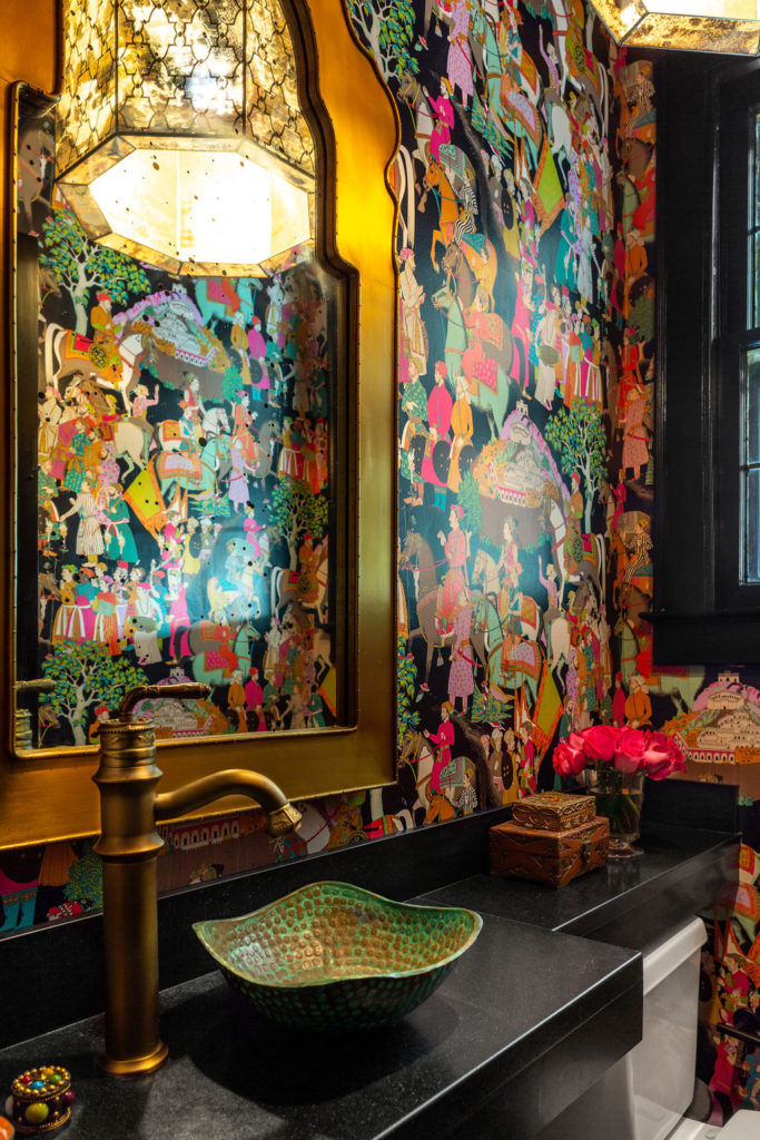
“2022 is the year of making statements! Show off your personal growth by expressing your boldness with an ocean of blues, greens and moody black hues,” says Autumn Rose Interiors. “You can start by adding a pop of dark accents to bookshelves and table-scapes. Once you’re ready, try long, dark, luscious drapes to provide a beautiful contrast to neutral light walls or take it to the next level with a surprise room — like a dark, moody powder bath or bedroom.”
3. Paint the Ceiling
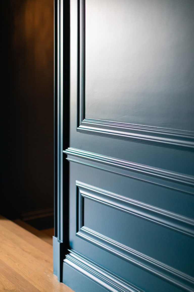
“Warmed up neutrals are a great way to incorporate trends but in a way that’s timeless, easy and renter-friendly because it’ll be easy to paint over if you move out. I love creamier shades of white on the walls paired with bright white trim and moldings,” says Kaitlin Madden. “Moody hues are big right now, especially blues and greens. For a look that’s very 2022, paint both walls and the ceiling (check with your landlord first!). If that’s not an option, try it with furniture. Paint a kitchen cart your favorite shade and use it as an island, for example.”
4. Be Bold
“We love using bold colors, such as the Van Deusen Blue from Benjamin Moore (one of Benjamin Moore’s most popular blues), to create vibrant accent walls in a property, especially in dining room areas to add a dramatic effect and visual interest,” says Pavel Khaykin from Pavel Buys Houses. “When paired with a neutral contrasting wall paint color, such as Benjamin Moore’s Classic Gray, the combination brings great energy to a room and goes beautifully with wood floors, especially white furnishings and fixtures. A small cosmetic update like this is fairly easy and quick to accomplish and can make your property truly stand out.”
5. Add Pizazz with Framed Art
“Chameleon colors like Sherwin Williams Sea Salt or Benjamin Moore’s October Mist allow renters to add relatively neutral colors to their space to make it their own,” says Port City Paint in Wilmington, NC. “When paired with shades of linen or gray — either paint or furniture — your home becomes a personal reflection of you! Add a pop of color with yellow, blue or coral throw pillows or framed art to add a little pizazz. A home office or workspace painted with a complementary color like Benjamin Moore Crisp Linen gives brightness and a sense of calm to the space. Accent a spare bedroom wall, half bath or a wall in your office space with a pop of periwinkle blue to bring the palate full circle.”
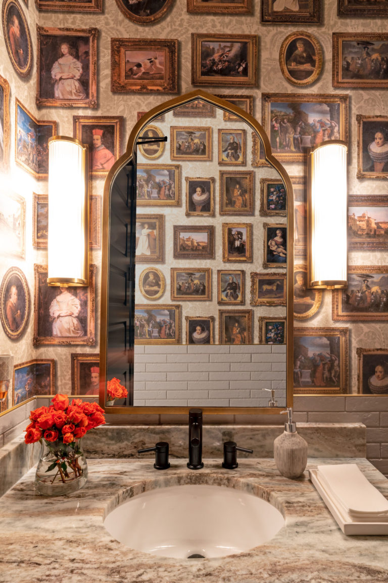
6. Frame Your Favorite Wallpaper
“A really fun way to bring style and design into a rental home is framed wallpaper! It is less expensive than wallpapering an entire wall,” says stylist and designer Becky McFarland Cox. “The key is coordinating the wallpaper with a contemporary paint color like Benjamin Moore’s October Mist. Framing wallpaper gives a huge visual impact and the best part is you can take it with you when you move!”
7. Get Dramatic with Warm Neutrals + Depth
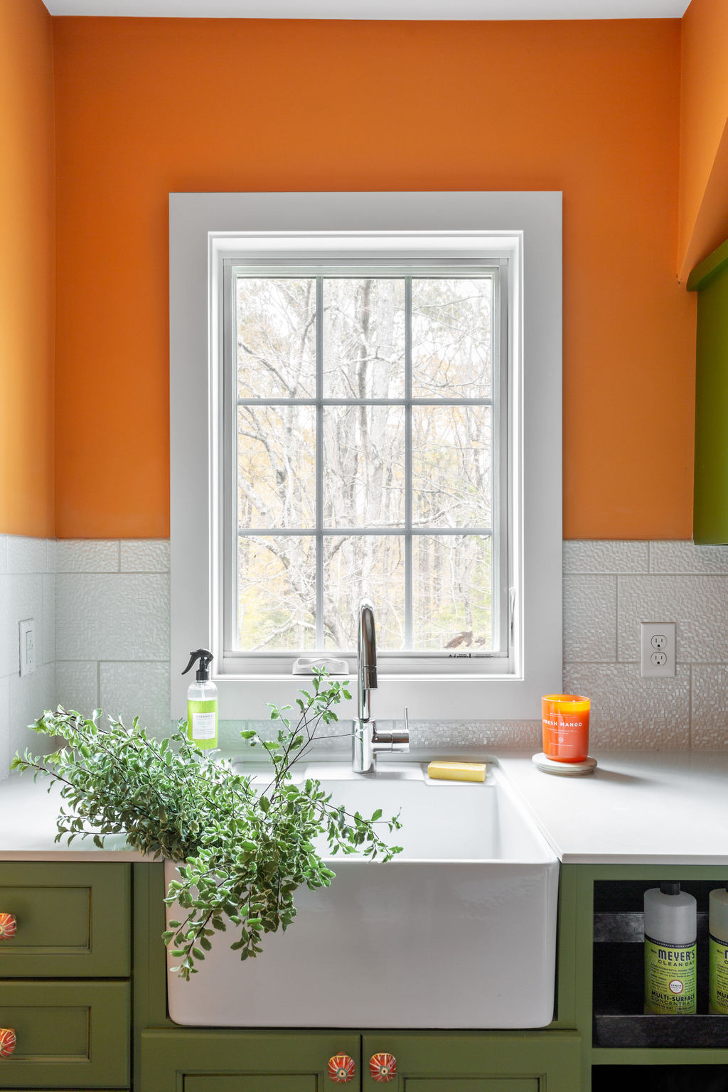
“When people hear terracotta they instinctively see an image of typical terracotta colored tiles which naturally leads to envisioning a southwest aesthetic. However, terracotta is so much more than that!” says the Crimson Design Group in Columbus, OH. “Start with a terracotta-colored base piece — think large pieces of furniture like a couch or cabinet — and use an assortment of colors in the terracotta family like oranges and reds for your accent pieces. Your space will become much richer and a lot more interesting!”
“Bringing in aquas or emeralds can be as simple as incorporating live greenery or accessories like throw pillows or vases into a more subdued space. It adds life and vibrancy!”
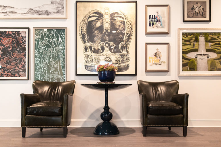
“Additionally, vibrant and earthy shades are an excellent way to incorporate color into your space, especially through our personal favorite, gallery walls! You can also use baskets, frames or plates to bring a vibrant earthiness to your space.”
“People are often scared of black paint but they don’t need to be — there is a reason it is known as the chicest color. It can be used to create a stunning moody romantic space that encourages intimate conversation. Use different shades of black to layer as the background with warm neutrals mixed in for a modern space. It can also be the perfect contrasting trim to white walls!”
8. Look to Your Lighting
“To get the most out of your moody hues, we recommend leaning into different layers of lighting. It’s hard to feel “the vibe” that a room full of aubergines and forest greens creates when all you have is super-bright overhead light fixtures,” says Kind Interior Design. “Add lamps for task and accent lighting in various zones around your space. Replace the bulbs in your overhead (ambient) light fixtures with smart bulbs to be able to dim your lights if your home isn’t wired for it. Dark and moody hues like Benjamins Moores’s Backwoods become rich and luxurious when adequately (but softly) lit.”
9. Opt for Complementary Shades
“A soft and earthy shade easily harmonizes with your floors, furniture and appliances,” says Sandpiper Listings. “Benjamin Moore’s October Mist is light enough to make rooms appear larger and it pairs perfectly with accessories and fixtures. Its calming tone is ideal for walls, doors or cabinetry. This sophisticated and modern color is complementary to blues, purples and darker shades of green.”
10. Play with Greige Undertones
“Evergreen Fog is Sherwin Williams’ 2022 color of the year for good reason! This incredibly elegant, cool paint color can be used in bedrooms, bathrooms, accent walls or even cabinets to instantly give your home a more sophisticated look,” says Brandon Griffin, founder and owner of Triangle Pro Painting. “For a bold contrast, try pairing Evergreen Fog with Sherwin Williams Alabaster, as they both share the same greige undertone.”
Want more tips? You can read the rest of this Rent.com article here.
As interior designers, we want to connect your personal connection with the designs you love by implementing them into the story of your home. You don’t have to look far as we can help you with your high-end residential design needs. If you’re interested in remodeling or renovating any room in your home (or the whole thing!), get in touch with us. We would love to hear about your project and how we can make your space and life more beautiful.