The brief: bold color, done right
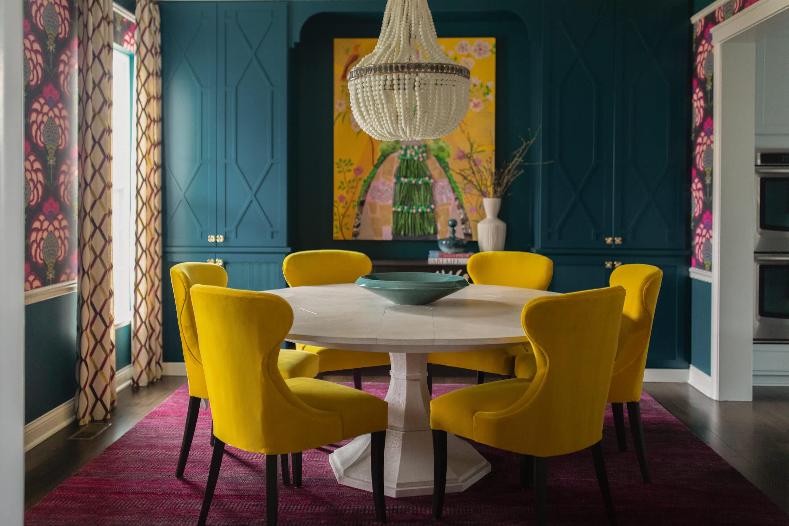
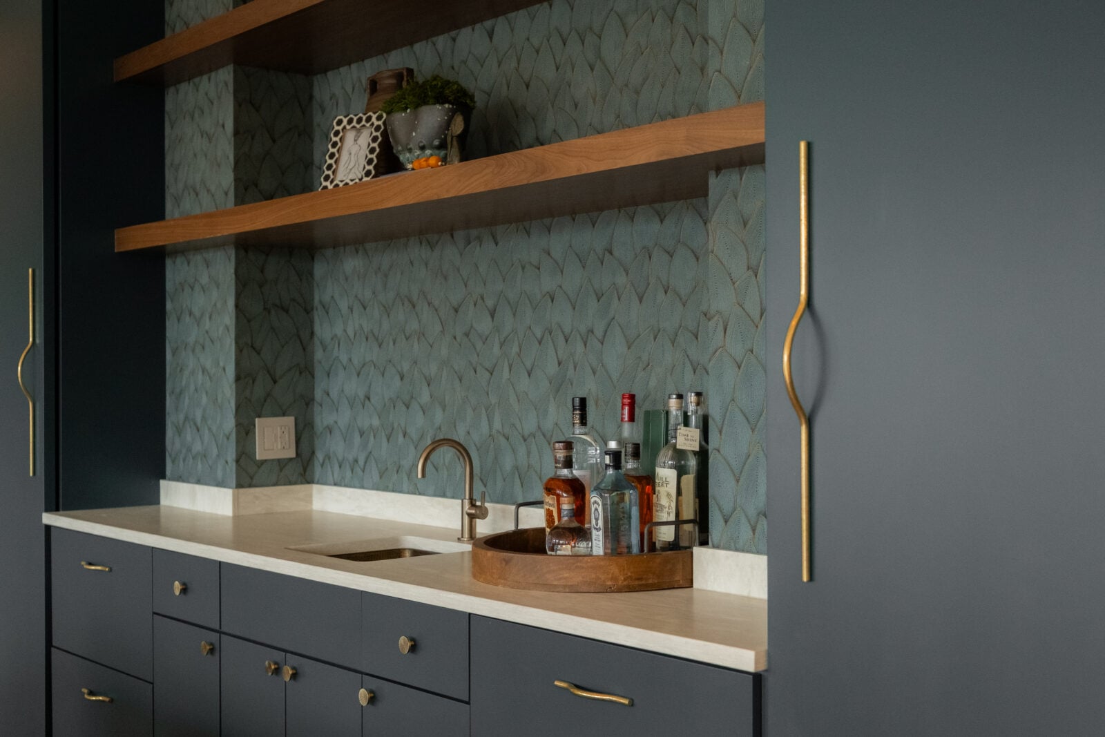
The goal for this space was a saturated, color-blocked look — the kind of confident color statement that defines a room the moment you walk in. But as Lauren put it, “We wanted a saturated, color-blocked look, but I knew we needed some texture to add some life.”
There can be a tension at the heart of a lot of wallpaper decisions because bold color reads beautifully in small doses, but across an entire wall it can feel flat, heavy or one-dimensional.
The fix: Let texture carry some of the weight
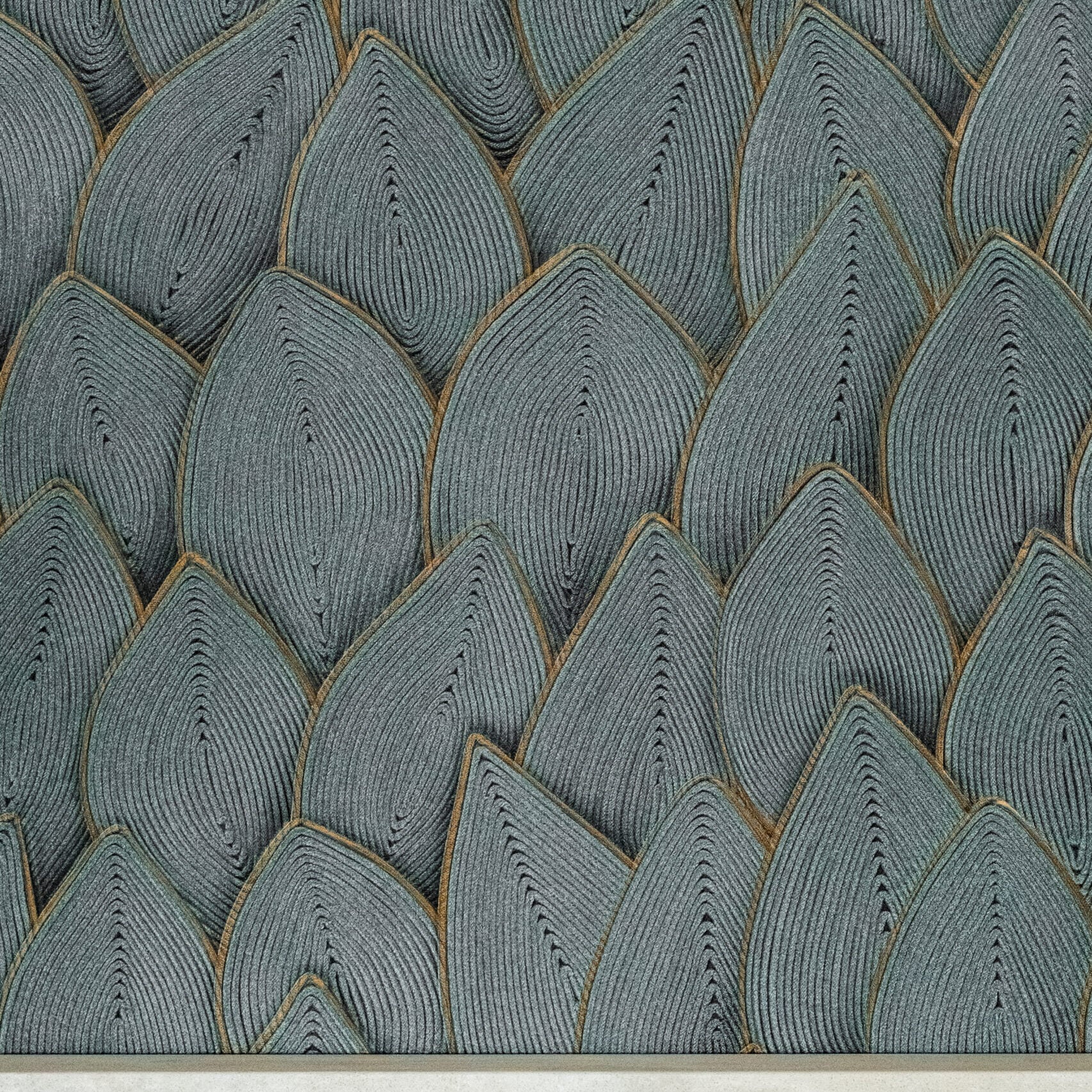
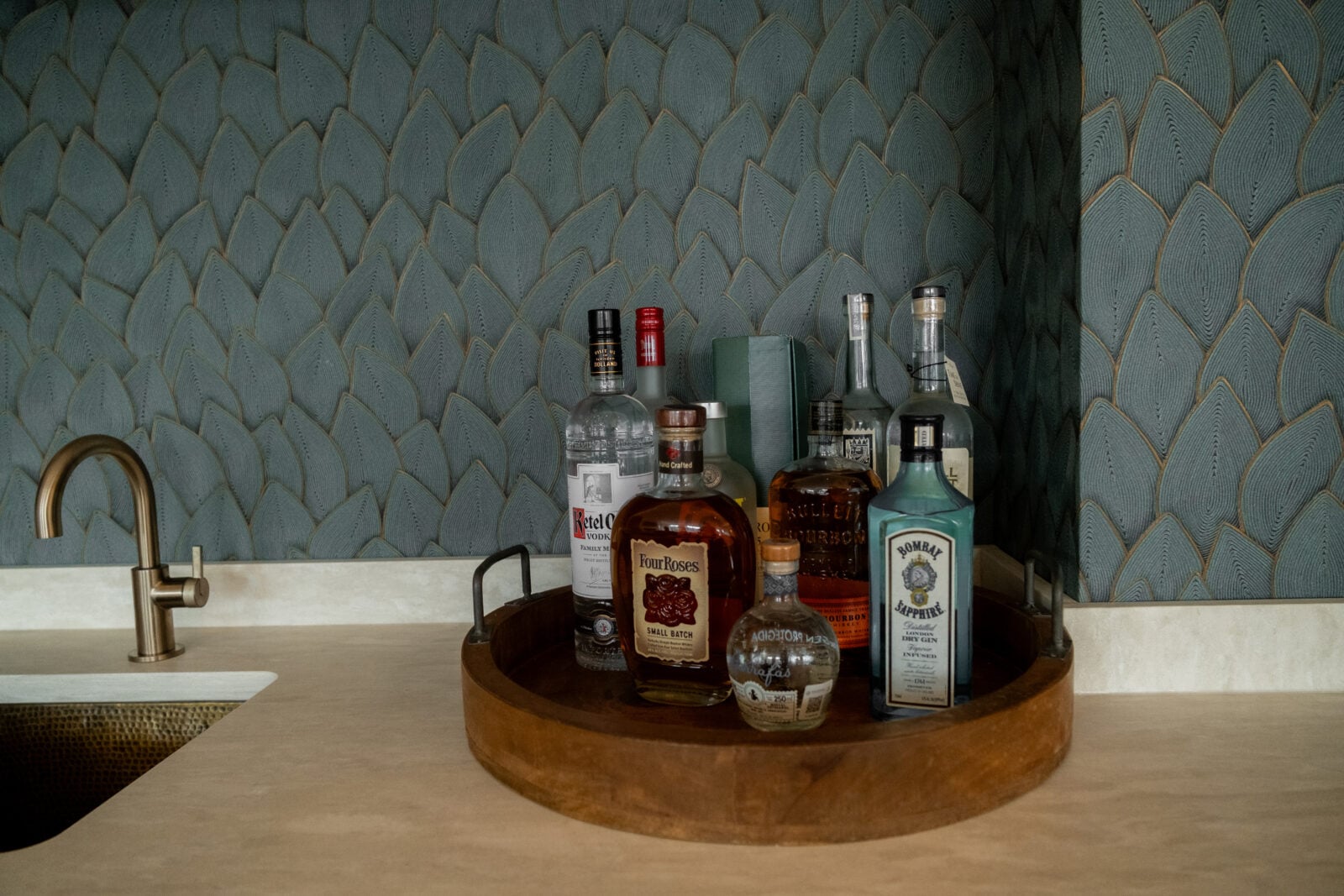
Instead of dialing back the color, the solution was to build texture into the wallpaper itself. A leafy motif with soft, repeating, and organic texture added visual interest without turning the wall into a busy focal point. As Lauren explained, it “helped add subtle texture and kept it simple while also having actual physical texture in the paper.”
Because it wasn’t just a printed pattern — the paper has real, physical texture, so the surface catches and shifts light throughout the day — it’s a detail you feel as much as see.
Three takeaways for your own space
1. Pair bold color with texture, not more pattern. If you love a saturated color, look for a wallpaper that adds dimension through texture rather than competing patterns or contrasting colors. It keeps the room feeling rich instead of overwhelming.
2. Choose a motif that works at two distances. A good pattern should read as texture from across the room and reveal detail up close. Subtle, repeating shapes — like a leaf or feather motif — tend to scale well in both small and large spaces.
3. Feel the paper before you decide. Texture isn’t only visual. Embossed, woven, or raised finishes add a tactile quality that flat prints can’t replicate, and they respond to light in ways a photo or swatch won’t fully show. Whenever possible, see (and touch) a physical sample in the room you’re decorating before committing.
The bottom line
Wallpaper decisions come down to more than color and pattern preference — they’re about how color, pattern, and texture work together at scale. If you’re planning a bold wallpaper moment in your own home, start with the color you want, then ask what texture can do to keep it feeling alive.