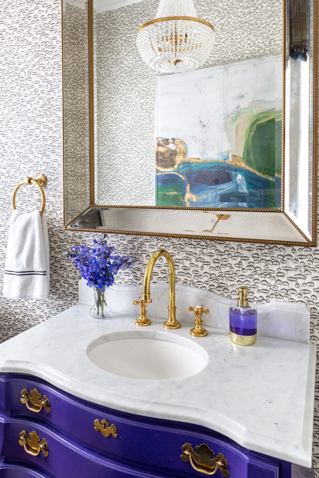
That vanity came with the house.
Dark brown stain, nothing remarkable — just a dresser that had been sitting in the bathroom since the previous owners. Most people would have pulled it out on demo day without a second thought. We asked a different question: what could this become?
Start with the bones, not the finish.
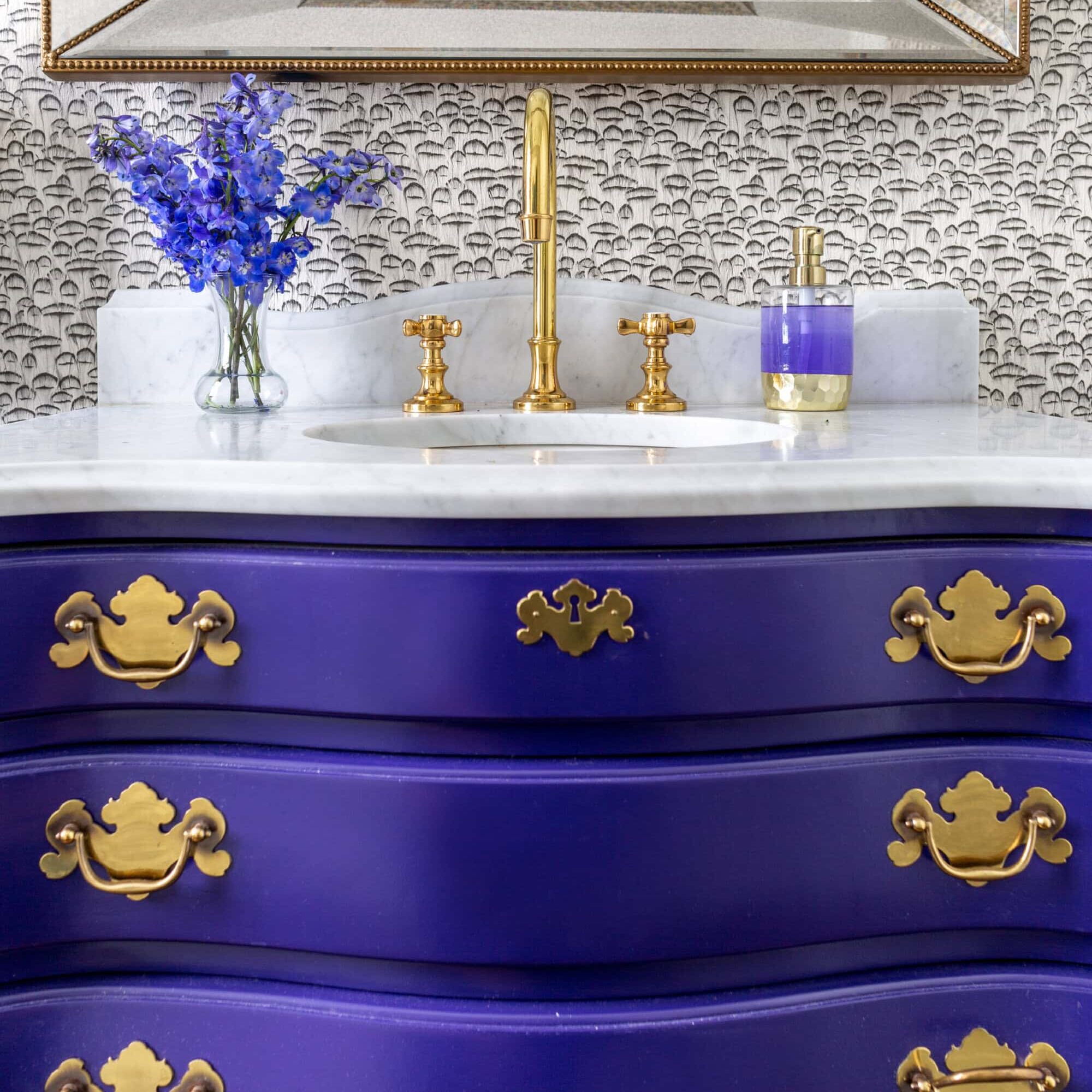
The dresser had a curved serpentine front that no standard vanity on the market could replicate. That shape — the way it moves, the way it commands attention — is the kind of detail that exists in antique and vintage furniture and almost nowhere else. The finish was wrong. The hardware was wrong. But the bones were exceptional.
This is one of the most important things we try to help our homeowners see: the finish is the easiest thing to change. The form is what you’re really buying. Before you replace something, look at what it’s made of and evaluate its potential.
The color had a reason.
We didn’t land on vibrant purple by accident. This home already had a strong color story — cobalt blue in the living room, deep green in the dining room. There was a clear thread of bold, jewel-toned color running through the house, and we wanted the powder room to feel like it belonged to that same family.
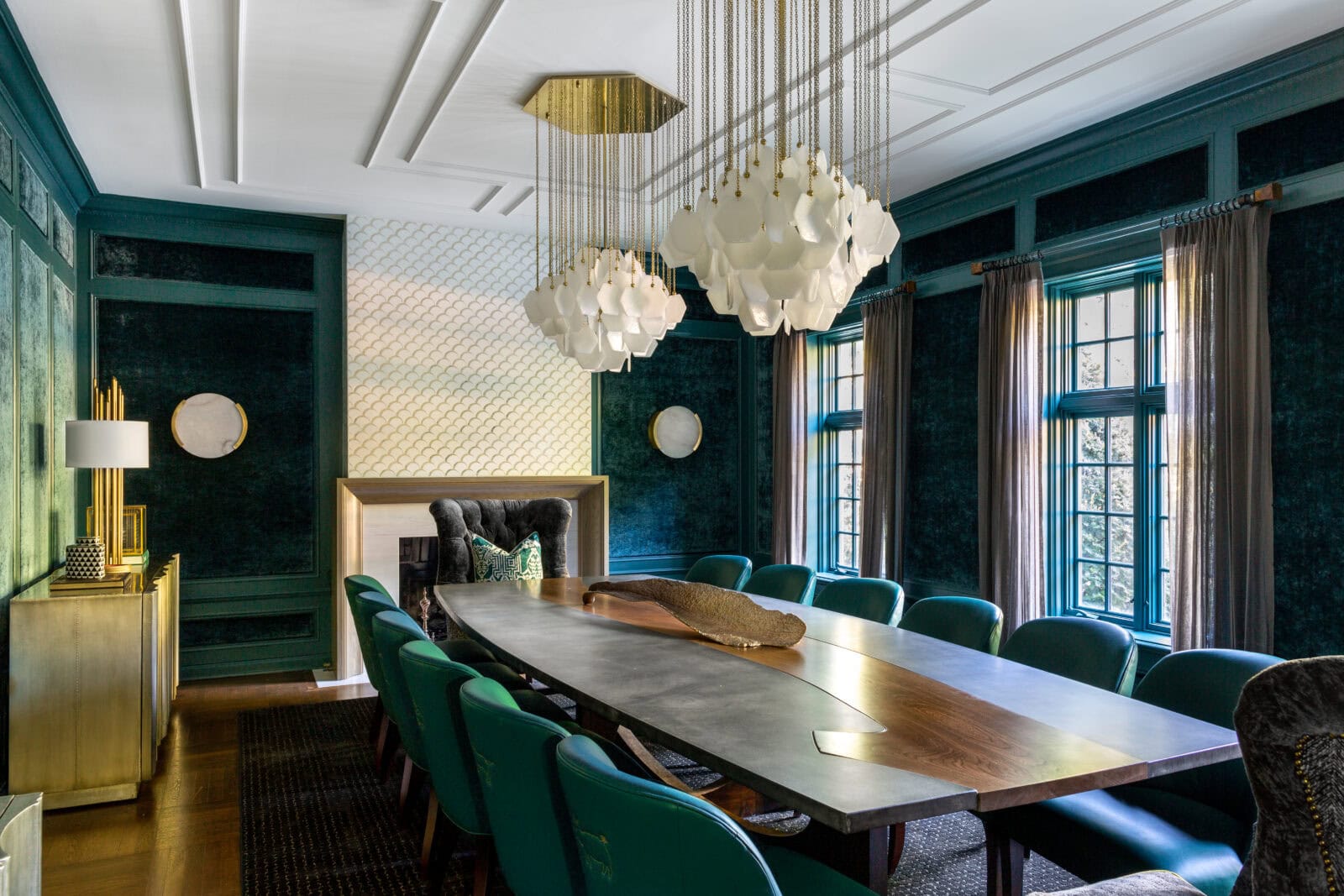
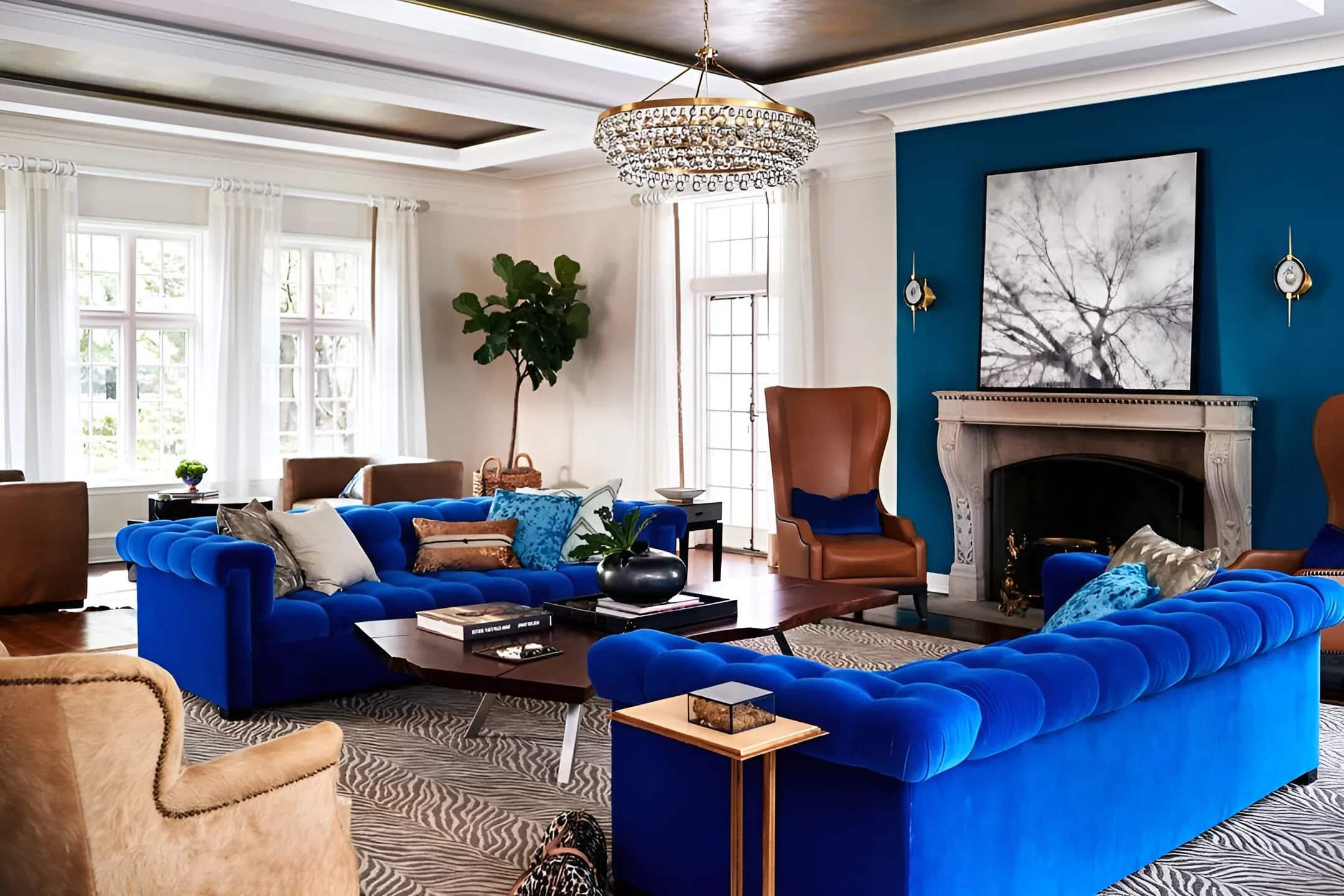
Purple kept the flow. We just turned up the volume.
Choosing a paint color for a vanity — or any piece of furniture — works best when you’re looking at the whole home, not just the room. What colors are already speaking? What would feel like a natural continuation of that conversation?
The wallpaper’s job was to complement, not compete.
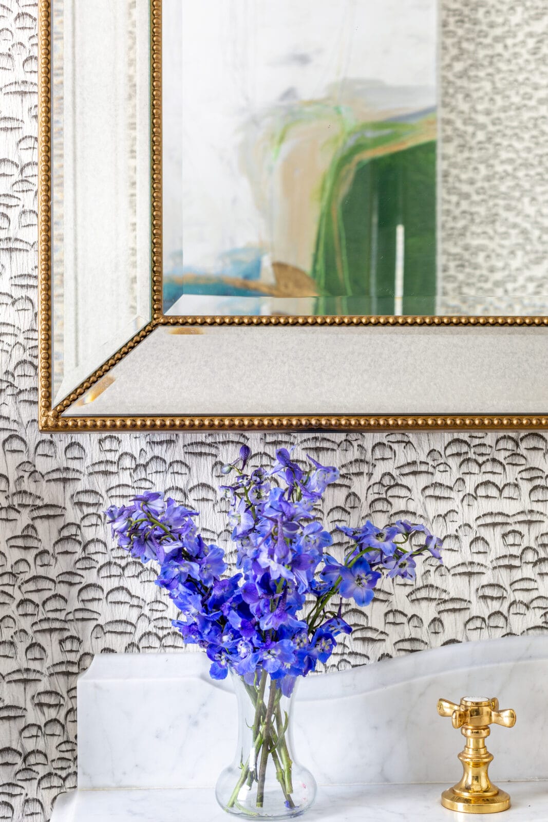
The homeowner loves animal print. So we found a wallpaper with a tiny feather pattern — just enough texture and personality to feel interesting up close, but neutral enough to let the vanity do the talking. We call this “understated funk.” It’s pattern that whispers while the color speaks.
The rule we follow: when you have a bold focal piece, the wallpaper or wall treatment behind it should add depth without drama.
One metal. All the way through.
Every metal in this room is gold — the faucet, the hardware, the mirror frame, the towel ring. This is a non-negotiable for us in small spaces, and especially in powder rooms where every detail is visible at once. Mixing metals in a tight space fragments the eye and makes even beautiful individual pieces feel disconnected.
Commit to one, let it repeat and watch the room come together.
The full formula for this room.
Bold vanity color + neutral pattern wallpaper + single metal throughout + marble that grounds it all = a powder room people stop and talk about.
None of it required starting from scratch, just seeing what was already there — differently.