Undertone matters
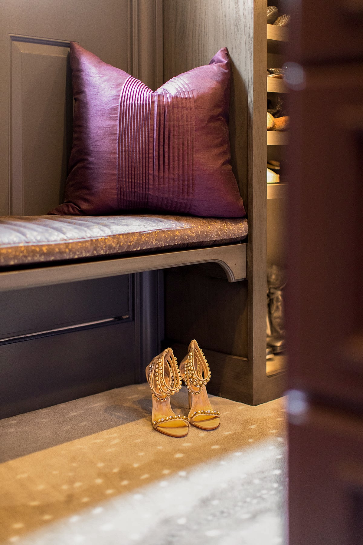
Two browns can look nearly identical in a paint chip and behave completely differently on a wall. One has a warm red or gold undertone, the other leans gray or green. Pair a gray-undertone brown with warm wood and brass, and the room starts to feel flat instead of rich. This is the single most common reason a “warm” room ends up feeling heavy instead of inviting.
Light exposure changes what a color needs
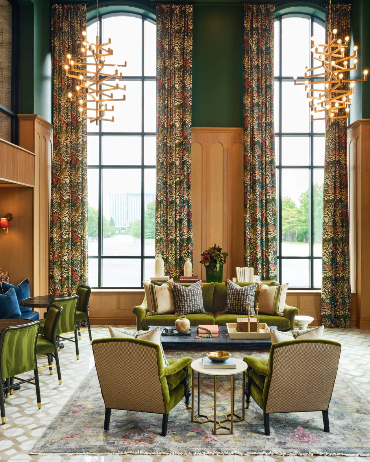
The fix isn’t switching to a different brown. It’s how much of the room you commit to it. In a room with less natural light, keep the warm tone contained, on millwork, an accent wall, or cabinetry, so it reads as intentional rather than dim. In a room that gets more daylight, that same tone can cover more surface area without feeling heavy.
Contrast keeps warmth from reading as heavy
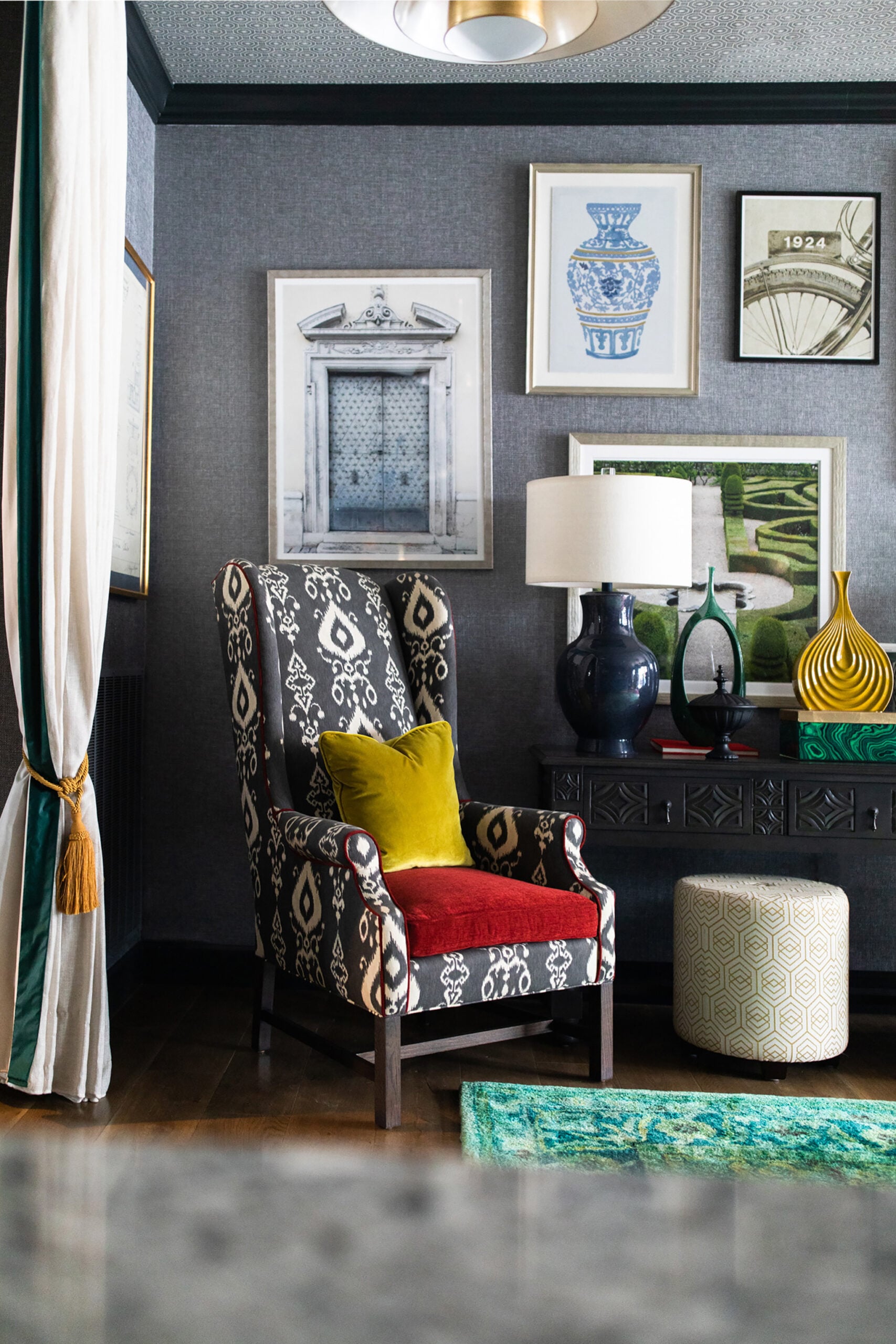
The spaces that feel intentional rather than dark almost always have a “reset,” something lighter or cooler nearby that gives the eye somewhere to land: a plaster ceiling, a linen drape, a pale stone surface. Without it, even a beautifully chosen brown can start to feel like a weight in the room rather than a warmth in it.
If a room in your home has always felt a little off and you couldn’t quite say why, it’s often one of these three things. We’re always happy to take a look, whether it’s a full room or just the wall that’s been bothering you.