The word "CRIMSON" is displayed in large, gold, elegant serif capital letters on a light background, reflecting the refined aesthetic of Crimson Design Group.
  • Portfolio
  • Expertise
  • Experience
  • Contact

Bold Luxury, Designed for Living

Search
  • Portfolio
  • Expertise
  • Experience
  • Contact
  • About
  • Meet the Team
  • Crimson World
  • Press & Awards
  • Careers
  • Aviation
  • Instagram
  • LinkedIn
  • Pinterest
The word "CRIMSON" is displayed in large, gold gradient capital letters on a white background, evoking the elegance and style of Crimson Design Group.
Explore

A Concept Worth Scaling
January 22, 2026 by Cheryl Beachy Stauffer

A Concept Worth Scaling

CommercialHospitalityRetail
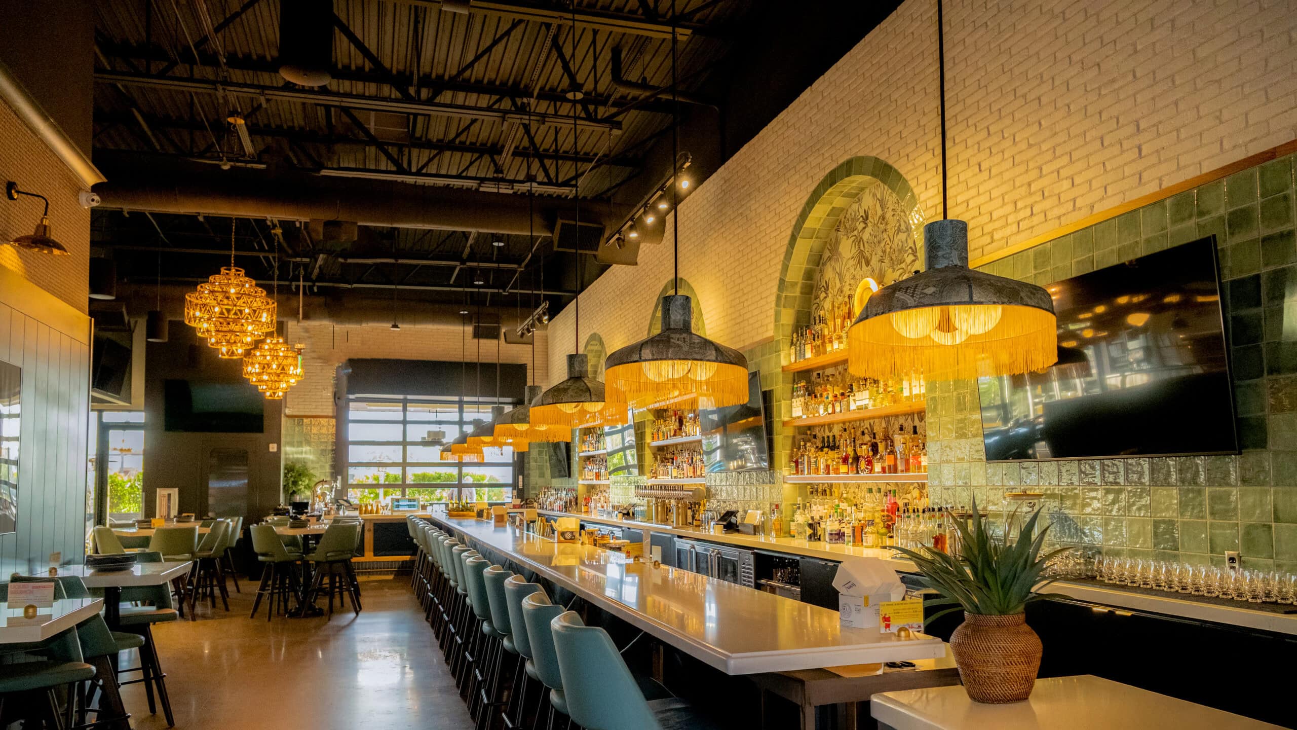
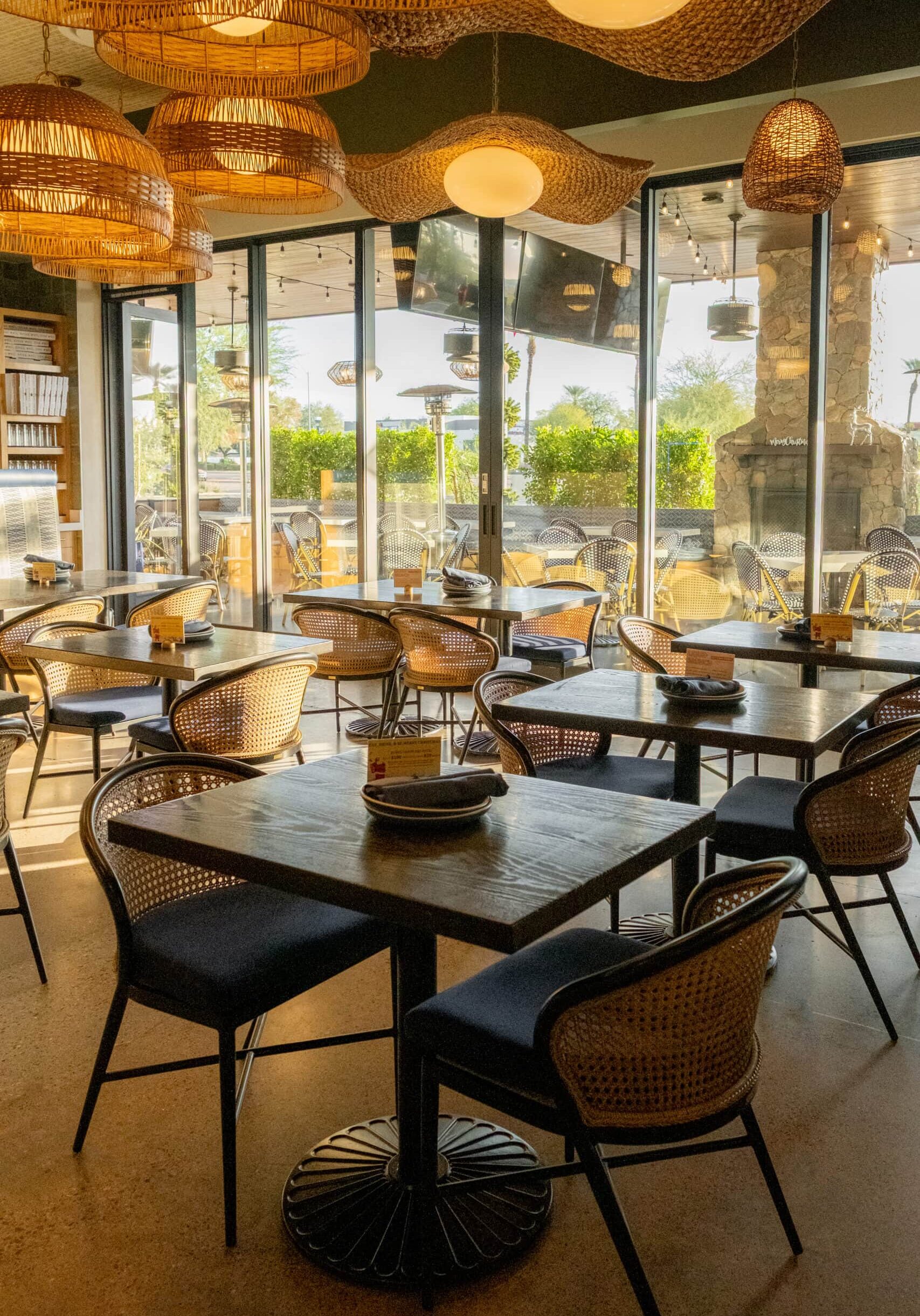
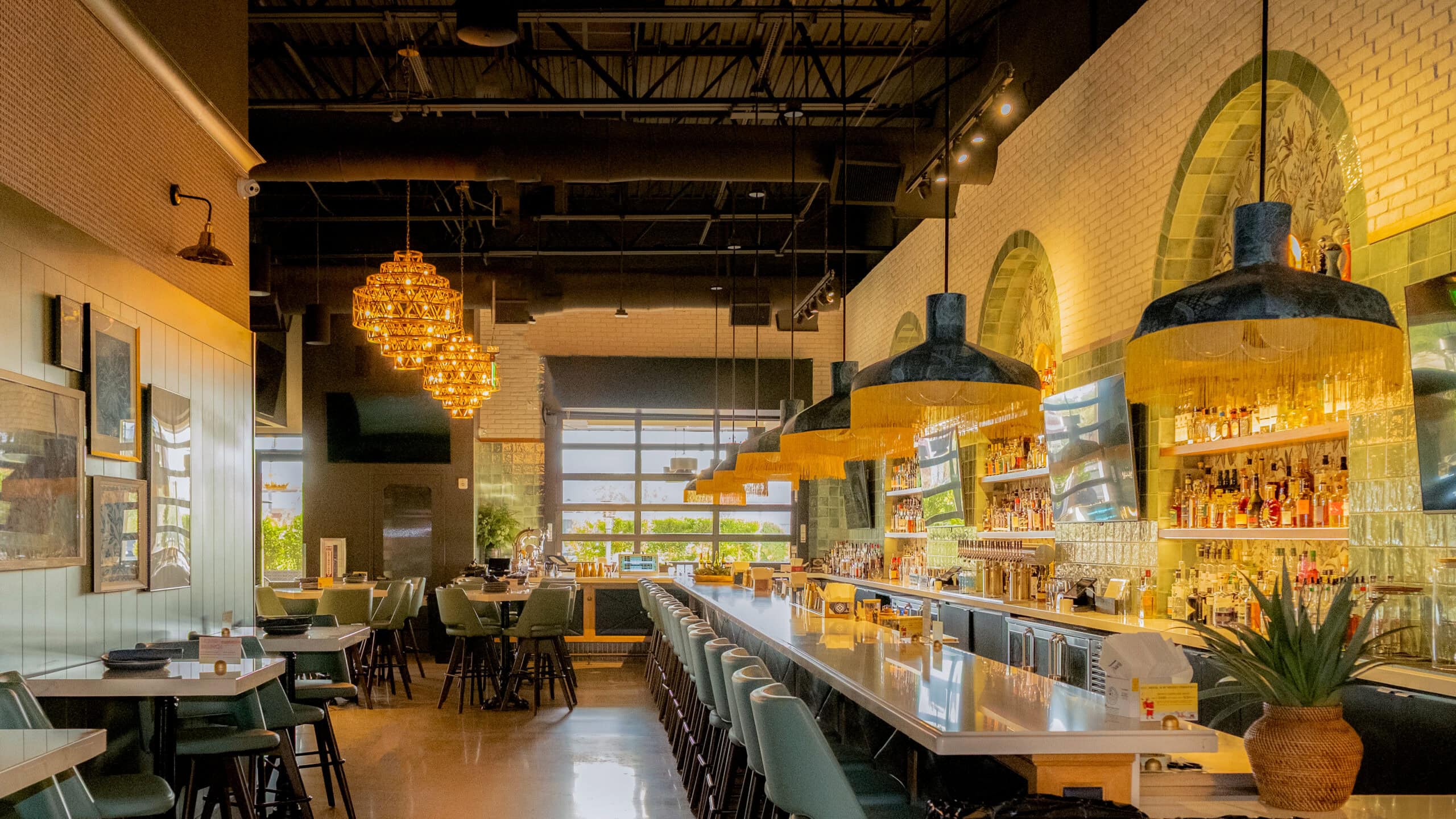
Modern restaurant interior with a long bar, green chairs, hanging lights, and large windows letting in natural light. Tables are set and shelves behind the bar display bottles.

A Concept Worth Scaling

A retail and hospitality concept refined, expanded, and scaled across multiple locations.

Category

Commercial, Hospitality, Retail

Location

Multiple Locations — Phoenix & Scottsdale, Arizona

Community Context

High-energy, community-driven neighborhoods selected for social gathering, visibility, and repeat visitation

Year

2021–2024
DSCF4797

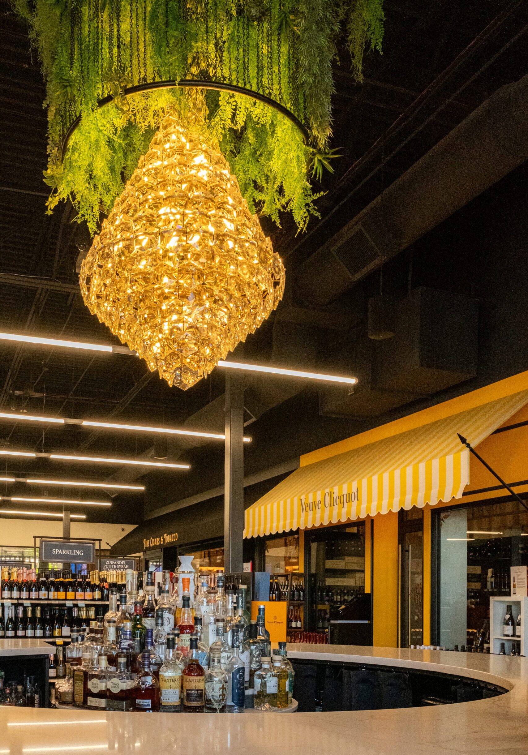
Every successful retail brand begins with a strong idea, but lasting growth depends on how that idea is carried forward. Trevor’s Liquor launched with a clear point of view: a liquor store designed as a destination, where retail, hospitality, and community intersect.

When new ownership acquired the brand, Crimson Design Group was brought on as the design partner to help evolve and expand that original concept. Beginning with Trevor’s second location and continuing through subsequent openings, Crimson worked closely with the team to translate the brand’s DNA into new spaces. We worked to refine the experience, adapt it to new footprints, and ensure consistency without repetition.


Project Snapshot


  • Scope: Design of locations two, three and four after change in ownership
  • Role: Brand translation, spatial refinement, and location-specific adaptation
  • Concept Type: Experiential retail with hospitality integration
  • Performance Signal: Successful expansion to four locations in under five years
  • Brand Impact: Proven scalability of an experience-driven retail model
DSCF4339
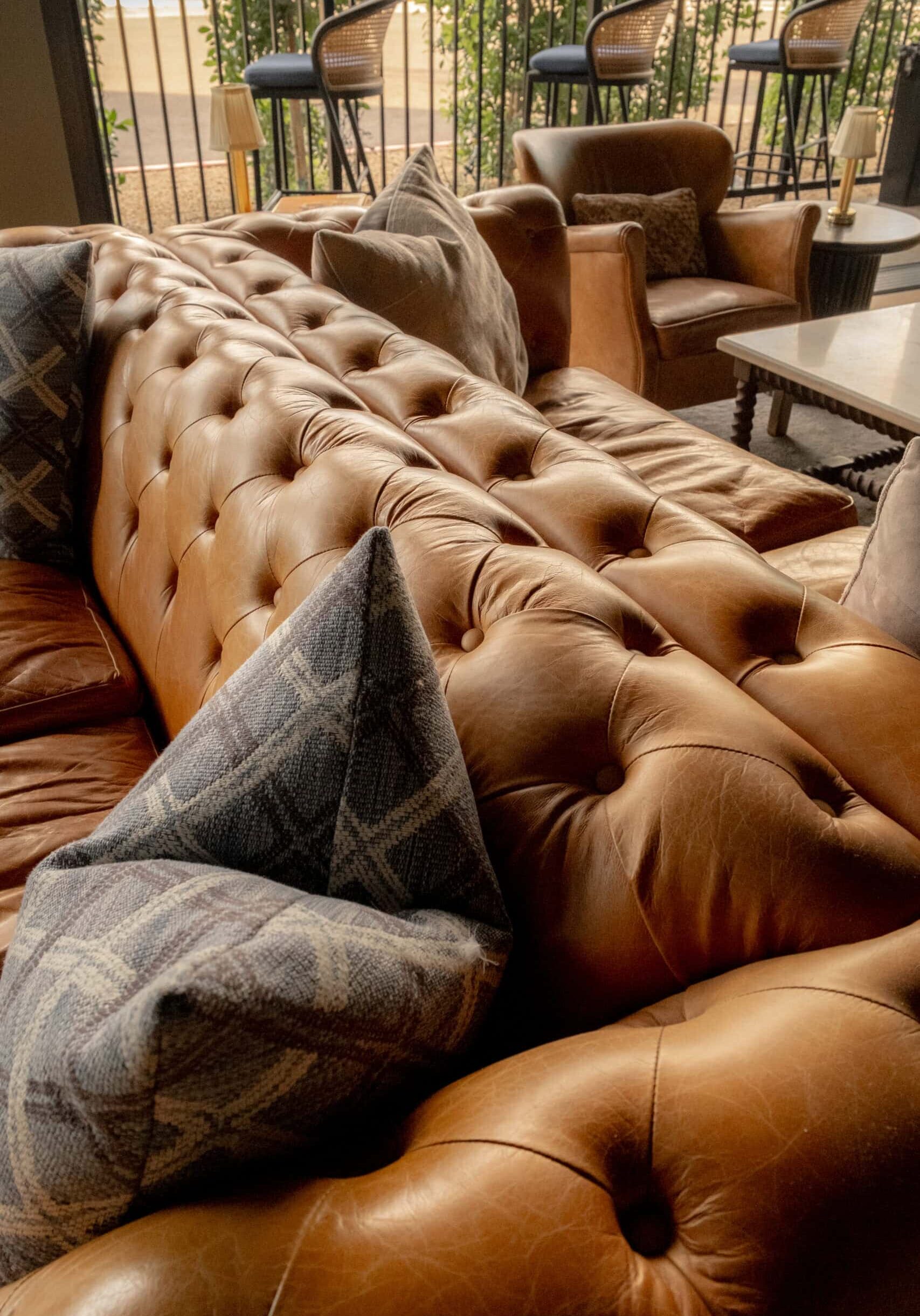
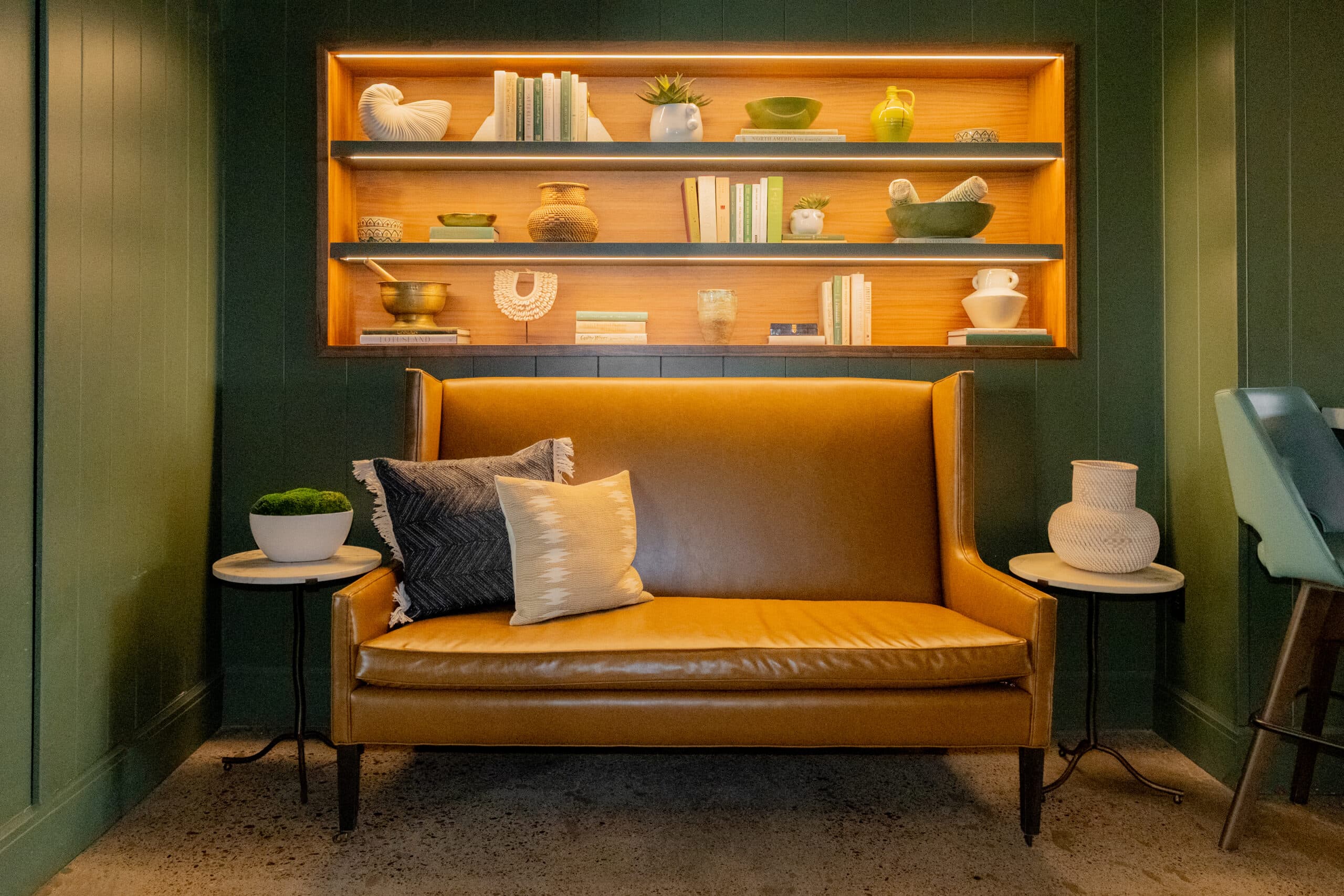
A couch with pillows on it.
DSCF4830

The Vision

Honor a strong original concept while refining it for growth.

The challenge wasn’t to reinvent Trevor’s — it was to understand what made the original concept resonate and ensure that essence carried through each new location. Crimson’s role was to help define what elements were core to the brand experience and where flexibility was possible.

The Approach

Translate brand DNA into adaptable, high-performing environments.

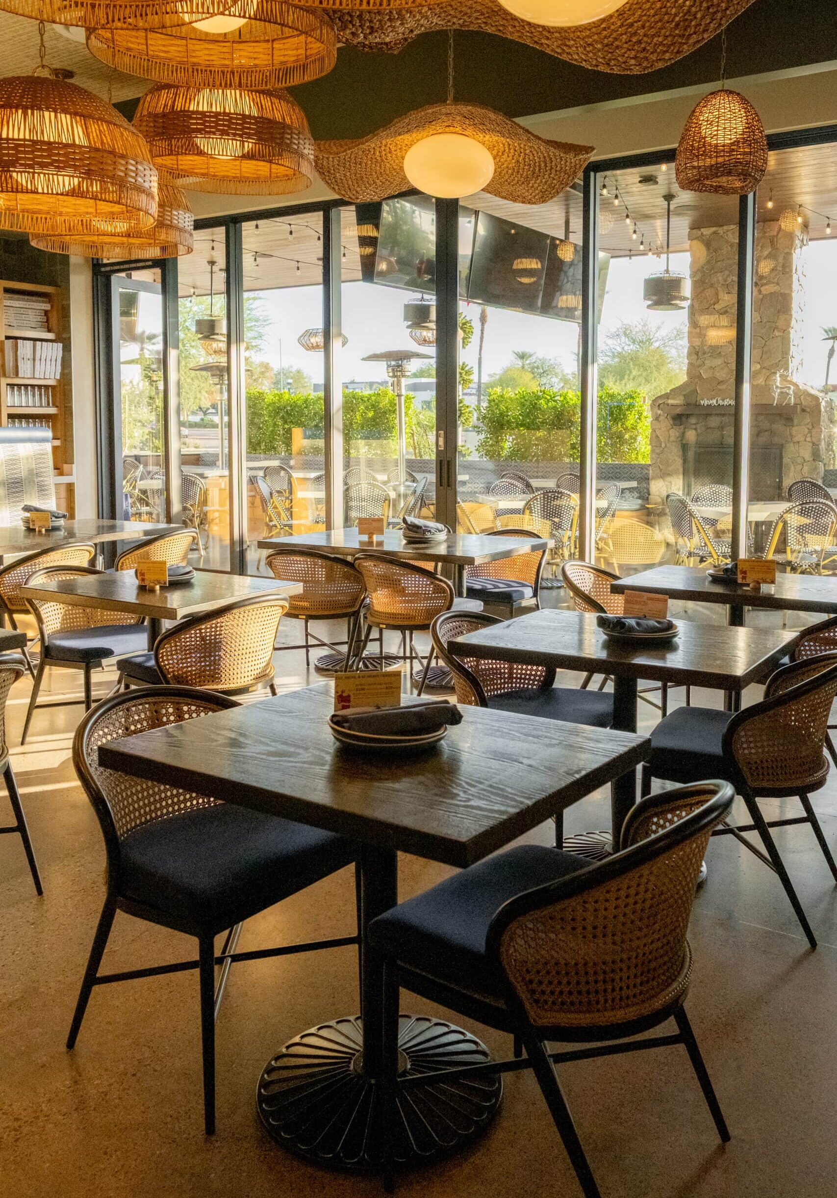
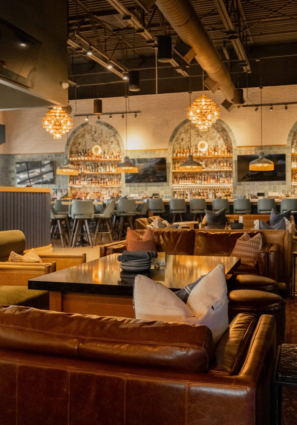
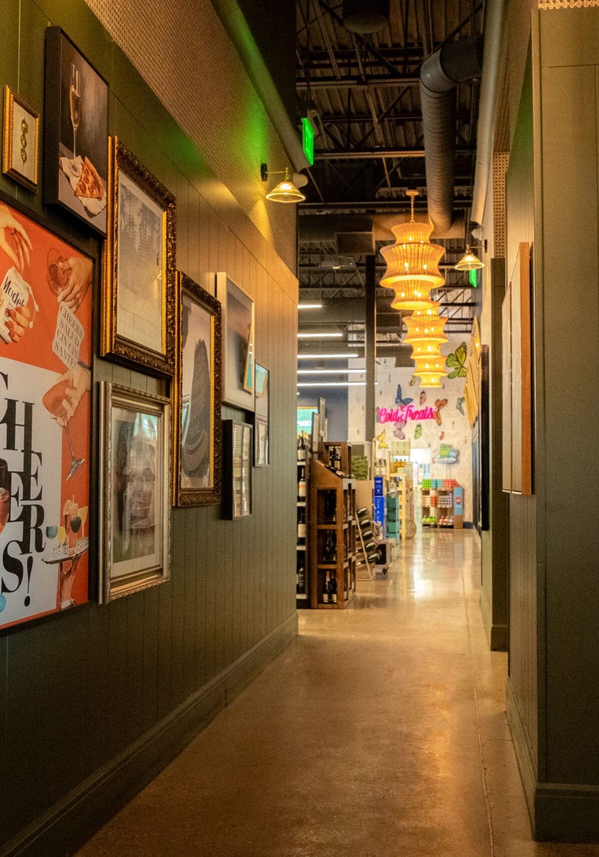
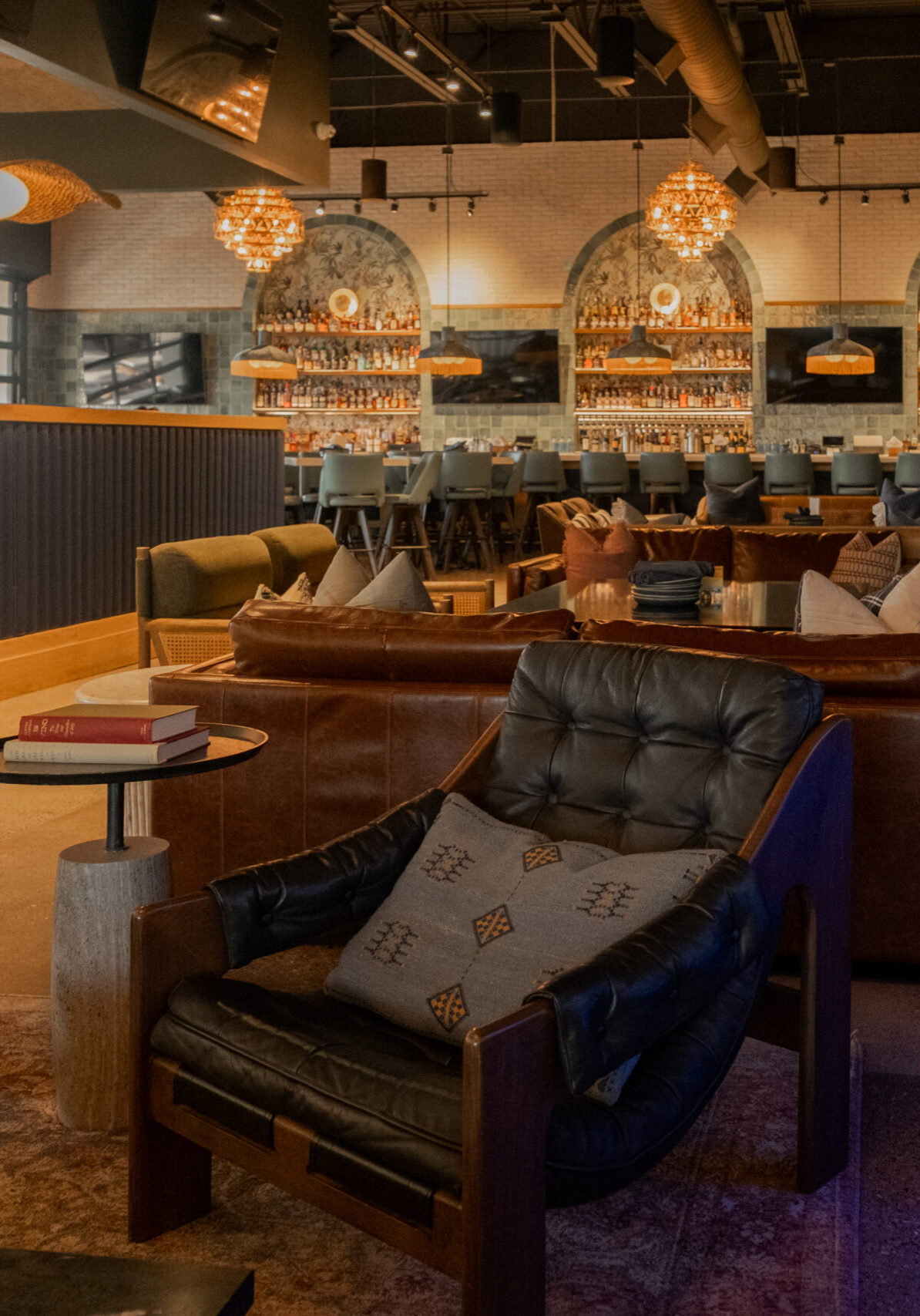
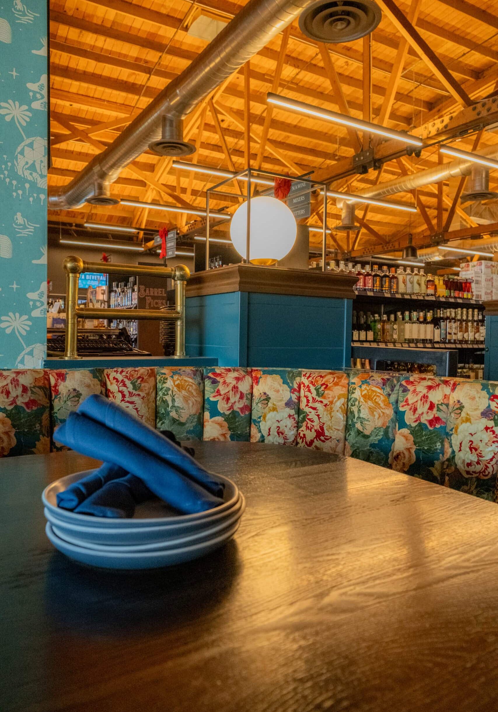
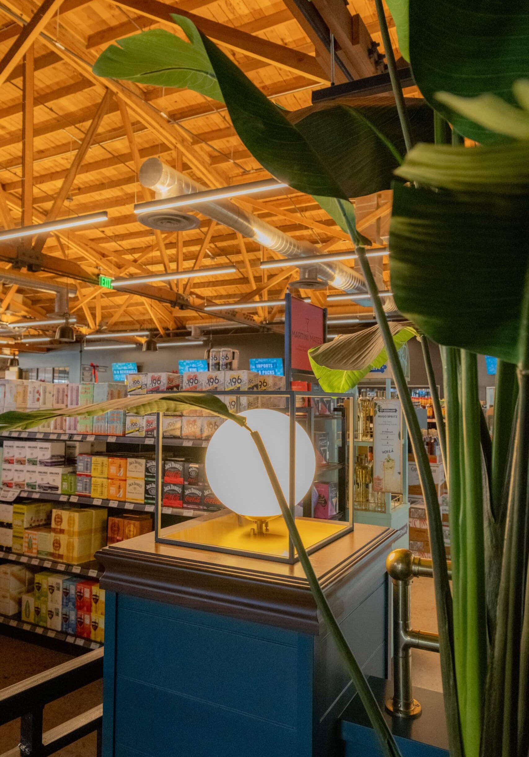
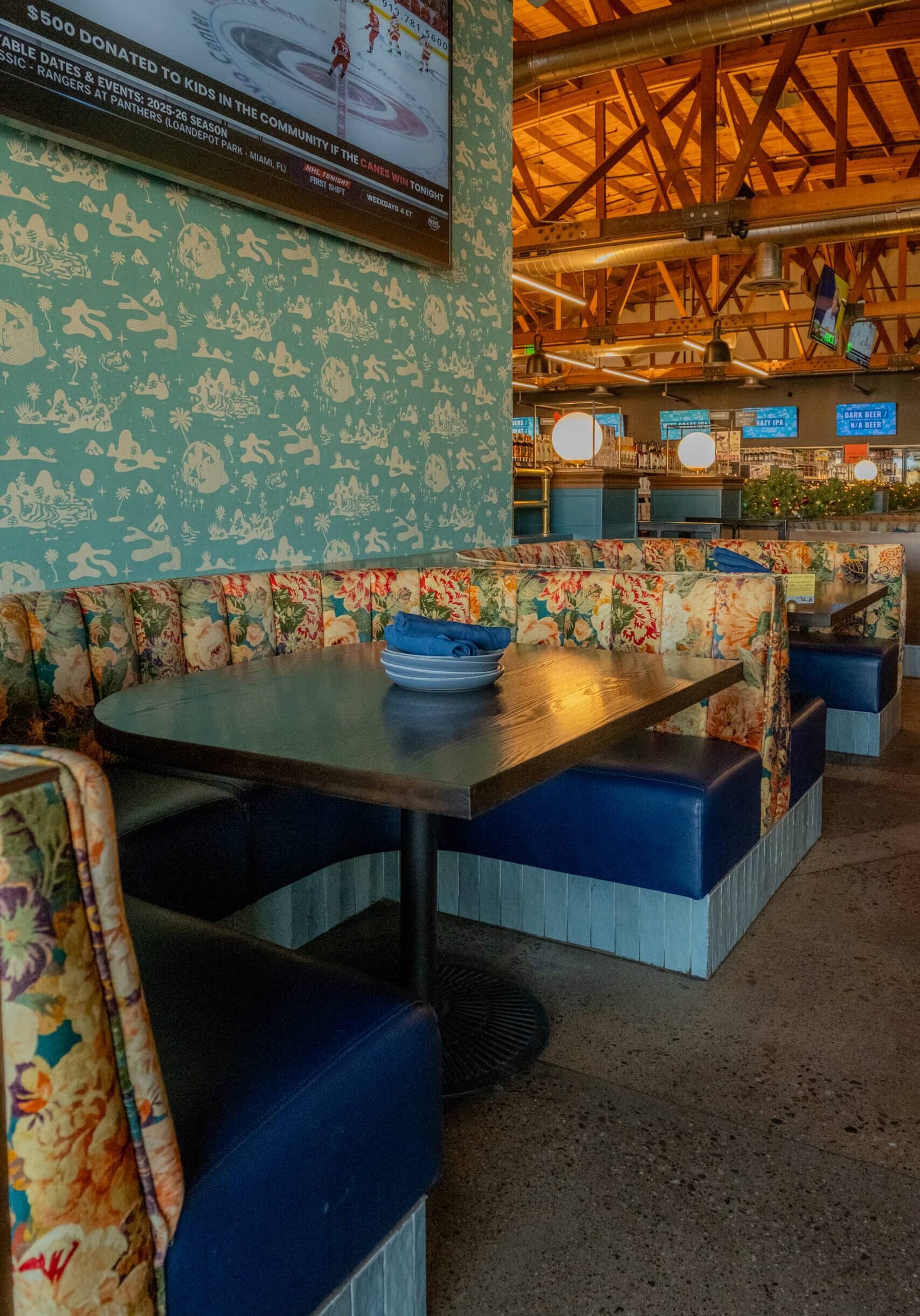
Crimson approached each location with a hospitality mindset, carefully choreographing how guests move, gather, and linger. While layouts and proportions shifted from site to site, key experiential elements — including bar moments, lounge seating, curated product displays, and layered lighting — were reinterpreted to suit each space.

Design decisions balanced expressive storytelling with disciplined planning. Warm materials, bold color, custom millwork, and vintage-inspired details added character, while durable finishes and operational clarity ensured each store could handle daily demand. The result was a refined version of the original idea that could flex, grow, and perform.

The Impact

A brand experience strong enough to expand and evolve.

The success of the expanded locations reinforced the power of the original concept and demonstrated its ability to scale. Customers responded to the consistency of experience paired with subtle variation, treating each Trevor’s as both familiar and new.

That momentum translated directly into growth. Trevor’s expanded to four locations across Arizona, with year-over-year sales increases reported at approximately 28% during expansion years. The brand’s continued growth confirms that experience-driven retail, when thoughtfully executed, can be both emotionally engaging and commercially successful.

“Scaling Trevor’s was about understanding what couldn’t change — and where each new location could have its own personality.”
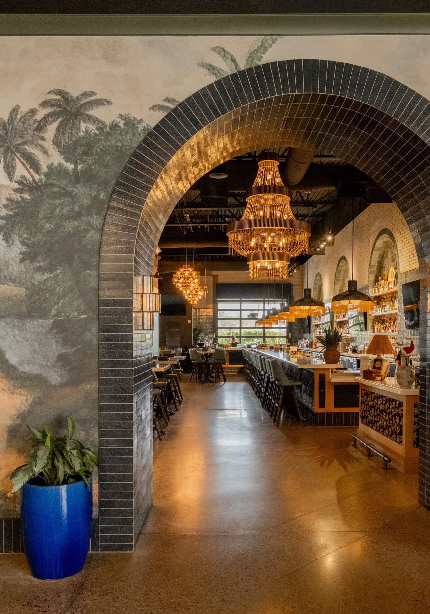
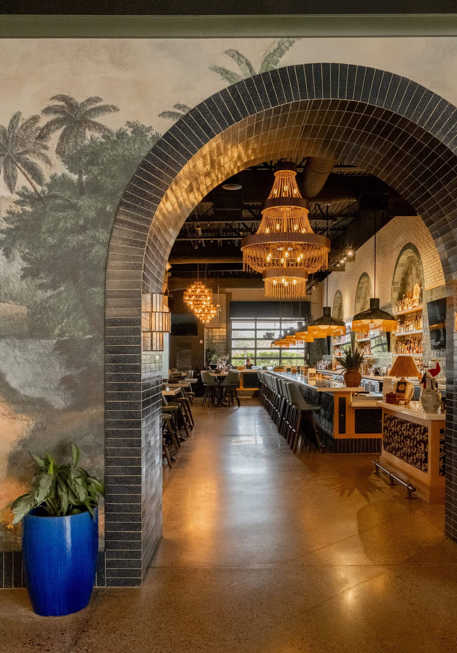
Arched entrance with black tile frames a view into a restaurant bar area, featuring chandeliers, wall art with palm trees, and a blue planter with a green plant.

Services Provided:

Brand Translation & Design Continuity

Multi-Location Interior Design

Space Planning & Layout Adaptation

Material & Finish Selection

Custom Millwork Design

Lighting Design Coordination

FF&E Specification & Coordination

Installation Oversight

Our Expertise

Our Favorite Details

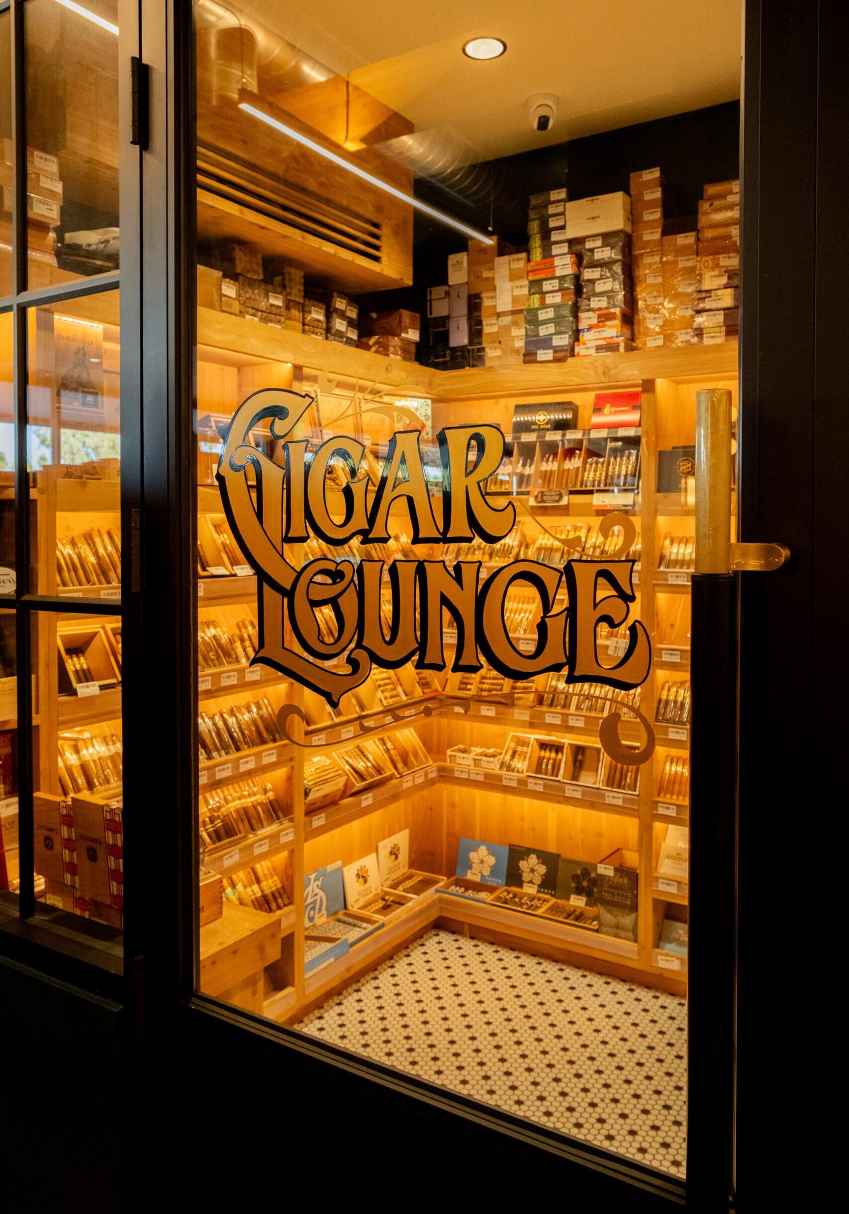
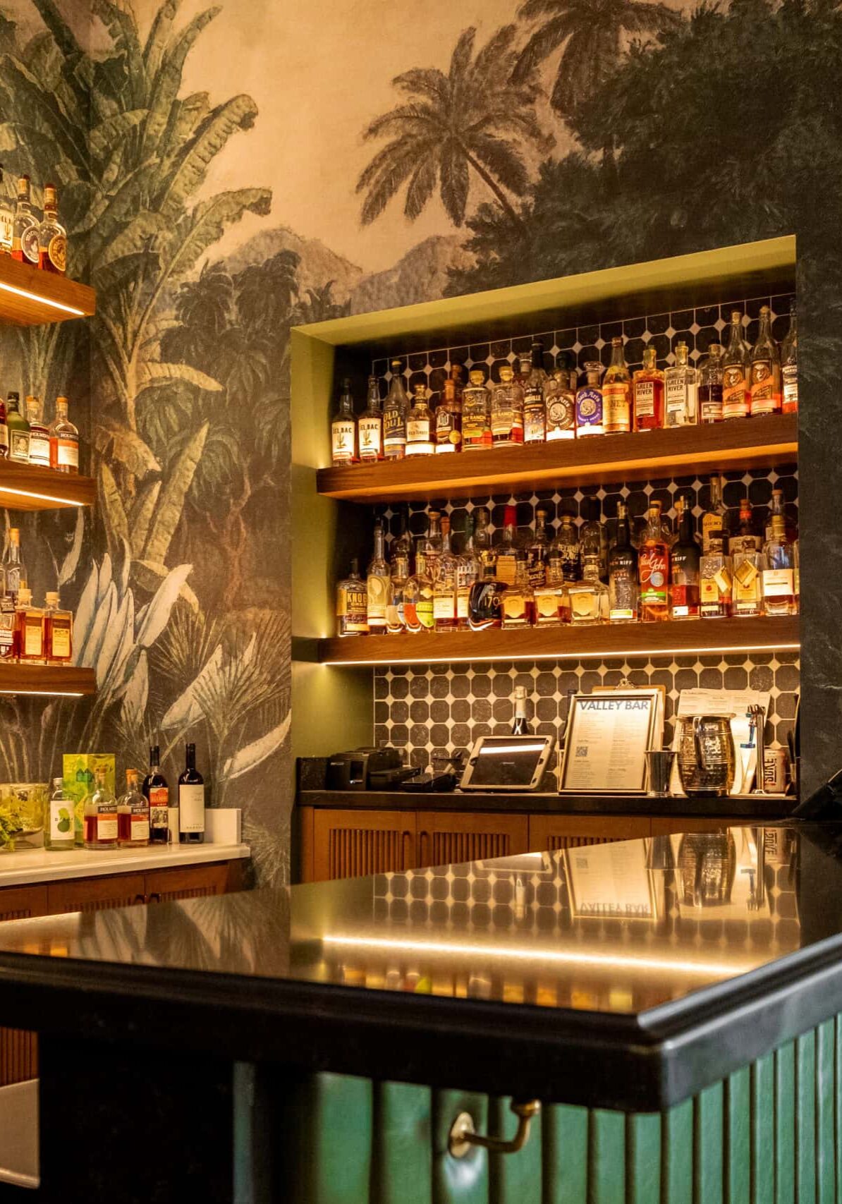
Across locations, Trevor’s spaces are defined by moments that encourage guests to linger. Bar areas that feel social rather than transactional. Lounge seating that invites conversation. Shelving systems that showcase products without overwhelming the experience.

Each location includes subtle variations — different adjacencies, scale shifts, or material emphases — while maintaining a consistent tone. It’s these nuanced decisions that allow the brand to feel cohesive without feeling formulaic.

Bold.
Unexpected.
Memorable.
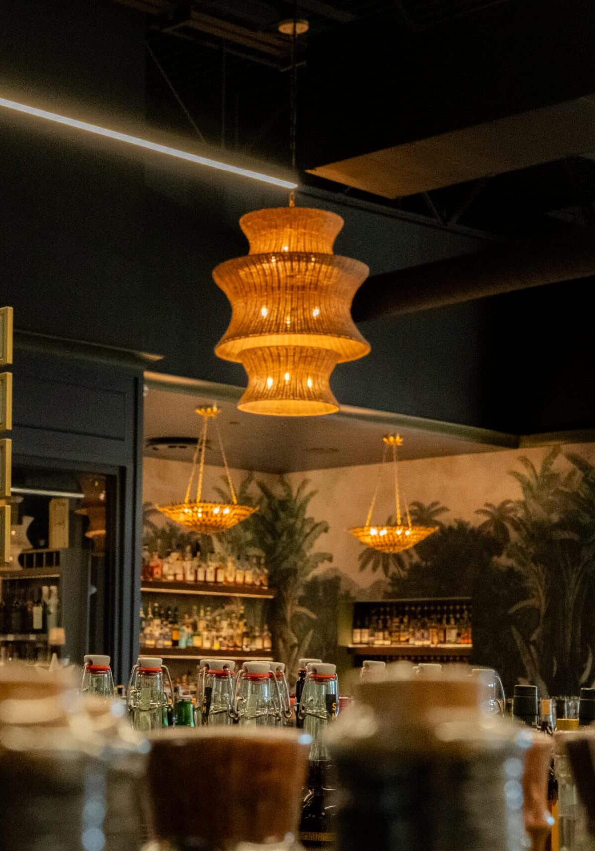
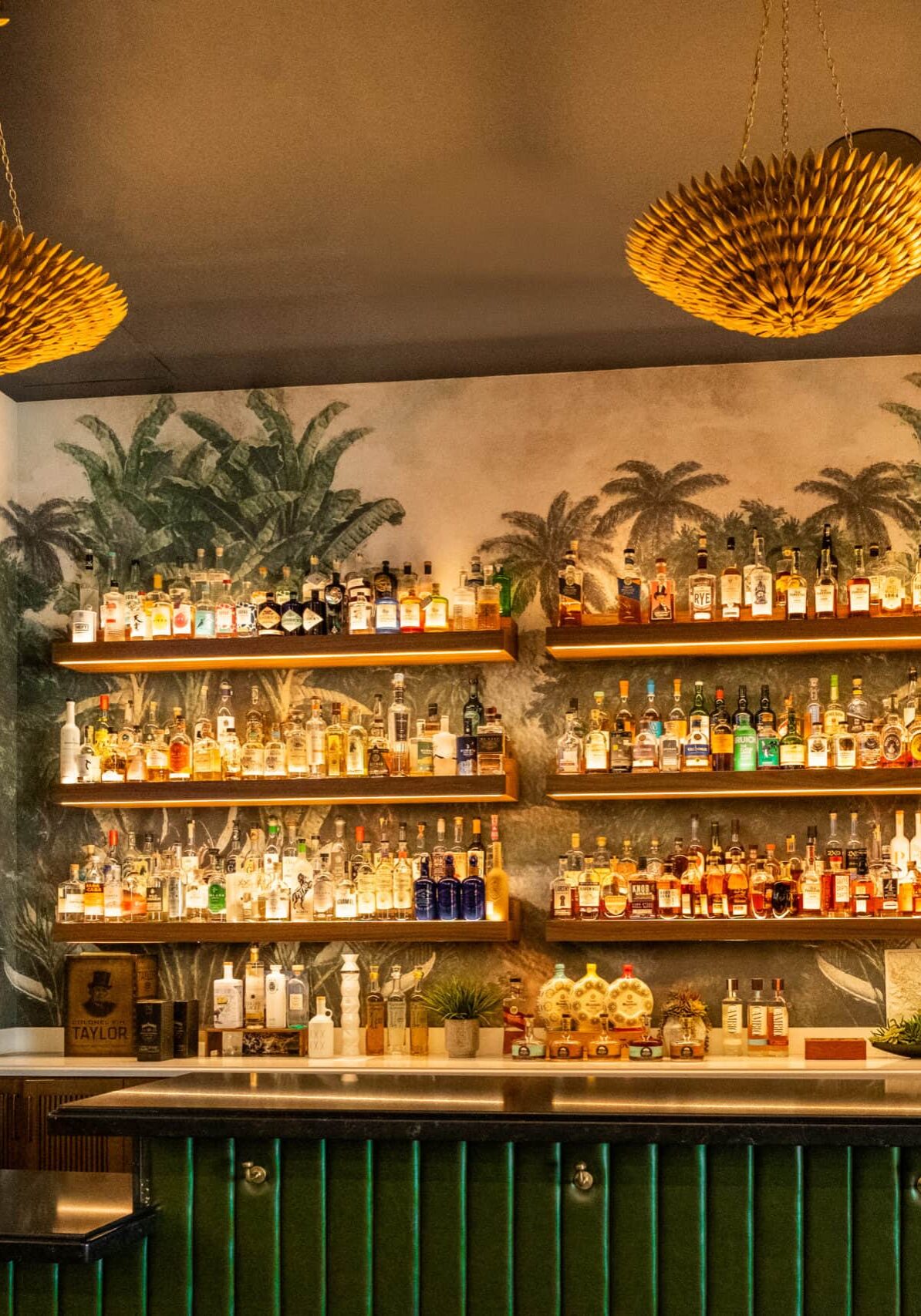
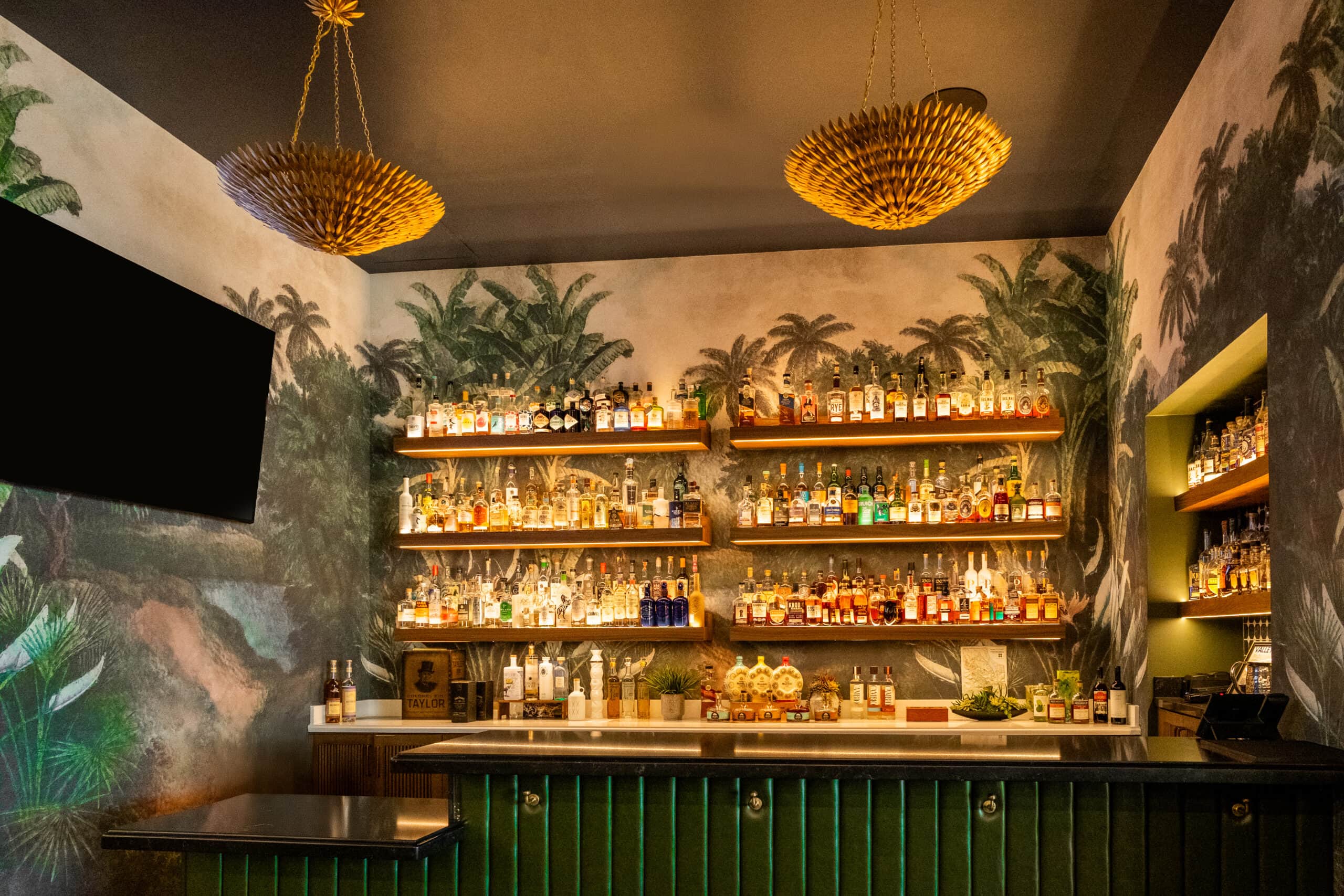
Bar interior with assorted bottles on the counter, hanging chandeliers, decorative signage, and a tropical-themed mural on the back wall.

Notes from the Design Team

Working on Trevor’s meant stepping into an existing story and helping it grow. What made the work especially rewarding was seeing how customers embraced each new location immediately. That response reinforced an important insight: when design is rooted in experience and intention, it becomes a powerful driver of both loyalty and growth.
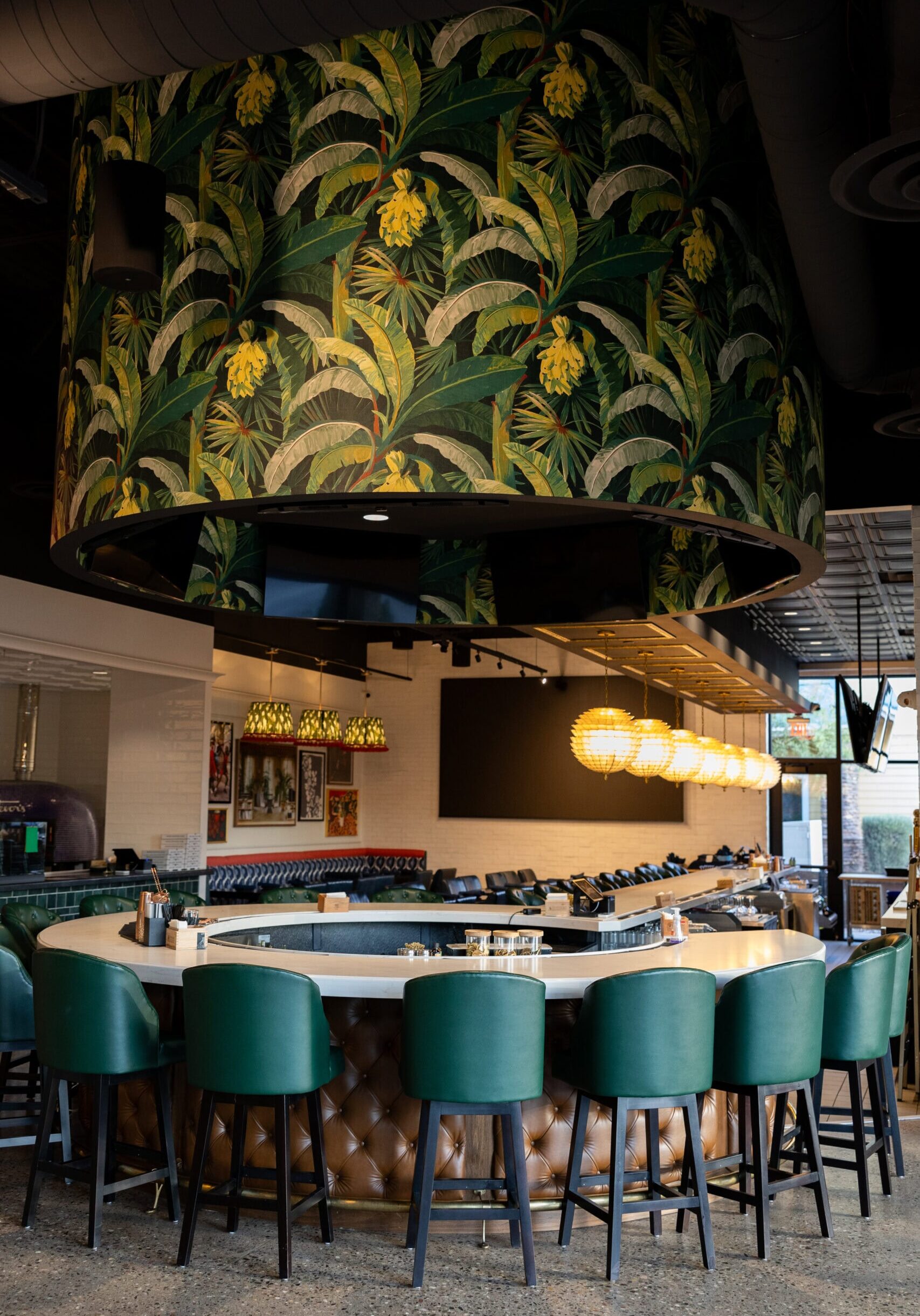
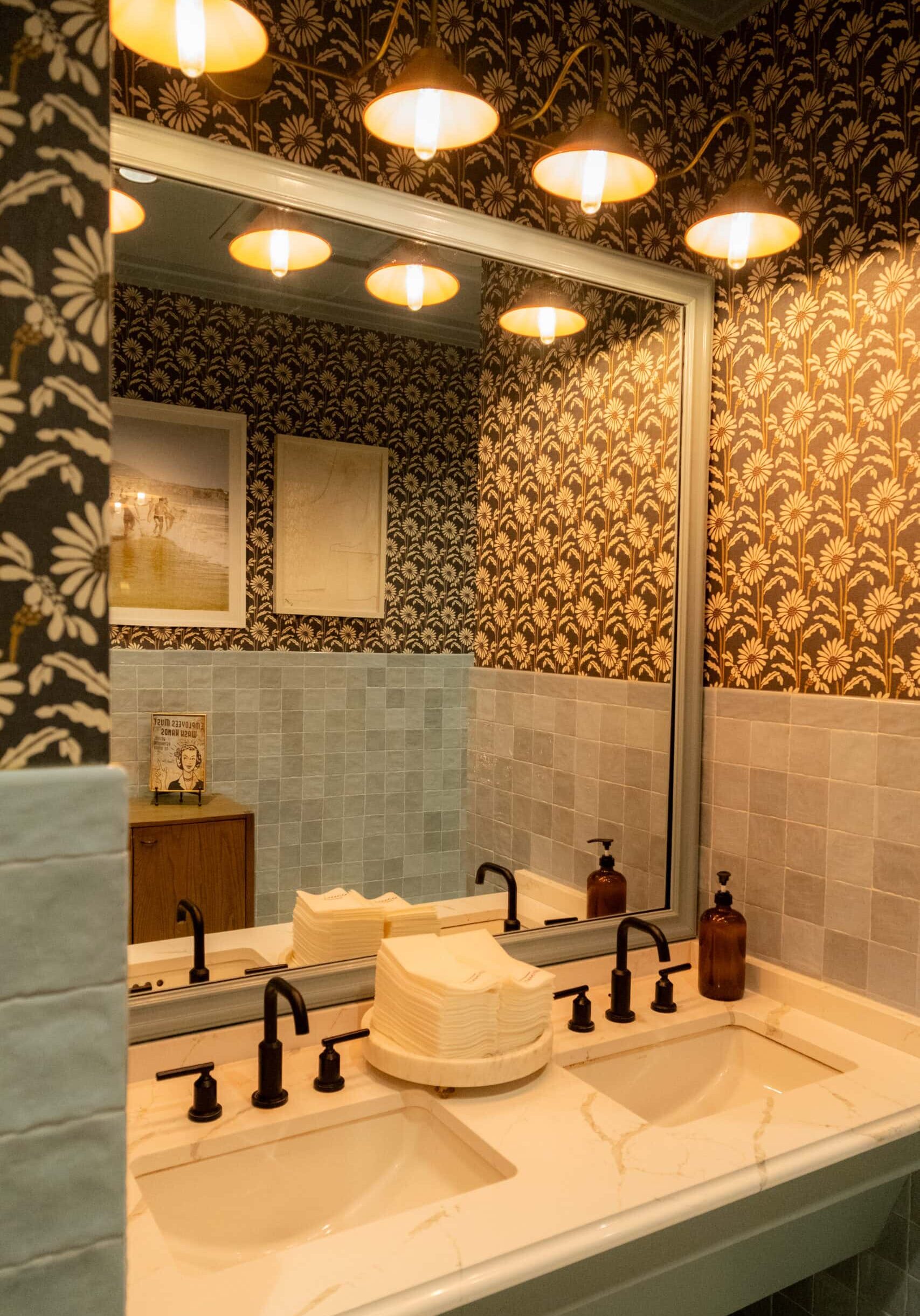
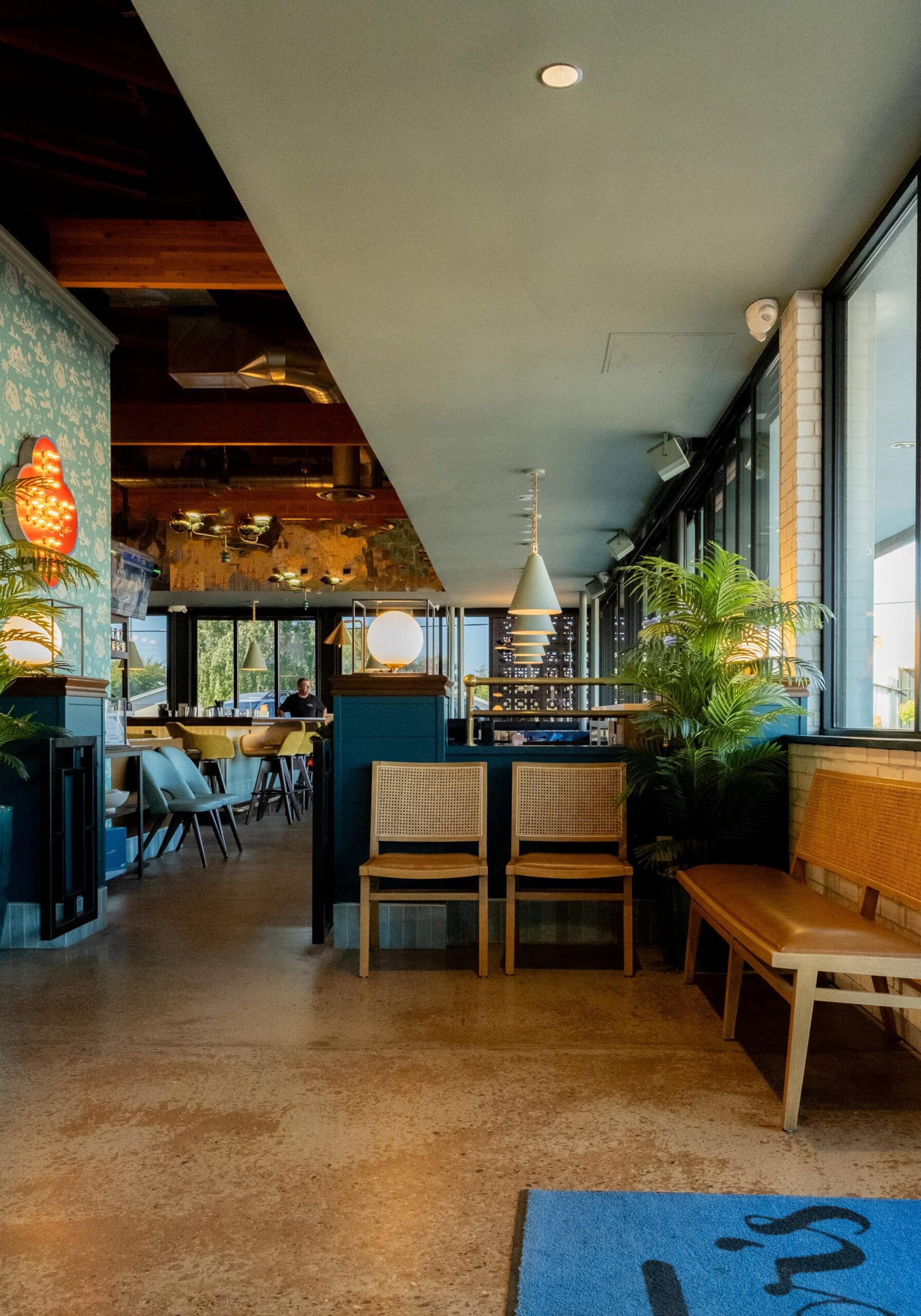
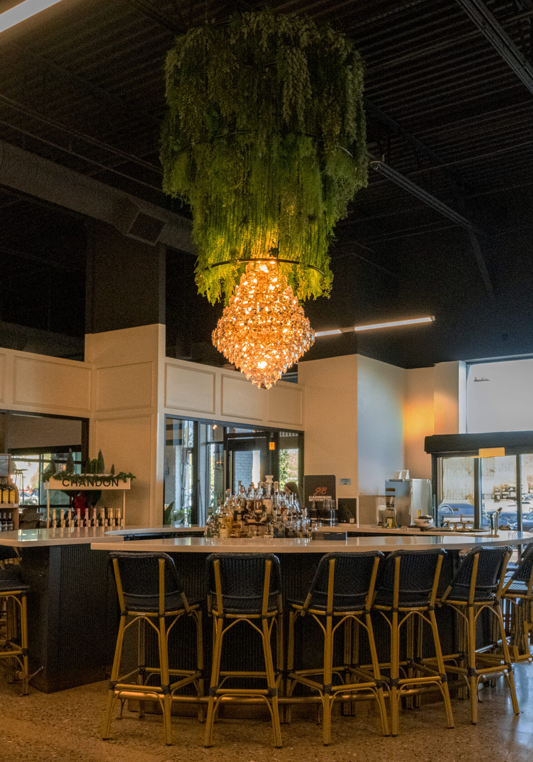
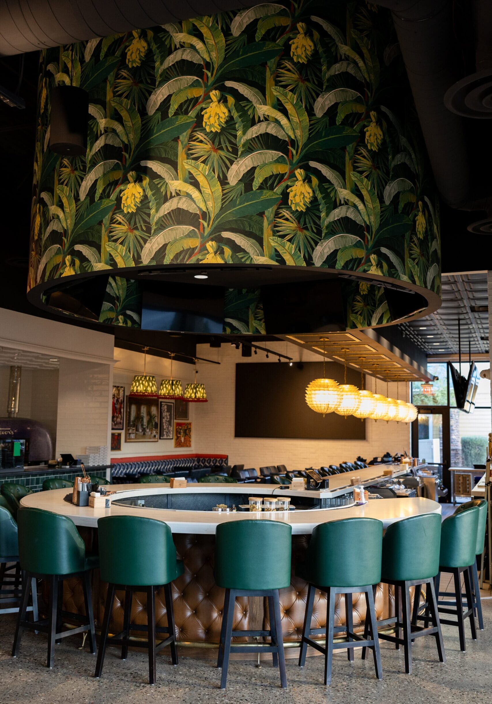
A modern bar with green upholstered chairs, a round counter, and a large overhead structure decorated with tropical leaf wallpaper. Spherical pendant lights hang in the background.
DSCF4558
DSCF4592

A Bold Icon in the Short North

January 21, 2026 by Cheryl Beachy Stauffer

A Concept Worth Scaling

CommercialHospitalityRetail
FINAL-04-June-2021-Whiskey-Bar-214
Crimson Design Group's immersive hospitality interior design for Luxe 23 Whiskey Lounge in Columbus' Short North — bold, theatrical, and custom-art driven.
FINAL-04-June-2021-Whiskey-Bar-217

Luxe 23 Whiskey Lounge

An immersive hospitality interior where luxury, art, and experience collide.

Category

Hospitality

Location

Short North Arts District, Columbus, Ohio

Community Context

A nationally recognized arts and entertainment district known for bold expression, nightlife, and cultural influence

Year

2021

FINAL-04-June-2021-Whiskey-Bar-292

Some projects demand restraint. Luxe 23 demanded courage.

Located in the heart of Columbus’ Short North Arts District, Luxe 23 Whiskey Lounge was conceived as part of a $30 million mixed-use development anchored by Urban Chophouse. From the beginning, the goal was to create a hospitality destination that felt unmistakably luxurious, unapologetically bold, and incredibly experiential. The developer wanted a space that could match the neighborhood’s creative energy while elevating it.

Crimson Design Group partnered closely with the development team to design an immersive interior experience layered with art, drama, and surprise. The result is a whiskey lounge that has been consistently positioned in local press as a destination in its own right, not just for its spirits program, but for the atmosphere that surrounds it.


The Vision

Create a hospitality destination that feels theatrical, luxurious, and unforgettable, but without sacrificing comfort or craft.

Luxe 23 was envisioned as more than a whiskey lounge. It needed to feel like a fully immersive experience that was layered with visual impact, artistic expression, and unexpected moments. The design had to invite conversation, curiosity, and return visits, while still delivering the refinement expected of a high-end hospitality environment.

Crimson approached the vision with a clear understanding that in the Short North, the city’s Arts District, boldness isn’t optional, it’s the baseline. The challenge was to push creatively while ensuring every element felt intentional, cohesive, and worthy of long-term relevance

The Approach

Lead with creativity, anchor it in strategy, and execute every detail with Red Glove precision.

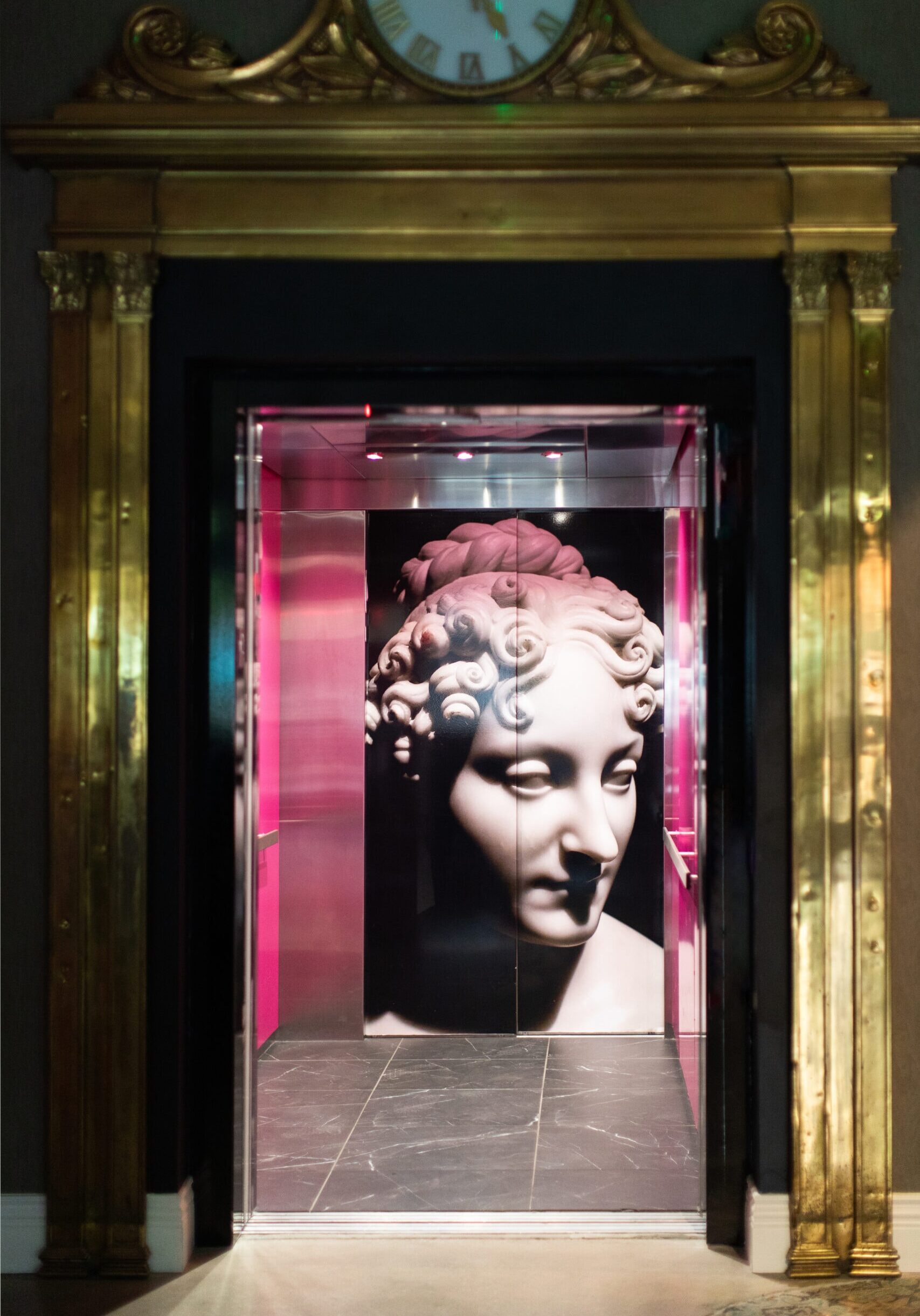
Crimson’s approach balanced high-concept design with smart, strategic decision-making. The team identified where bold custom elements would create lasting impact, and where inventive solutions could achieve drama without unnecessary cost. One example was the use of large-scale vinyl graphics in elevator interiors, transforming a utilitarian moment into a memorable arrival experience.

At the same time, Crimson leaned fully into hands-on creativity. Custom installations, layered styling, and curated objects were developed, sourced, and installed with direct involvement from the design team. This allowed the space to feel personal rather than overproduced.

The Impact

A space that became part of the neighborhood conversation.

Since opening, Luxe 23 Whiskey Lounge has been consistently framed in local media as a destination — praised for its energy, atmosphere, and role within the larger Luxe 23 development. Coverage highlights the lounge’s ability to shift seamlessly from a relaxed daytime environment to a lively nightlife setting, reinforcing how the design supports multiple modes of use throughout the day and evening.

Positioned within a high-profile mixed-use project, the Whiskey Lounge contributes to Luxe 23’s identity as a lifestyle destination in the Short North. The space doesn’t just serve guests — it shapes how they experience the property and the neighborhood as a whole.
“This project gave us permission to be fearless — and to trust that when design is done thoughtfully, bold ideas resonate.”
— Crimson Design Group

FINAL-04-June-2021-Whiskey-Bar-177

Services Provided:

Hospitality Interior Design

Experiential Concept Development

Space Planning + Guest Flow Strategy

Custom Art + Installation Design

Material + Finish Selection

FF&E Specification + Procurement

Graphic Integration + Visual Branding

Installation Oversight + Styling

Our Expertise

Our Favorite Details

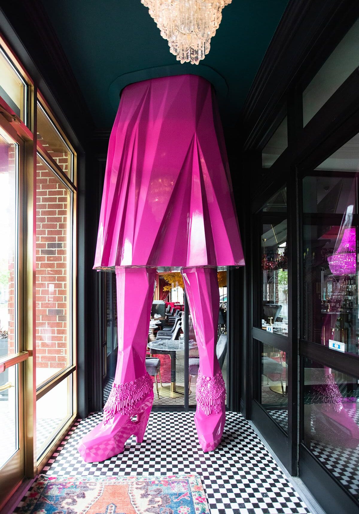
At the heart of Luxe 23 stands its most iconic feature: a 12-foot-tall pink woman, custom-designed and 3D printed exclusively for the space. Her underskirt is decorated with a fabulous, patterned wallpaper, her accessories were individually hand-applied and the space featured a sculptural moment that immediately signals this is not a typical lounge.

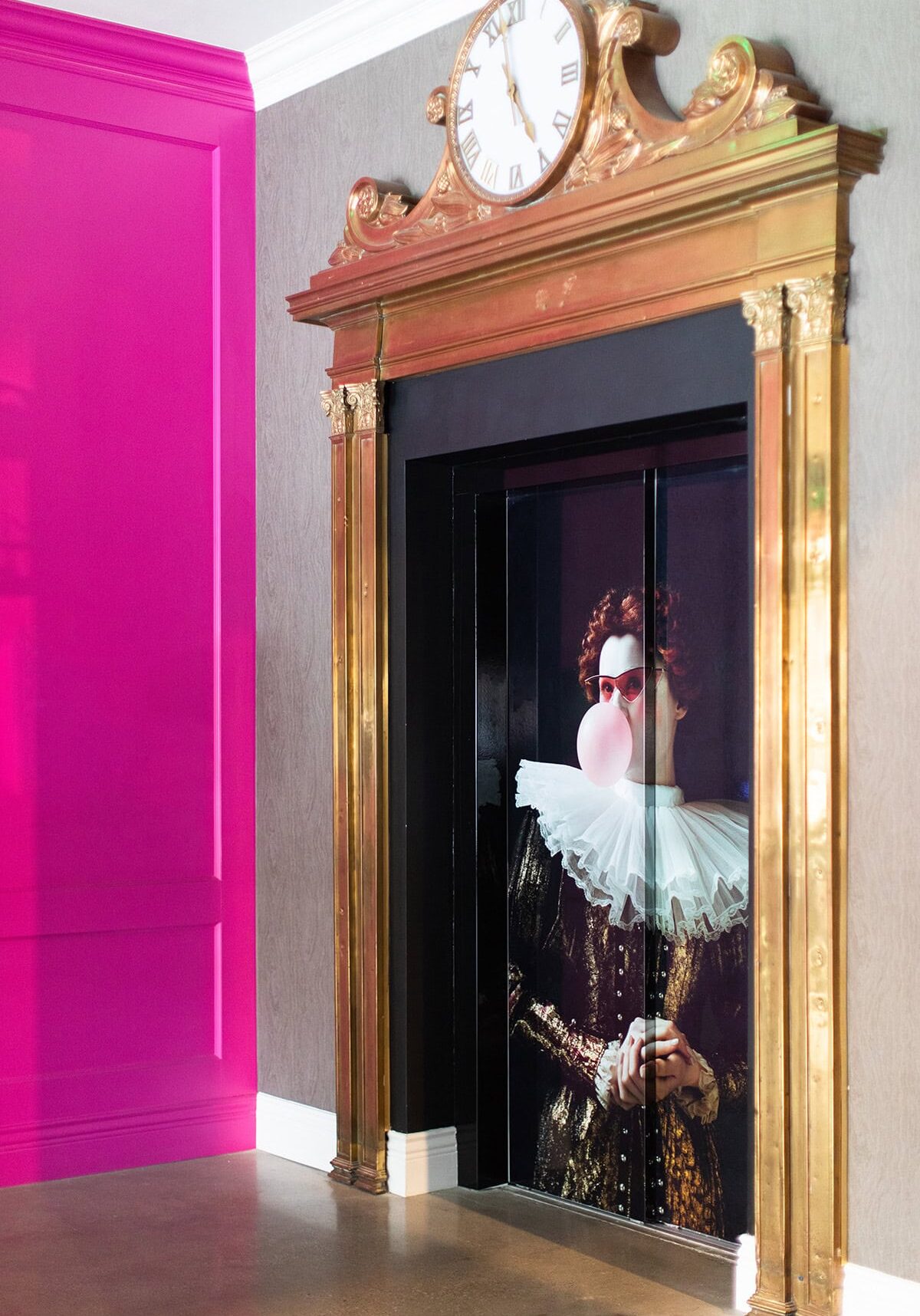
Elsewhere, unexpected details reward closer attention. Elevators wrapped in oversized vinyl graphics deliver a dramatic first impression. Acrylic display boxes house hand-painted shoes, mannequin hands, and costume jewelry — many thrifted personally by Cheryl herself — creating curated moments that feel playful and human. Even the bathrooms hold surprises, with graffiti-style artwork modified and framed by Cheryl and her sister, turning an often-overlooked space into a guest favorite.

Bold.
Unexpected.
Memorable.

Large pink sculpture of legs in high-heeled shoes and a skirt stands under a chandelier on a black-and-white checkered floor near a window and mirrored wall.

Notes from the Design Team

Luxe 23 was one of those rare projects where trust unlocked creativity. The client allowed us to push, and we took that responsibility seriously. This wasn’t about adding bold elements for shock value. It was about crafting moments that felt authentic, layered, and memorable.

Some of the most meaningful details came from going beyond the expected scope — thrifting, painting, installing, adjusting on site. Those are the moments guests respond to, even if they can’t always articulate why. That’s when a space stops feeling designed and starts feeling alive.

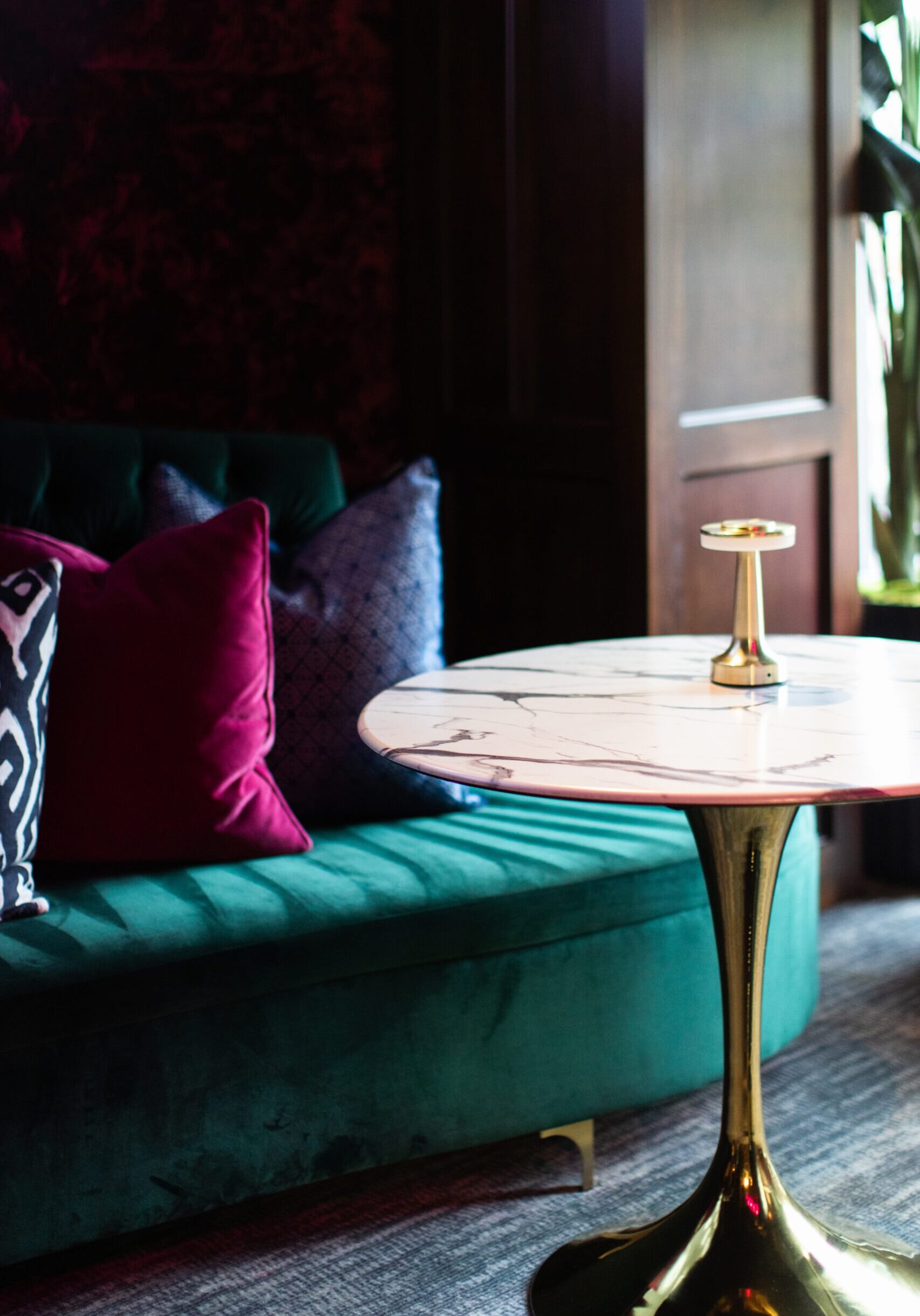
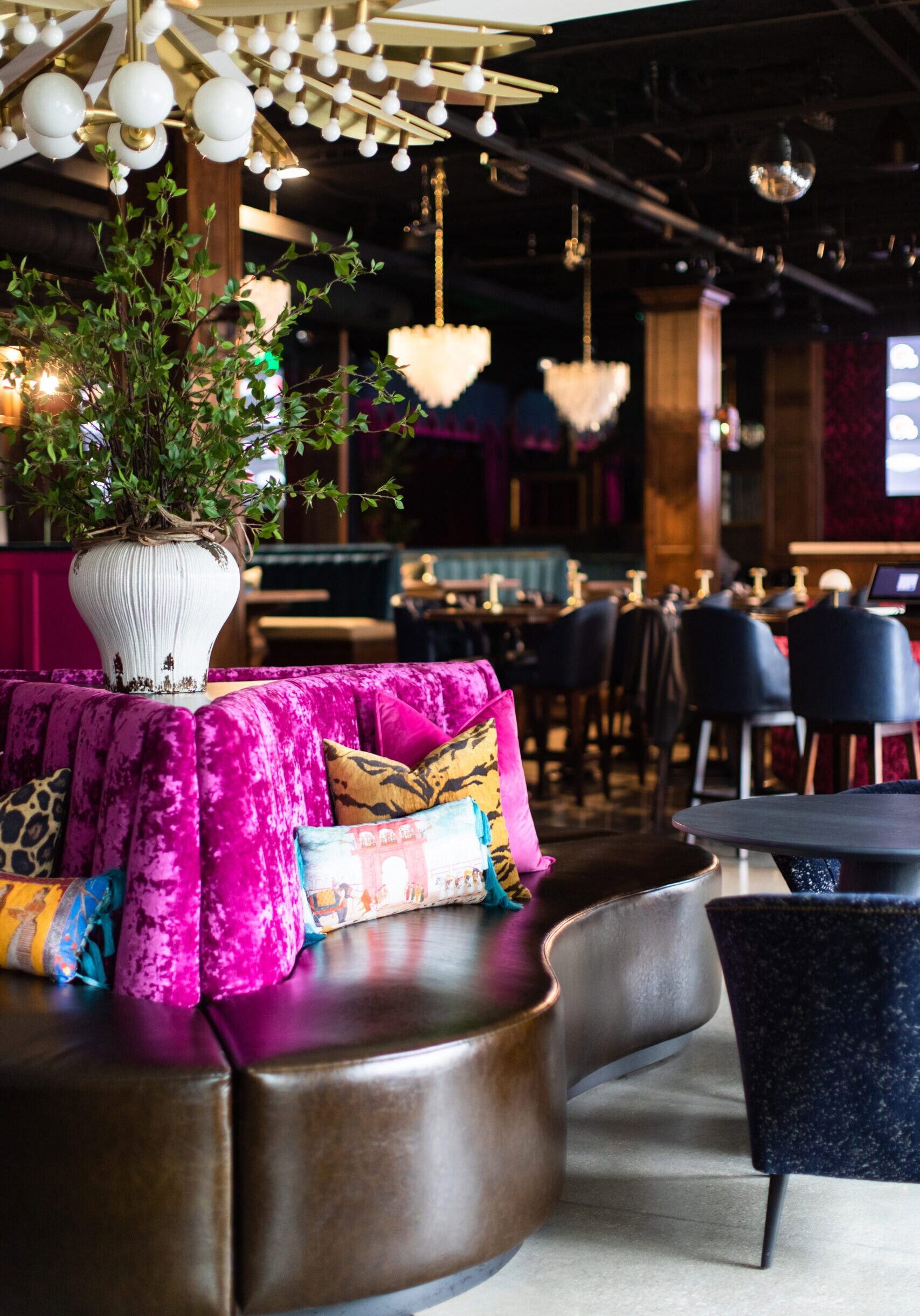
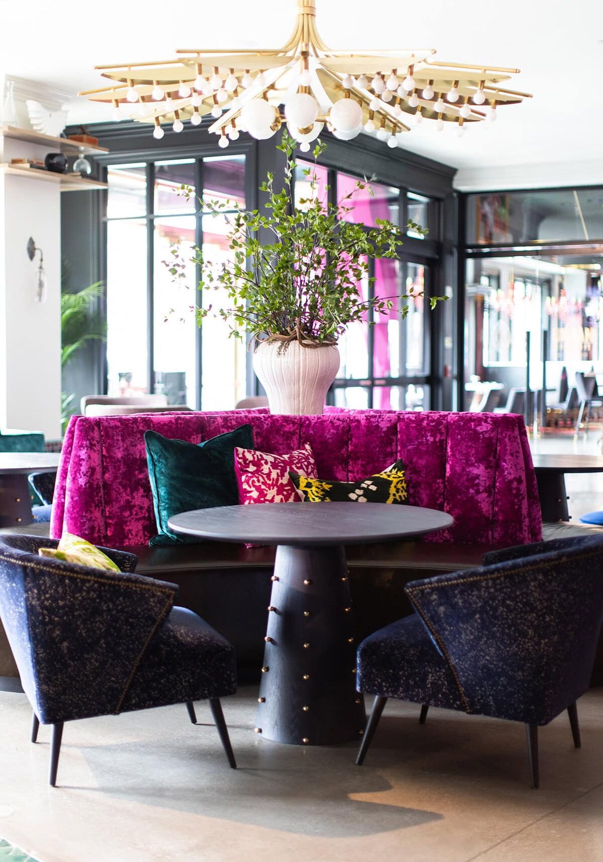
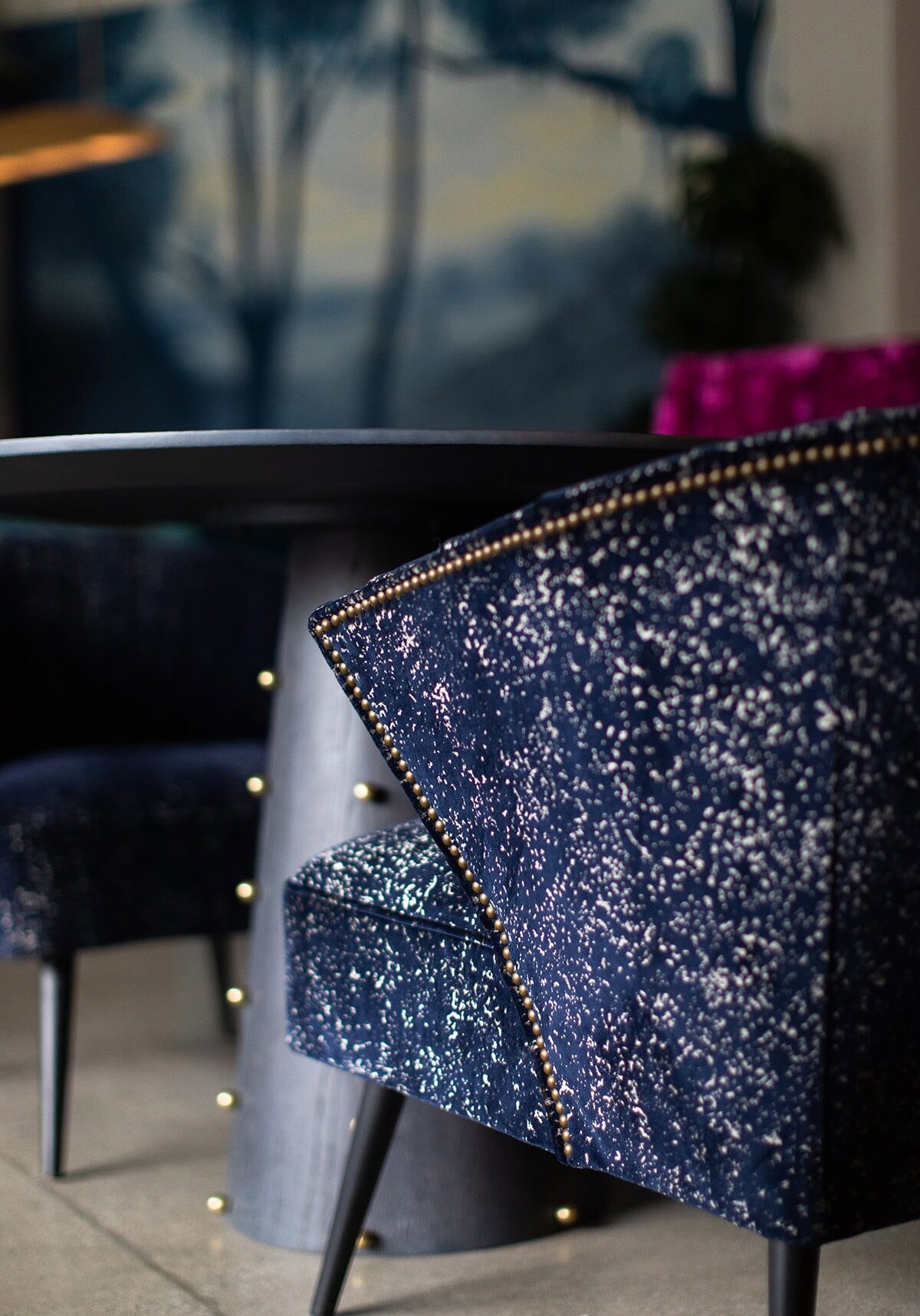
A round black table with dark blue chairs and a magenta velvet banquette, featuring assorted cushions and a large vase with green branches, under a modern chandelier.
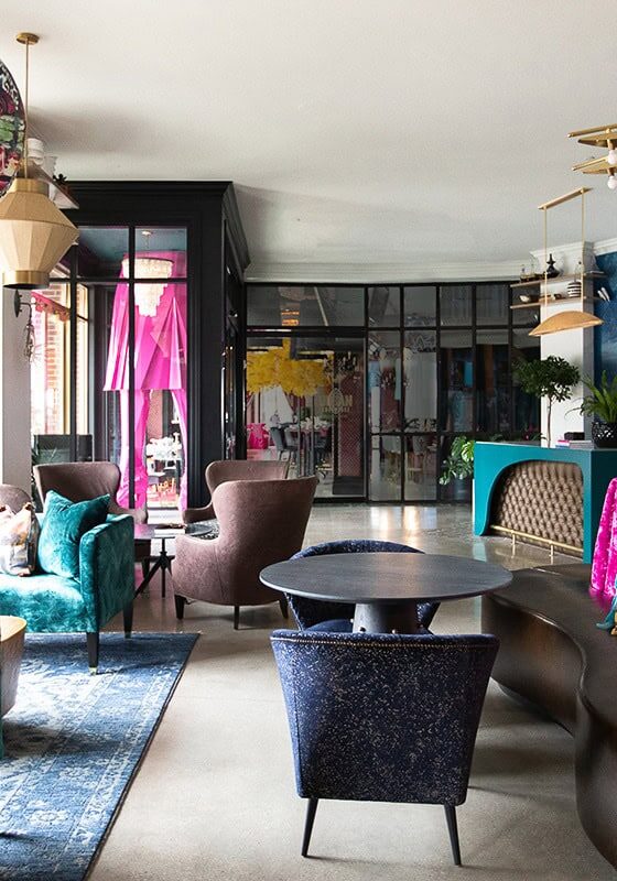
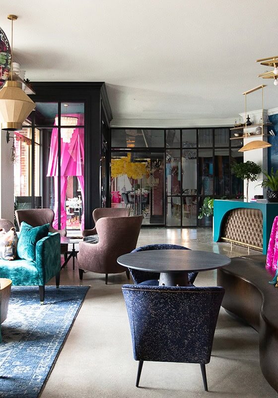
A modern lounge with colorful velvet seating, decorative pillows, large globe lamps, plants, and a mural on the wall.
Elevator doors feature an image of a person in Elizabethan costume blowing bubblegum, set in a gold-frame elevator next to a bright pink wall.
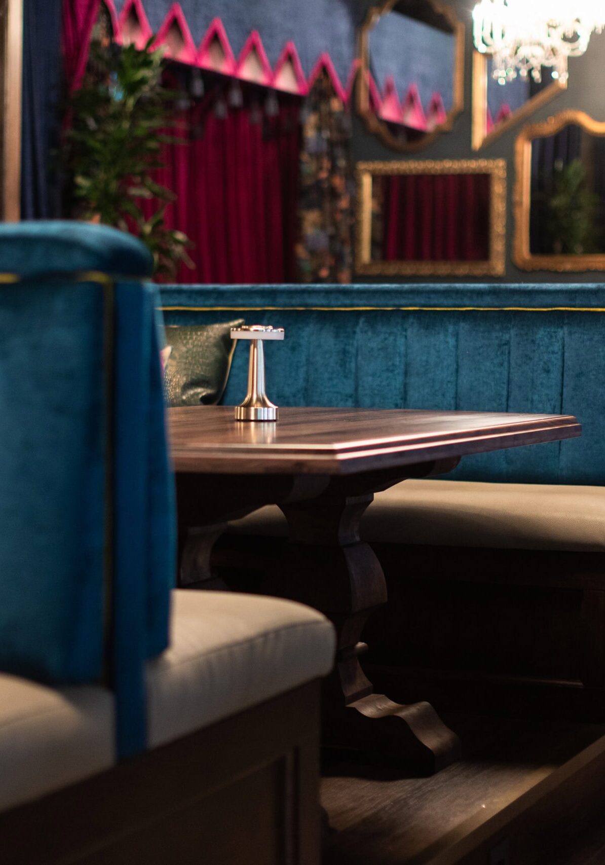
Close-up of a blue velvet chair with gold studs next to a round dark table in a modern interior setting.
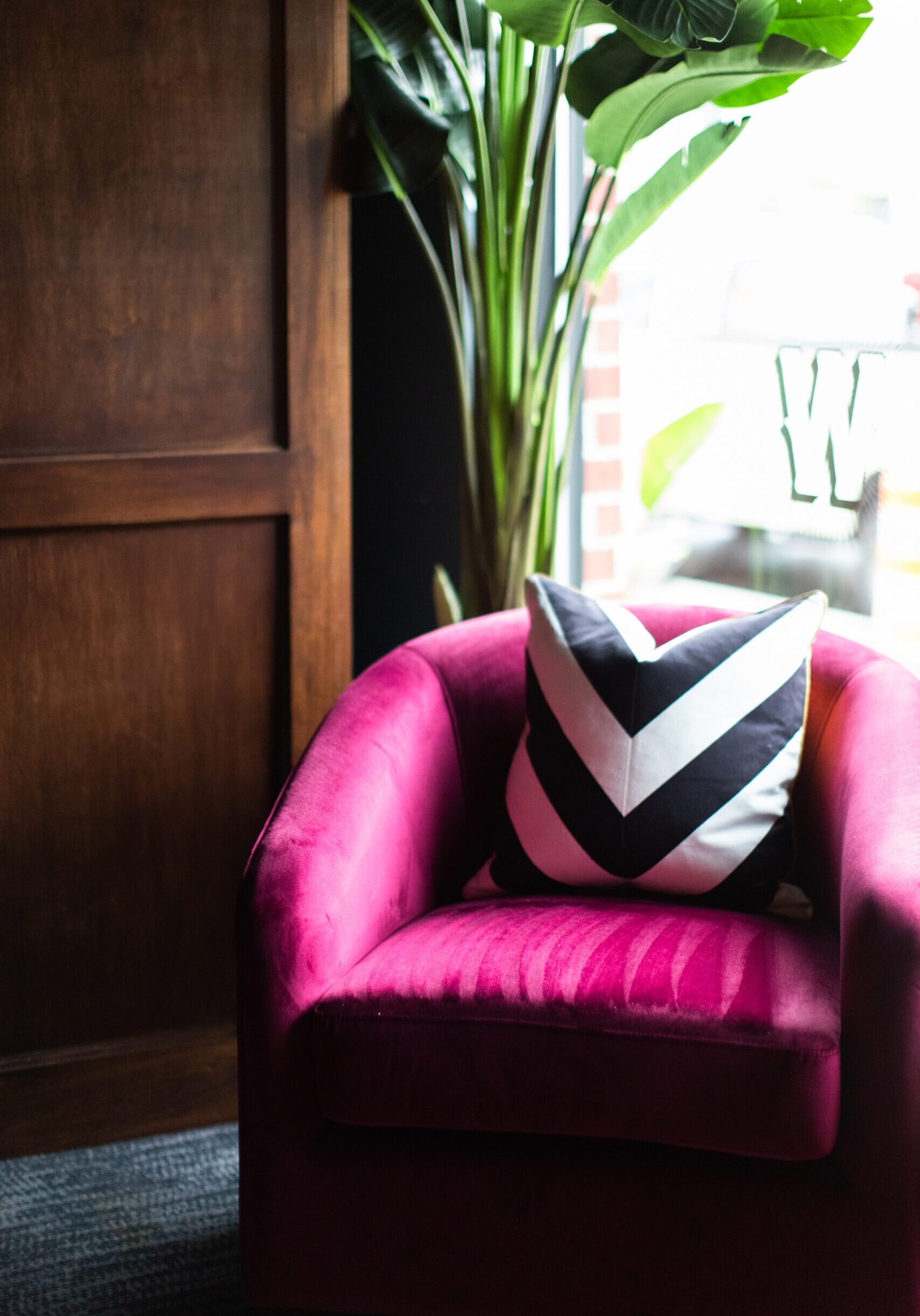
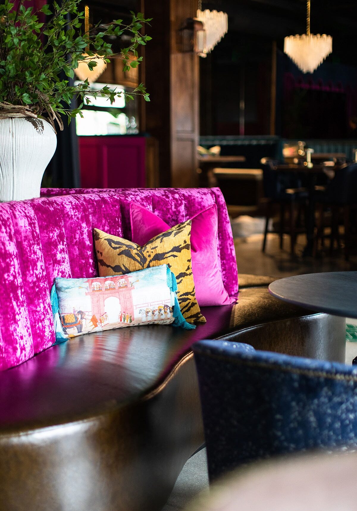
A plush, magenta velvet booth with decorative pillows, including a tiger print and a tasseled cushion, in a stylish, upscale lounge with chandelier lighting.
A modern lounge with colorful velvet seating, decorative pillows, large globe lamps, plants, and a mural on the wall.

Designed For the Neighborhood

January 15, 2026 by Cheryl Beachy Stauffer

A Concept Worth Scaling

CommercialHospitalityRetail
Crimson Design Group's neighborhood-focused retail and hospitality interior design for Trevor's Liquor at Paradise Valley Mall in Phoenix, Arizona.

Trevor’s Liquor Paradise Valley Mall

A familiar, welcoming expression of the Trevor’s concept built around connection and repeat visits.

Category

Commercial, Hospitality, Retail

Location

Paradise Valley Mall redevelopment

Community Context

Neighborhood-serving location with a strong emphasis on repeat customers and local connection in a mixed-use lifestyle destination design called Paradise Valley Mall

Year

2024

DSCF4076

While every Trevor’s location shares the same design DNA, this neighborhood-focused location highlights one of the brand’s most important strengths: its ability to become part of daily life. This is the kind of place people stop into regularly — not just for what they need, but for how it feels to be there.

Crimson Design Group approached this space with an emphasis on warmth, familiarity, and ease. The goal was to create an environment that feels instantly comfortable, while still delivering the layered experience that sets Trevor’s apart. The result is a destination that feels less like a store and more like a local fixture — a place that belongs to its community.


The Vision


Create a space that feels personal, welcoming, and easy to return to, again and again.

The vision for this location centered on familiarity. Crimson designed the space to feel approachable and intuitive, encouraging guests to move comfortably through the store while discovering new offerings along the way. The experience needed to feel elevated, but never intimidating — a place where regulars feel known and newcomers feel at ease.

By emphasizing warmth, scale, and comfort, the design supports everyday use while still offering moments of interest and delight.

The Approach

Design for rhythm, routine, and genuine connection.

Crimson prioritized clarity and comfort in the layout, creating clear paths, welcoming sightlines, and gathering zones that feel natural rather than staged. Materials and finishes were selected to feel lived-in and inviting, reinforcing a sense of familiarity over time.

Lighting plays a key role here, softening the space and setting a relaxed tone that encourages lingering conversations and repeat visits. The result is an environment that supports both quick stops and longer interactions with equal ease.

The Impact

A location that earns loyalty by feeling like it belongs.

This neighborhood location demonstrates how thoughtful design can foster genuine connection. Customers don’t just shop here — they return regularly, recognize the space, and feel comfortable spending time within it. The atmosphere supports habit-building, turning routine visits into part of a larger lifestyle experience.

For developers and operators, this location highlights the long-term value of designing for community. Spaces that feel approachable, consistent, and welcoming create trust — and trust drives sustained success.

“This location was about creating a place people feel connected to — somewhere familiar, comfortable, and worth returning to.”

DSCF4361

Services Provided:

Concept Adaptation for Community Context

Full Interior Design

Space Planning + Layout

Material & Finish Selection

Custom Millwork Design

Lighting Design Coordination

FF&E Specification + Coordination

Installation Oversight

Our Expertise

Our Favorite Details

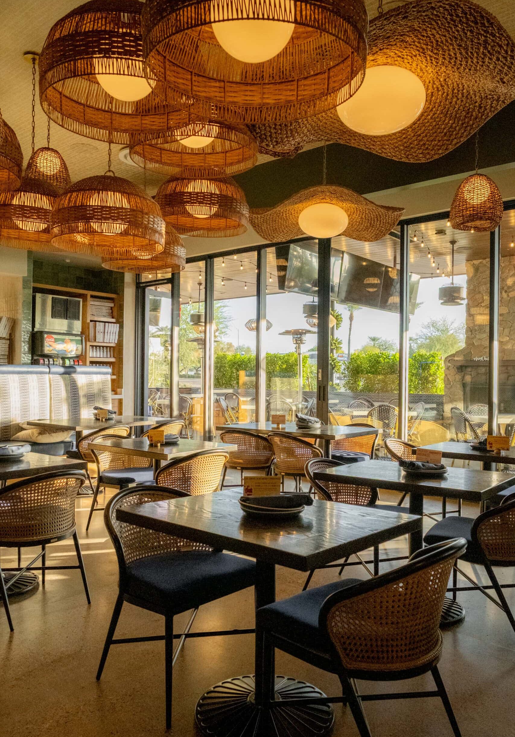
The details here are intentionally understated. Warm finishes, approachable seating, and thoughtful lighting work together to create a sense of ease. Rather than demanding attention, the design quietly supports comfort and familiarity.

These are the kinds of spaces that feel better the more time you spend in them — and the more often you return.

Bold.
Unexpected.
Memorable.

DSCF4419

Notes from the Design Team

This location reminded us that not every space needs to announce itself. Sometimes the most successful design is the one that feels effortless — a place that people adopt as their own without thinking twice about it.

Designing for community meant thinking beyond first impressions and focusing on long-term use. It’s a space built for everyday moments, and that’s exactly what makes it powerful.

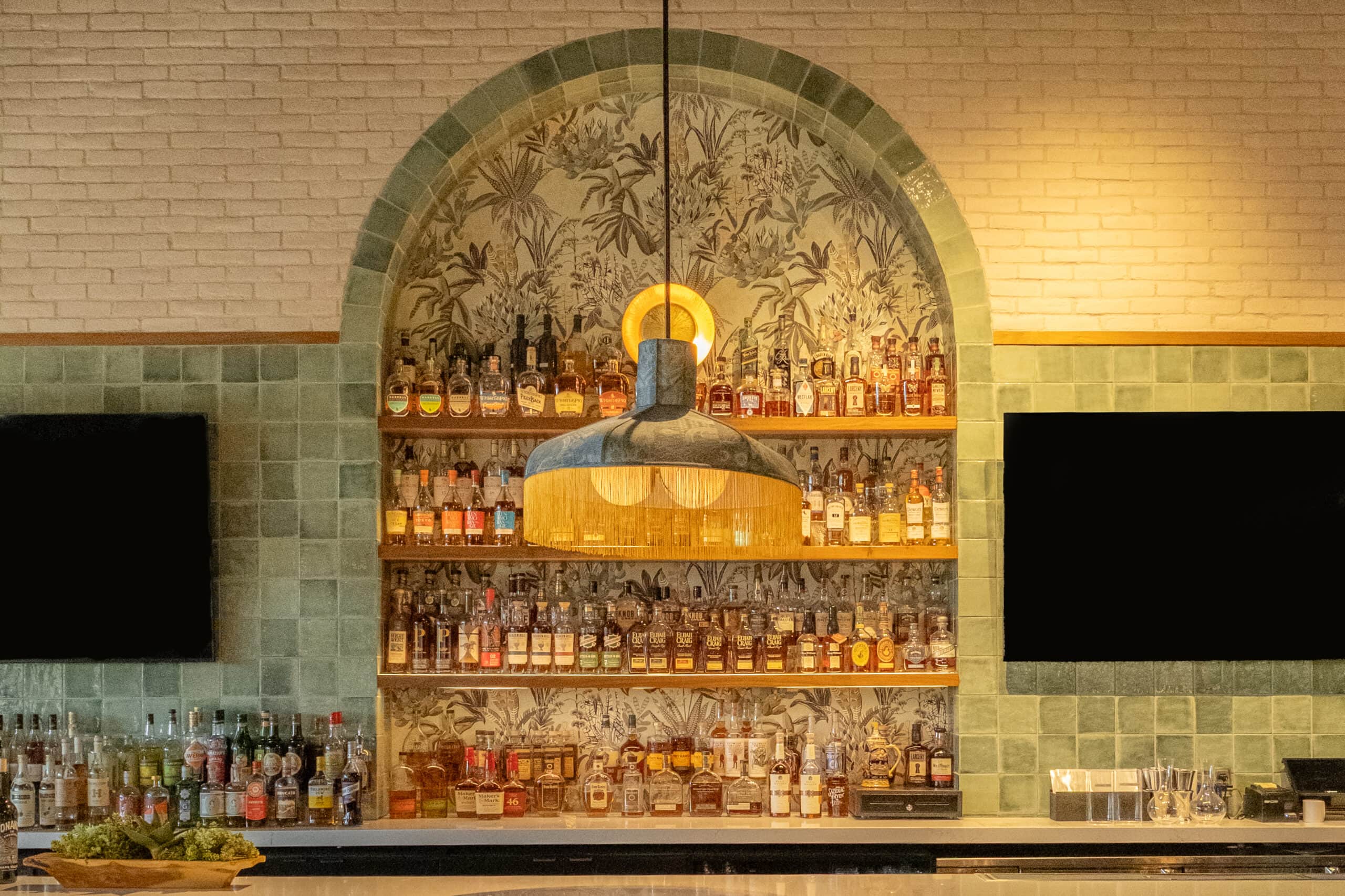
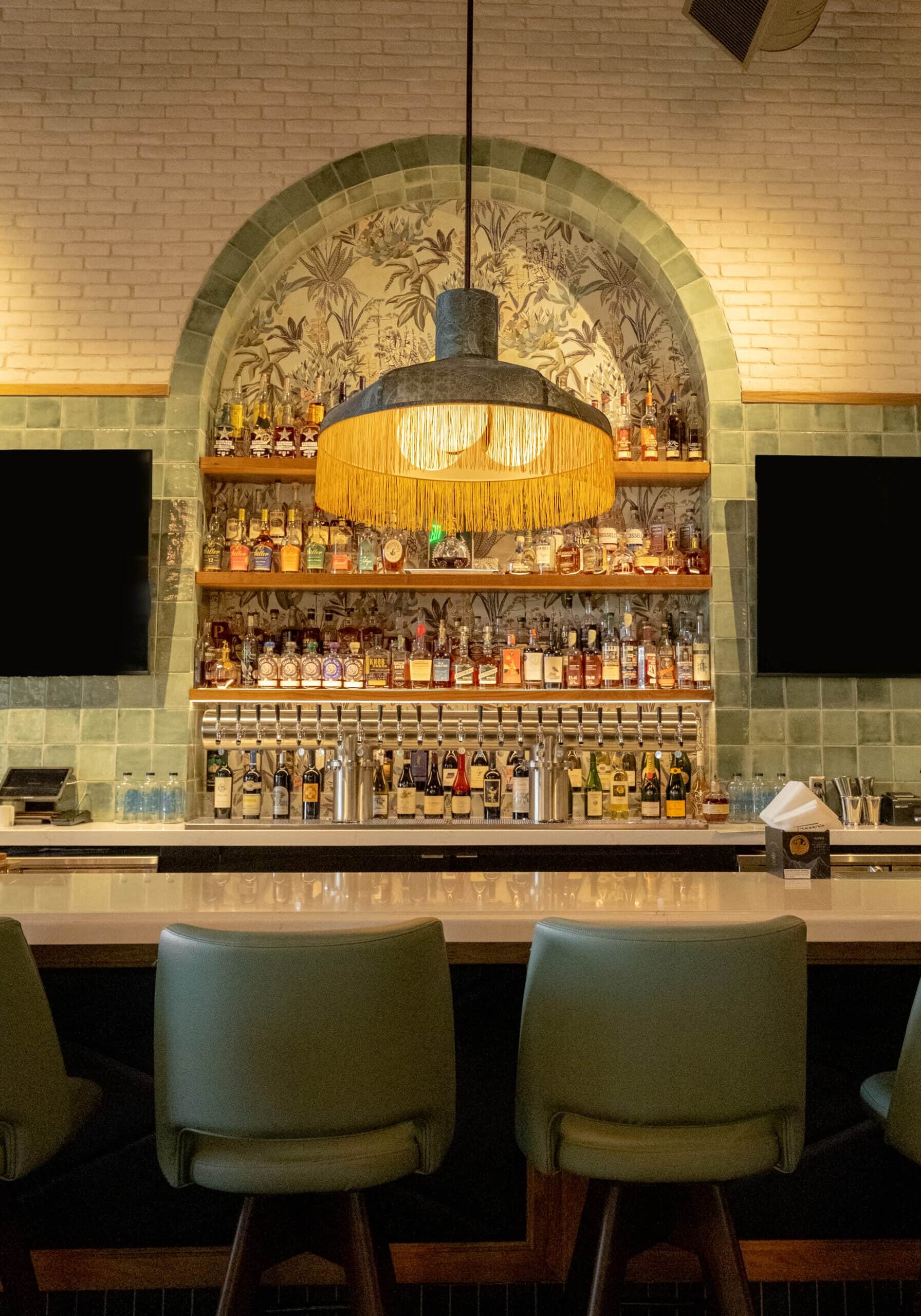
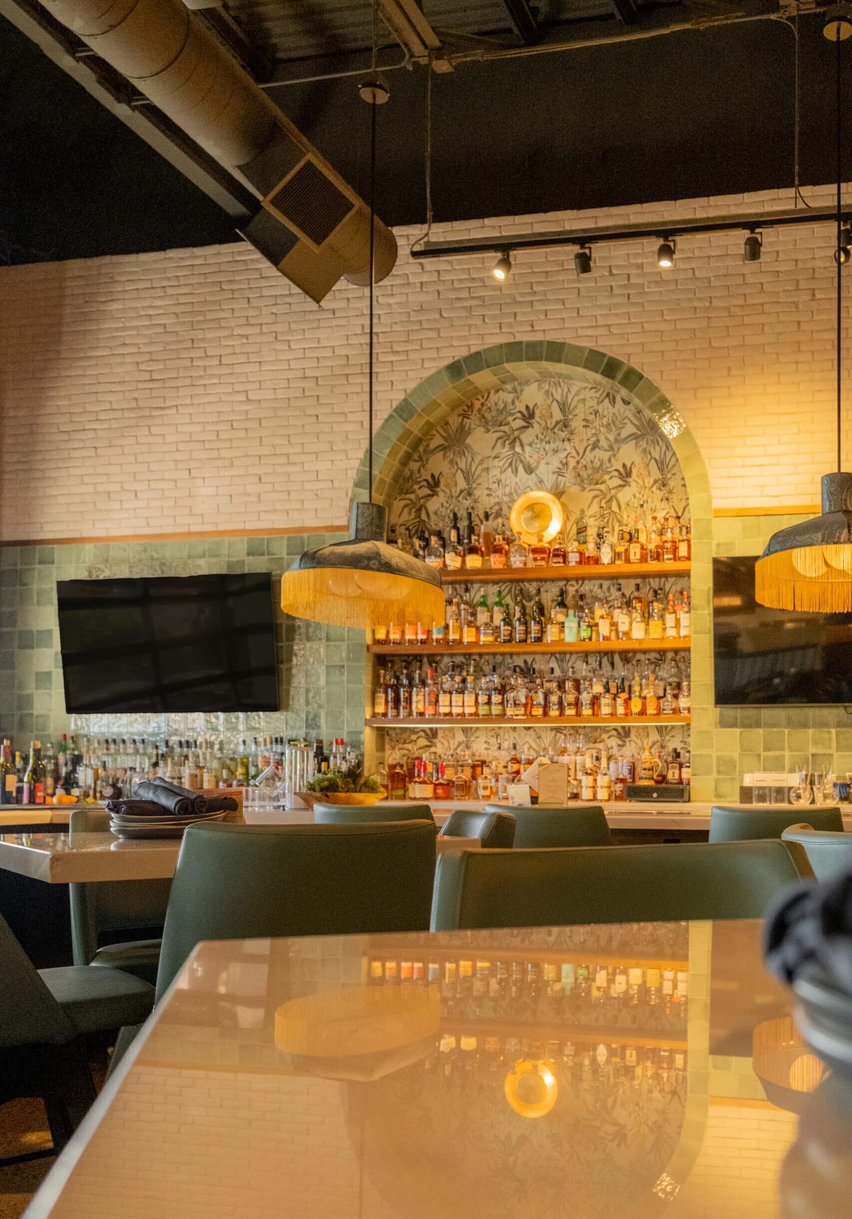
A bar with shelves stocked with various bottles of liquor, a central hanging light fixture, and two flat-screen TVs mounted on a tiled wall.
DSCF4076
Arched entrance with black tile frames a view into a restaurant bar area, featuring chandeliers, wall art with palm trees, and a blue planter with a green plant.
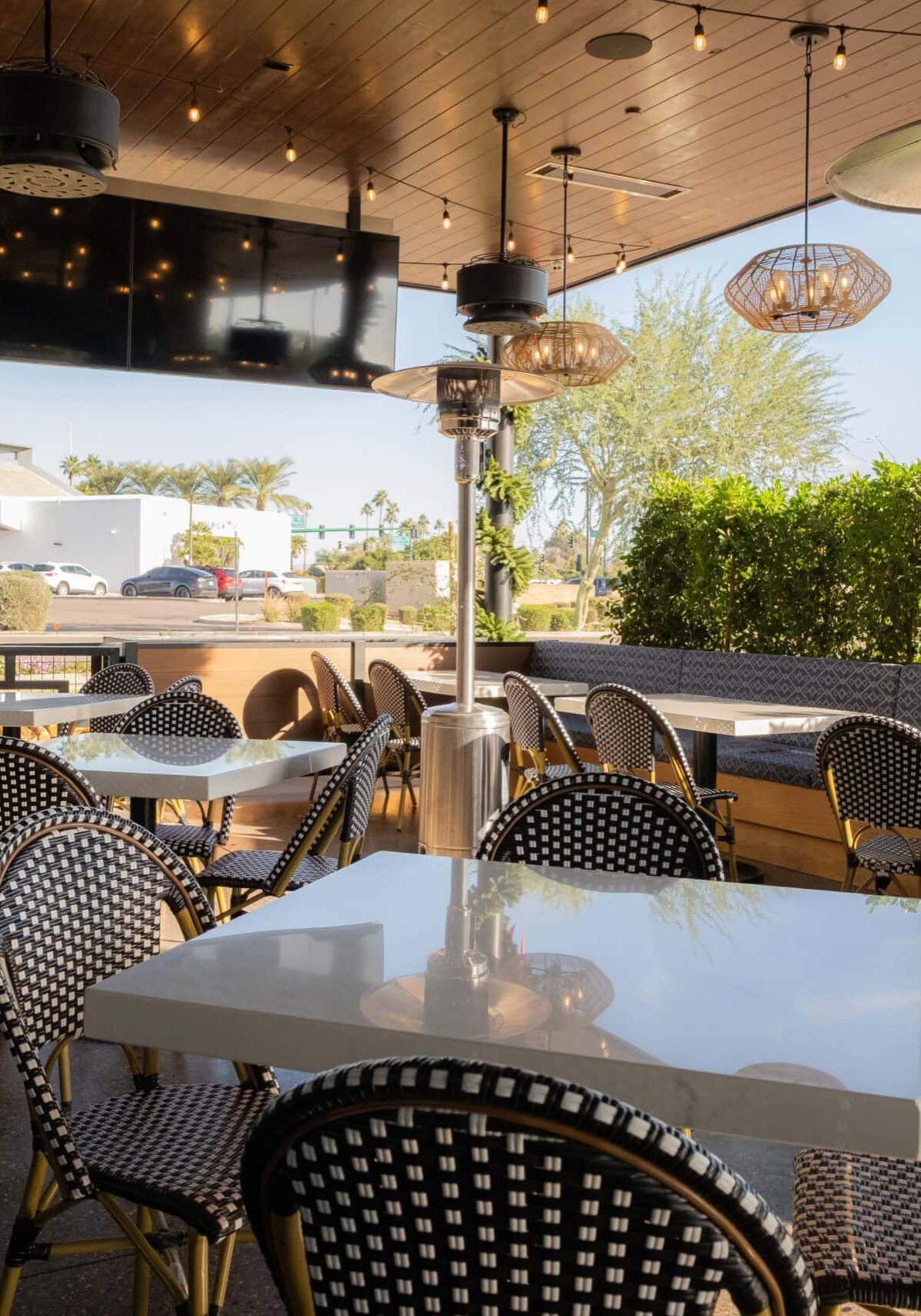
Outdoor restaurant patio with empty tables and chairs, patterned cushions, potted plants, hanging lights, and a large TV, with a street and buildings visible in the background.
DSCF4361
DSCF4304
DSCF4409
DSCF4307
DSCF4078
DSCF4172
DSCF4447
DSCF4125
DSCF4177
DSCF4499
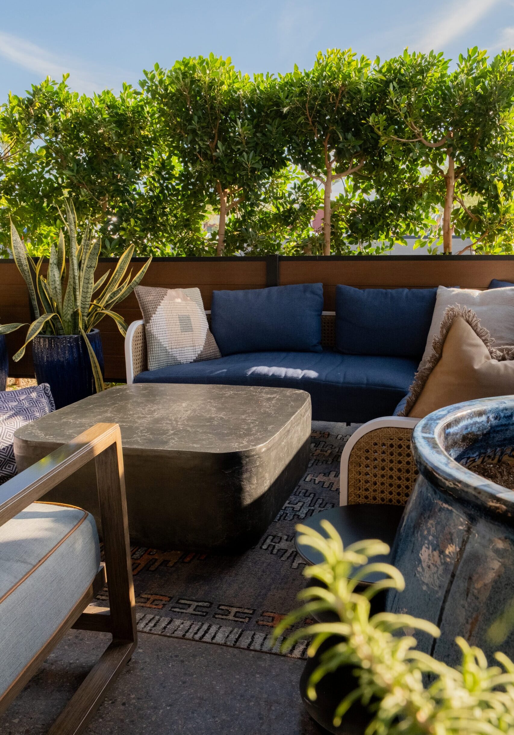
Outdoor patio seating area with blue cushions, a black table, decorative plants, and a leafy green privacy hedge in the background.

Raising the Bar In Scottsdale

January 15, 2026 by Cheryl Beachy Stauffer

A Concept Worth Scaling

CommercialHospitalityRetail
DSCF4808
DSCF4839
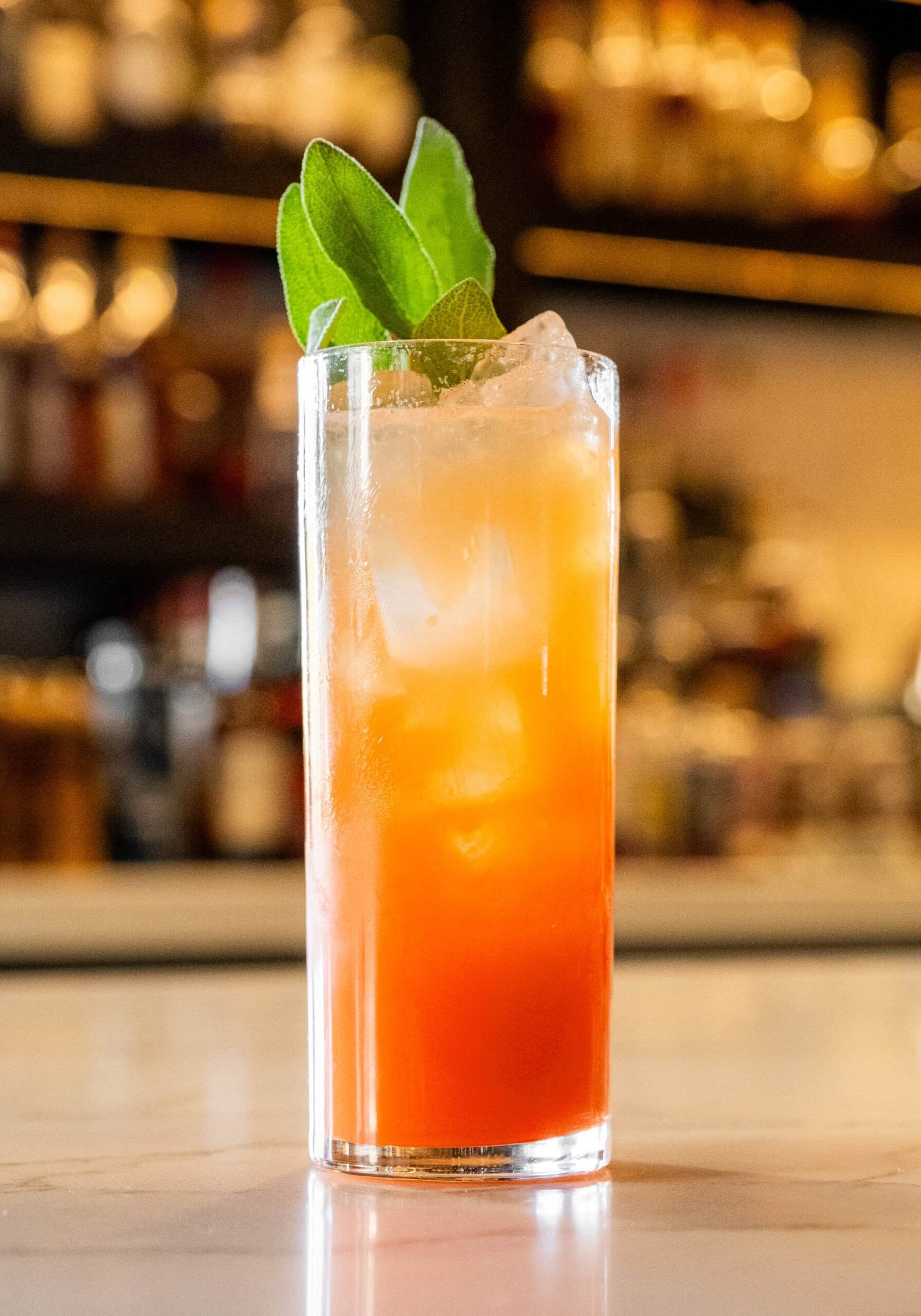
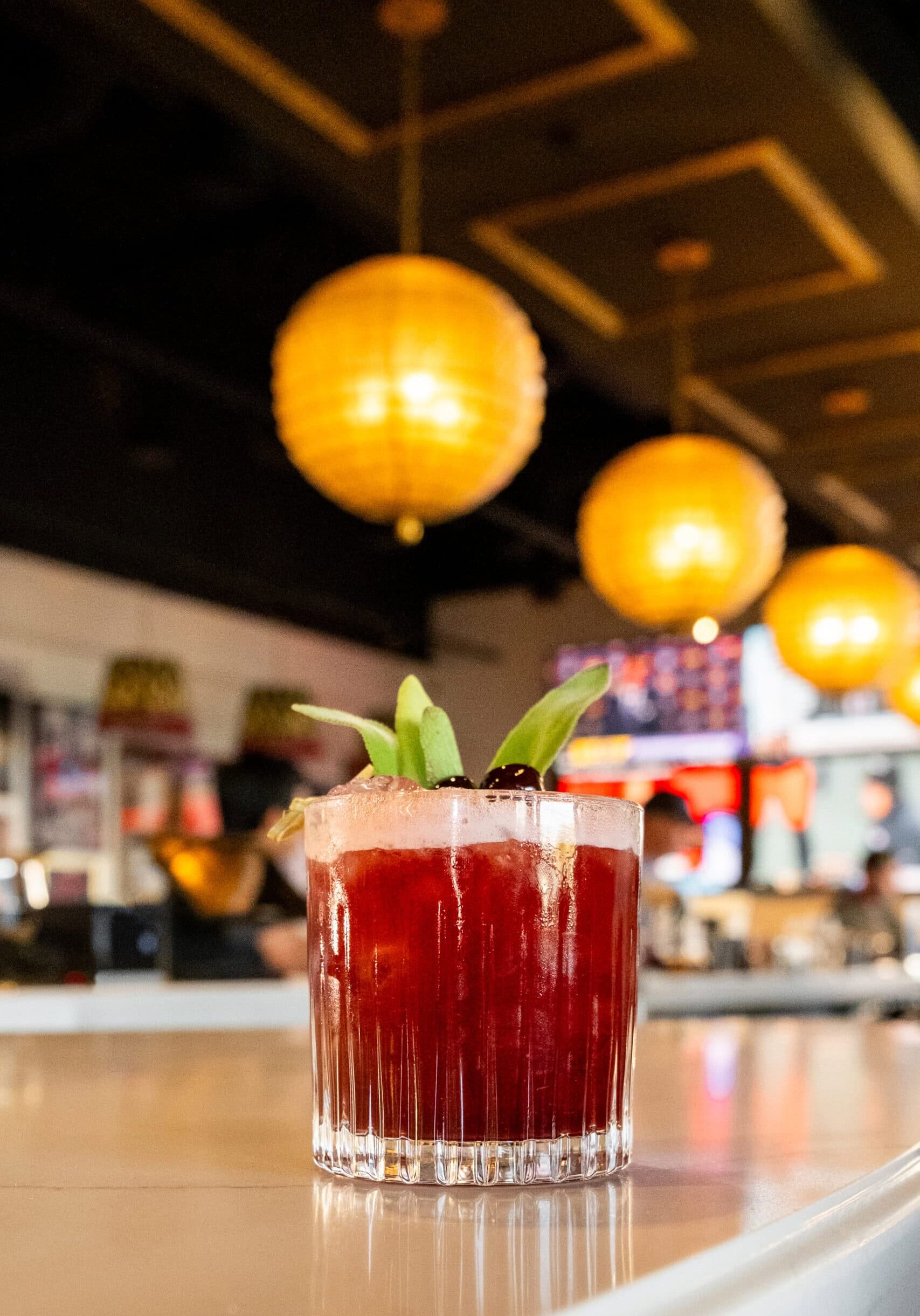
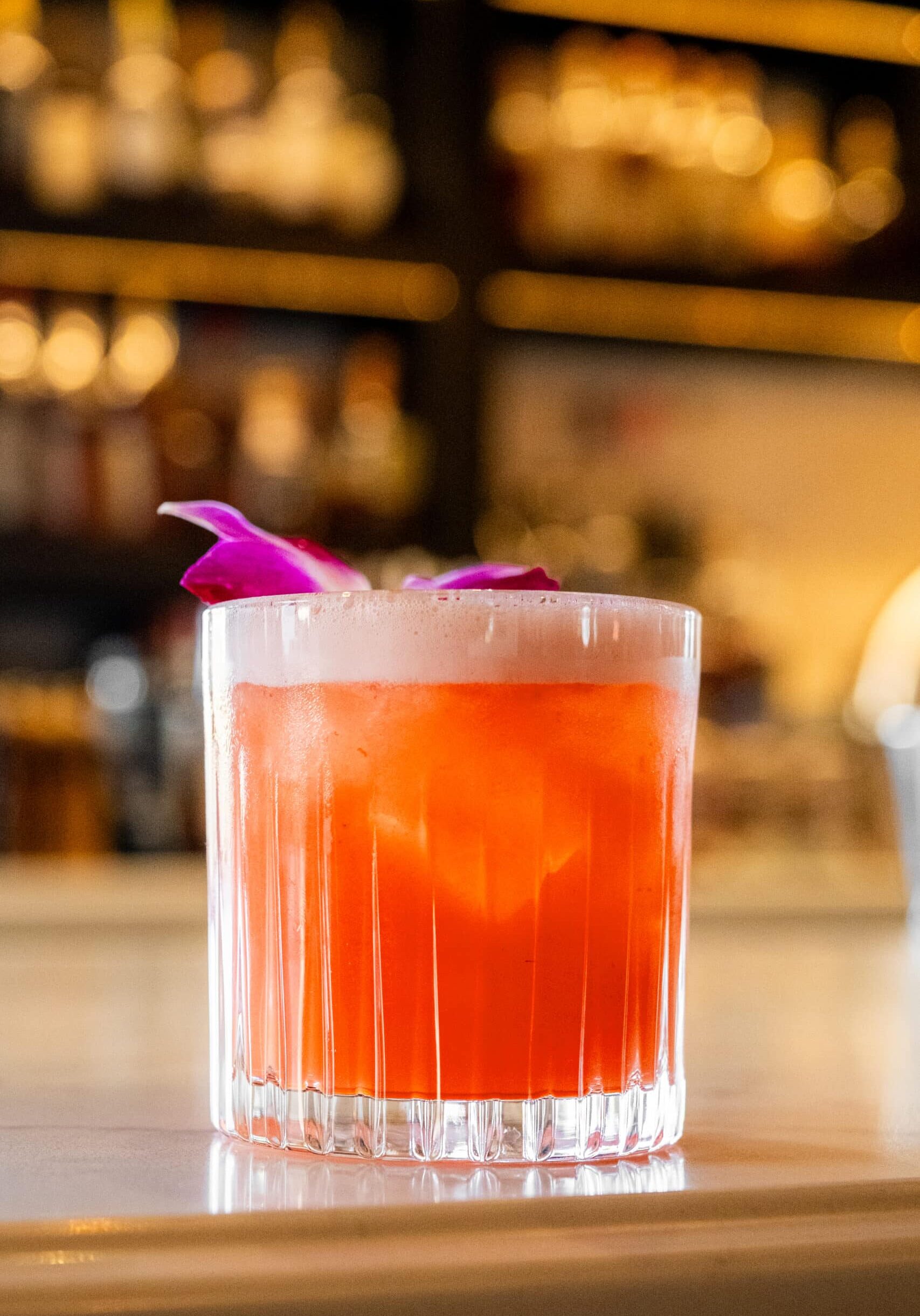
A red cocktail garnished with green leaves and a cherry sits on a bar counter, with warm, round pendant lights hanging in the background.

Trevor’s Liquor Scottsdale

A refined evolution of the original concept, designed for a design-savvy, high-expectation market.

Category

Commercial, Hospitality, Retail

Location

The Scottsdale 101 Shopping Center location elevated the concept for a design-savvy and trend-aware audience.

Community Context

Affluent, design-forward market with high expectations for experience and quality

Year

2023

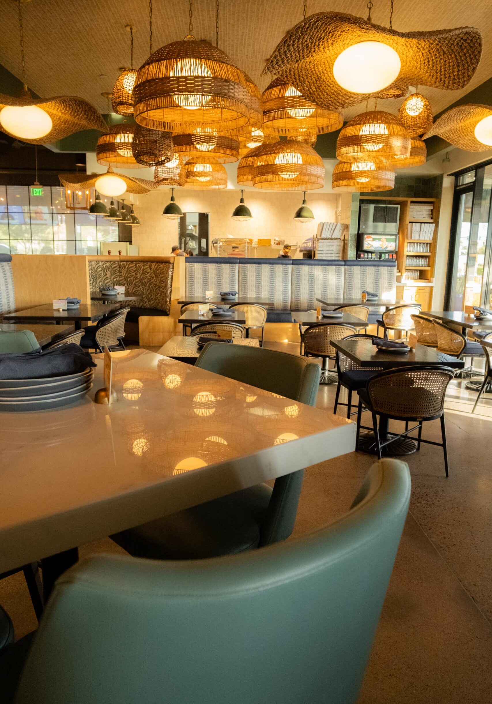
A round bar with green chairs is centered under a large, leafy patterned canopy in a modern restaurant with globe pendant lights and framed photos on the wall.

By the time Trevor’s expanded into Scottsdale, the concept had already proven itself. The challenge here wasn’t whether the model worked, it was whether it could rise to meet a more competitive, design-conscious audience without losing personality that defined the brand.

Crimson approached the Scottsdale location as a natural evolution of the original Trevor’s experience, aiming to elevate the look and feel while maintaining the same sense of approachability, energy, and hospitality. The result is a space that feels confident and composed. 


The Vision


Refine the Trevor’s experience for a more elevated market, without sacrificing energy, warmth, or accessibility.

The Scottsdale location was envisioned as a more polished expression of the Trevor’s brand. While the original location introduced the concept, this space needed to demonstrate its versatility, showing that the experience could scale into a higher-end environment while remaining inviting and lively.

The Approach

Dial up refinement, maintain identity, and let design do the quiet heavy lifting.

Crimson refined the core design language for Scottsdale, leaning into cleaner lines, elevated finishes, and a more composed material palette. Lighting plays a central role, setting a warm, inviting tone while highlighting key moments throughout the space.

Spatial planning was carefully adjusted to support both browsing and social interaction, ensuring the store functions seamlessly during peak hours without feeling crowded. The result is a space that feels effortless. It’s expressive without being overwhelming, and confident without feeling exclusive.

The Impact

A destination that feels right at home in a competitive, design-savvy market.

The Scottsdale location reinforced Trevor’s position as more than a liquor retailer. Customers respond to the atmosphere as much as the product, often describing the space as welcoming, elevated, and enjoyable to spend time in — a place that feels intentional rather than transactional.

For investors and developers, the Scottsdale location stands as clear evidence that thoughtful design can flex across demographics while maintaining consistency and performance.

“Scottsdale challenged us to refine the concept, not reinvent it. The result feels elevated, confident, and completely authentic to the brand.”

DSCF4834

Services Provided:

Concept Adaptation + Design Refinement

Full Interior Design

Space Planning + Layout

Material + Finish Selection

Custom Millwork Design

Lighting Design Coordination

FF&E Specification + Coordination

Installation Oversight

Our Expertise

Our Favorite Details

Elevated finishes, thoughtful lighting, and carefully chosen textures create a space that feels layered without feeling busy. Subtle moments, from tailored shelving details to seating areas that invite you in.

Bold.
Unexpected.
Memorable.

DSCF4841

Notes from the Design Team

Scottsdale was about confidence. The concept was already strong, but this location asked us to be more precise and to refine rather than add. That meant editing thoughtfully and trusting that fewer, better moves would carry more impact.

What we love most about this space is how natural it feels. Nothing is trying too hard, yet every detail is intentional. It’s a reminder that great design isn’t about louder ideas, it’s about clearer ones.

Adapting the Experience for an Urban Rhythm

January 15, 2026 by Cheryl Beachy Stauffer

A Concept Worth Scaling

CommercialHospitalityRetail
DSCF4592
Crimson Design Group's urban retail and hospitality interior design for Trevor's Liquor in Arcadia, Phoenix — high-energy concept built for a tighter footprint.
DSCF4529

Adapting the Experience for an Urban Rhythm

A flexible, high-energy interpretation of the Trevor’s concept designed for an urban footprint.

Category

Commercial, Hospitality, Retail

Location

The Arcadia Phoenix location adapted the brand’s DNA within a tighter urban footprint — inside a vibrant community hub with high pedestrian energy.

Community Context

Urban setting with high daily traffic, frequent repeat visits, and varied customer needs

Year

2024

DSCF4577

As Trevor’s continued to expand, the Phoenix urban location presented a new kind of challenge. Unlike earlier sites, this space required the brand’s signature experience to adapt to a tighter footprint, faster pace, and more diverse daily traffic — all without losing the sense of discovery and atmosphere that made Trevor’s distinctive.

Crimson Design Group approached this location as an exercise in precision. The goal was to translate the Trevor’s DNA into an urban environment where flow, visibility, and efficiency matter just as much as mood. The result is a space that feels energetic and intuitive and built to perform at peak hours while still encouraging customers to slow down and engage.


The Vision


Maintain the immersive Trevor’s experience while optimizing for speed, clarity, and flow.

The vision for the Phoenix location centered on balance. The space needed to feel vibrant and expressive, yet operate efficiently within an urban context. Customers might be stopping in quickly or spending time exploring — the design had to support both behaviors seamlessly.

Crimson focused on preserving the warmth and personality of the Trevor’s brand while ensuring the environment felt intuitive and easy to navigate. Every design move was measured against how the space would actually be used, day in and day out.

The Approach

Design with intention, edit with discipline, and let flow lead the experience.

Spatial planning played a central role in this location. Clear sightlines, strategic product placement, and well-defined zones help guide customers naturally through the space, reducing friction without sacrificing character. Lighting was carefully layered to create moments of energy and pause, even within a compact footprint.

Material selections leaned durable and hardworking, supporting heavy traffic while maintaining the layered, eclectic feel that defines Trevor’s. The result is a space that feels lively but controlled — expressive without being chaotic.

The Impact

A concept that proves it can flex without losing its identity.

The Phoenix urban location demonstrates the strength of the Trevor’s concept at its core. Customers experience the same sense of atmosphere and hospitality found in other locations, even as the space responds to a faster-paced environment.

For developers and investors, this location reinforces a critical point: the Trevor’s model is not dependent on one type of site or footprint. Thoughtful design allows the experience to adapt, perform, and remain profitable across varying conditions.

“This location pushed us to be incredibly intentional — every square foot had to work harder without feeling overdesigned.”

DSCF4583

Services Provided:

Concept Adaptation for Urban Context

Full Interior Design

Space Planning + Circulation Strategy

Material & Finish Selection

Custom Millwork Design

Clubhouse, fitness center, co-working space, and lounge areas curated as resident destinations.

Lighting Design Coordination

FF&E Specification + Coordination

Installation Oversight

Our Expertise

Our Favorite Details

What stands out most in this space is how effortlessly it moves. Shelving, lighting, and circulation work together to guide customers intuitively, while layered textures and warm finishes prevent the space from feeling purely functional.

Subtle design moments — from integrated lighting to thoughtfully placed gathering zones — create pockets of interest that invite engagement, even during quick visits.

Bold.
Unexpected.
Memorable.

DSCF4518

Notes from the Design Team

This location required restraint. With less room to work, every decision carried more weight. We focused on clarity first — how people enter, move, browse, and exit — and then layered in personality where it mattered most.

What we love about the Phoenix location is how adaptable it feels. It proves that the Trevor’s experience isn’t tied to scale. With the right design strategy, it translates anywhere.

Woman sitting cross-legged on a chair, smiling and holding a white abstract bust sculpture, with a colorful blanket draped over the seat.
A high-ceiling multi-family amenity lobby featuring tall arched windows, deep green walls, velvet olive-green furniture, and geometric gold chandeliers.
Framed abstract painting with vibrant, colorful geometric shapes and swirling lines, hanging on a white wall.
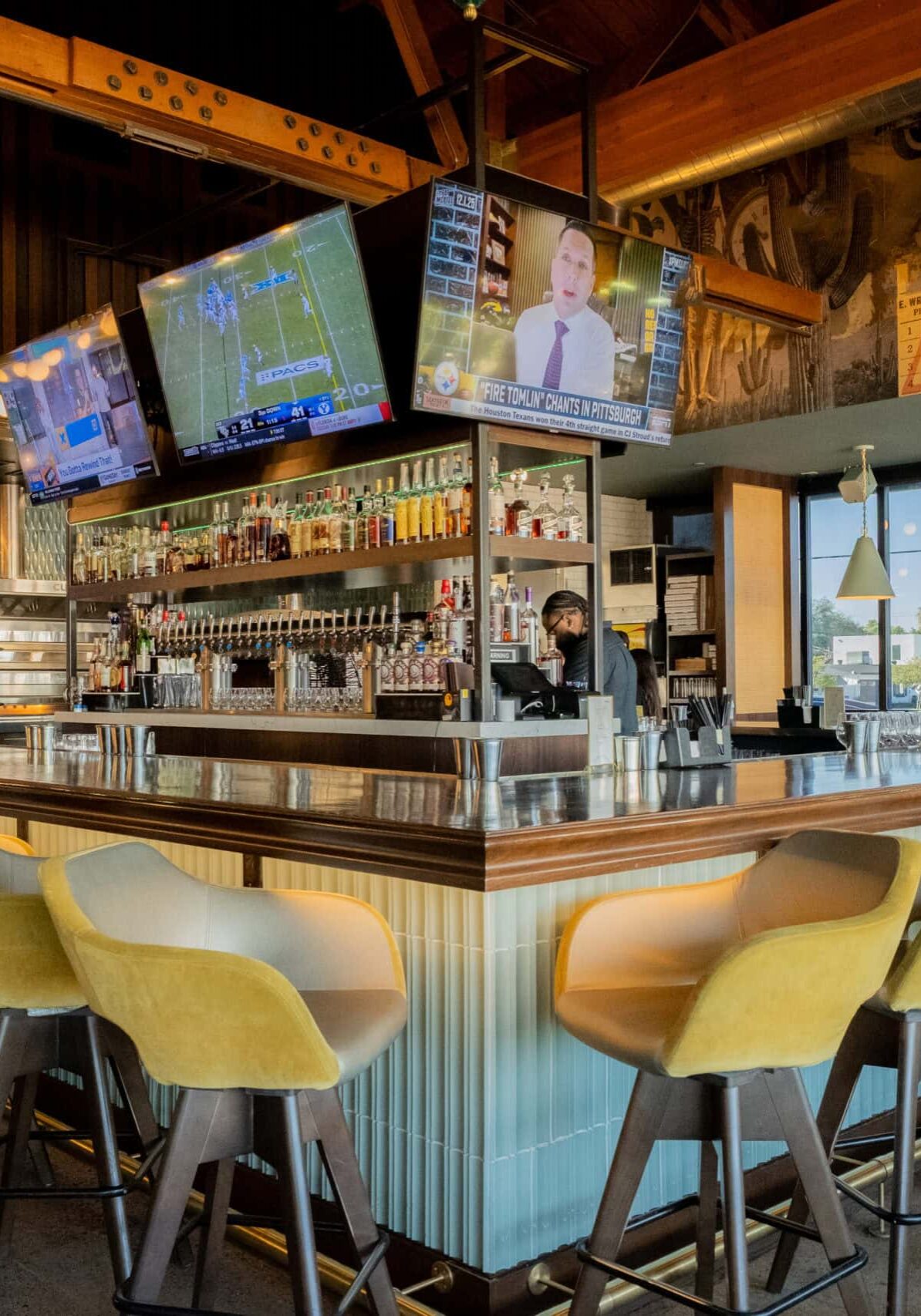
Contemporary bar interior with a long counter, hanging fringe lamps, shelves stocked with bottles, a wall-mounted TV, and decorative tiled arches.
A symmetrical maroon geometric pattern inspired by Crimson Design Group, featuring curved brackets and diamond shapes on a light gray background.
  • Expertise
  • Portfolio
  • Experience
  • Crimson World
  • About Us
  • Press & Awards
  • Contact Us
  • Careers
  • Instagram
  • LinkedIn
  • Pinterest

Stay curious with Crimson

Subscribe to stay updated.

The word "CRIMSON" is displayed in large, elegant, maroon capital letters on a white background, reflecting the refined aesthetic of Crimson Design Group.

© 2026 Crimson | Privacy Policy | Cookie Policy | Terms of Use | Disclaimer | Accessibility | Site by Wonderly