The word "CRIMSON" is displayed in large, gold, elegant serif capital letters on a light background, reflecting the refined aesthetic of Crimson Design Group.
  • Portfolio
  • Expertise
  • Experience
  • Contact

Bold Luxury, Designed for Living

Search
  • Portfolio
  • Expertise
  • Experience
  • Contact
  • About
  • Meet the Team
  • Crimson World
  • Press & Awards
  • Careers
  • Aviation
  • Instagram
  • LinkedIn
  • Pinterest
  • What Our Clients Say
The word "CRIMSON" is displayed in large, gold gradient capital letters on a white background, evoking the elegance and style of Crimson Design Group.
Explore

Raising the Bar In Scottsdale

January 15, 2026 by Cheryl Beachy Stauffer

Raising the Bar In Scottsdale

CommercialHospitalityRetail
DSCF4808
DSCF4839
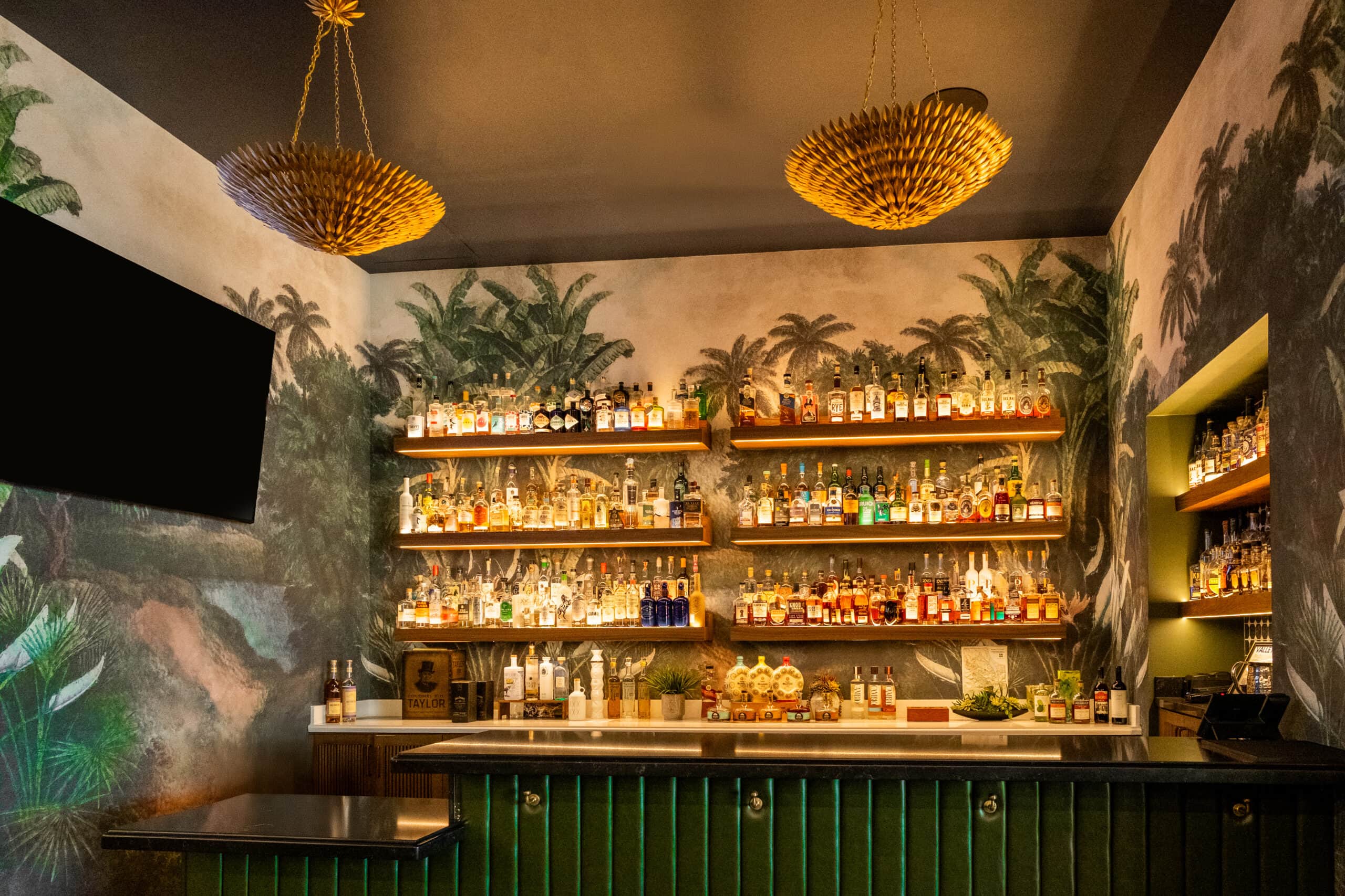
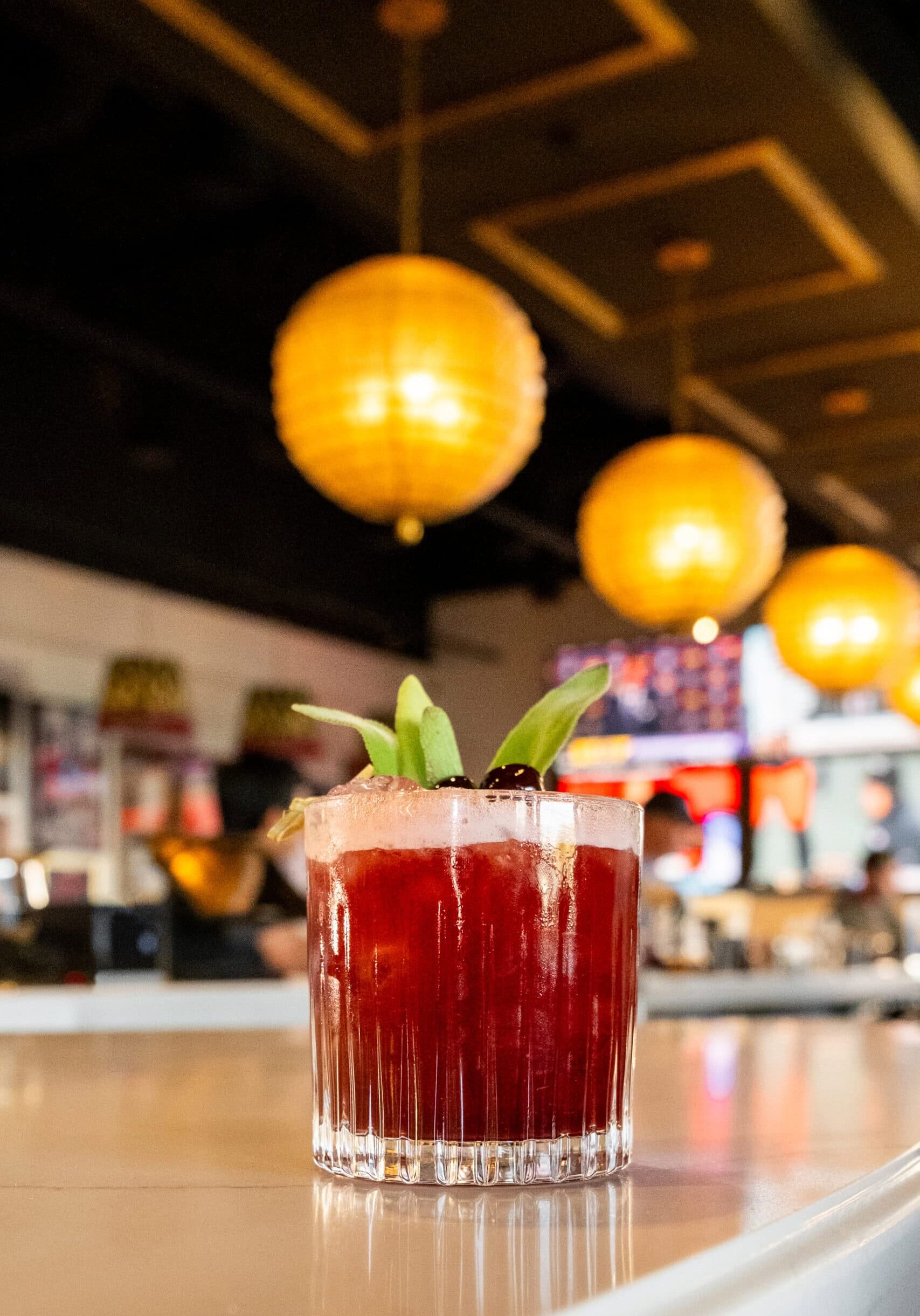
A red cocktail garnished with green leaves and a cherry sits on a bar counter, with warm, round pendant lights hanging in the background.

Trevor’s Liquor Scottsdale

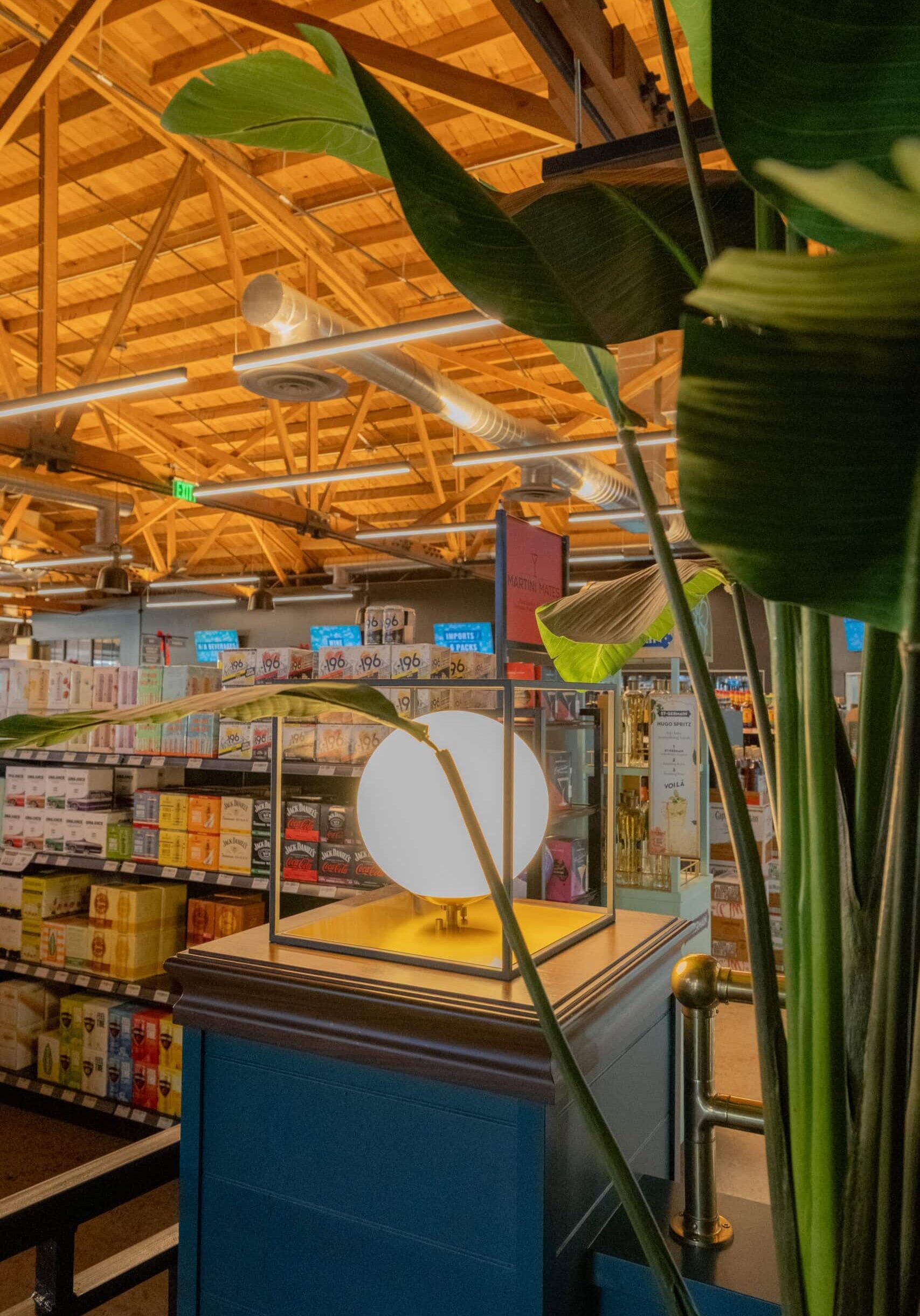
A refined evolution of the original concept, designed for a design-savvy, high-expectation market.

Category

Commercial, Hospitality, Retail

Location

The Scottsdale 101 Shopping Center location elevated the concept for a design-savvy and trend-aware audience.

Community Context

Affluent, design-forward market with high expectations for experience and quality

Year

2023

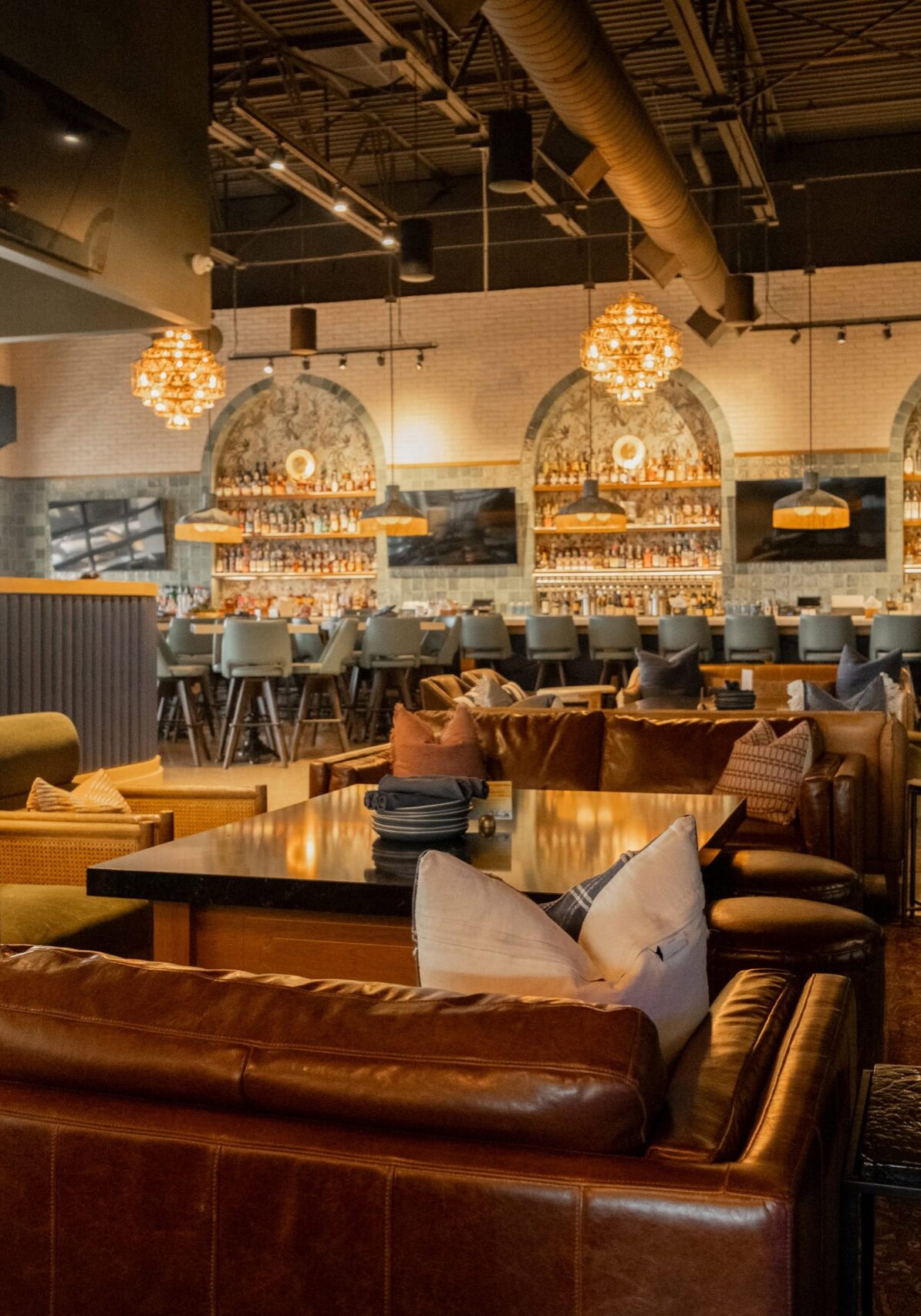
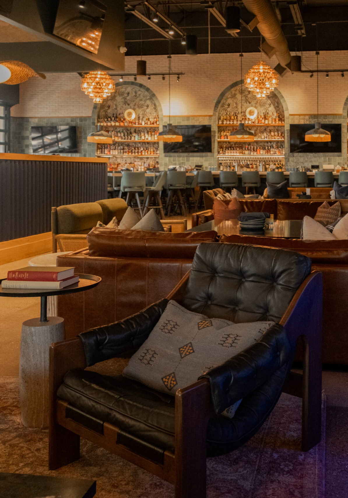
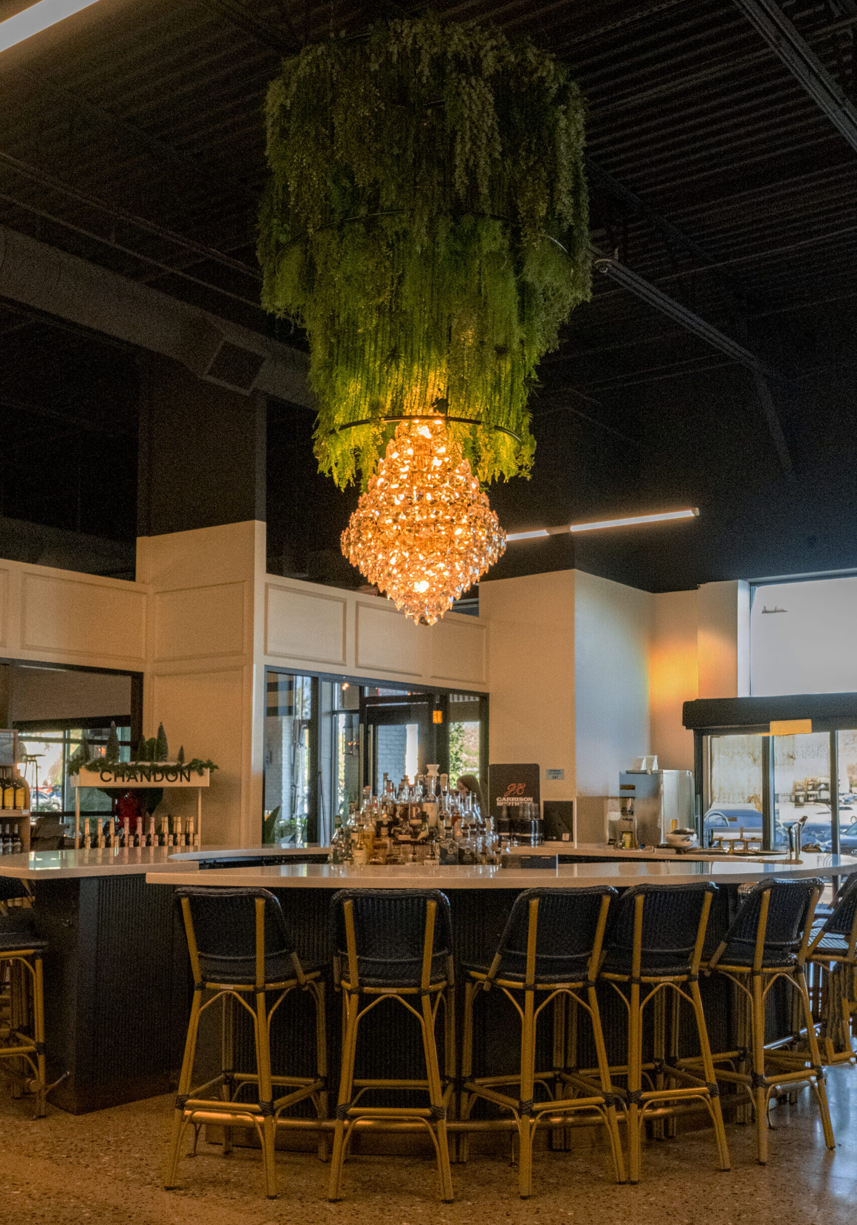
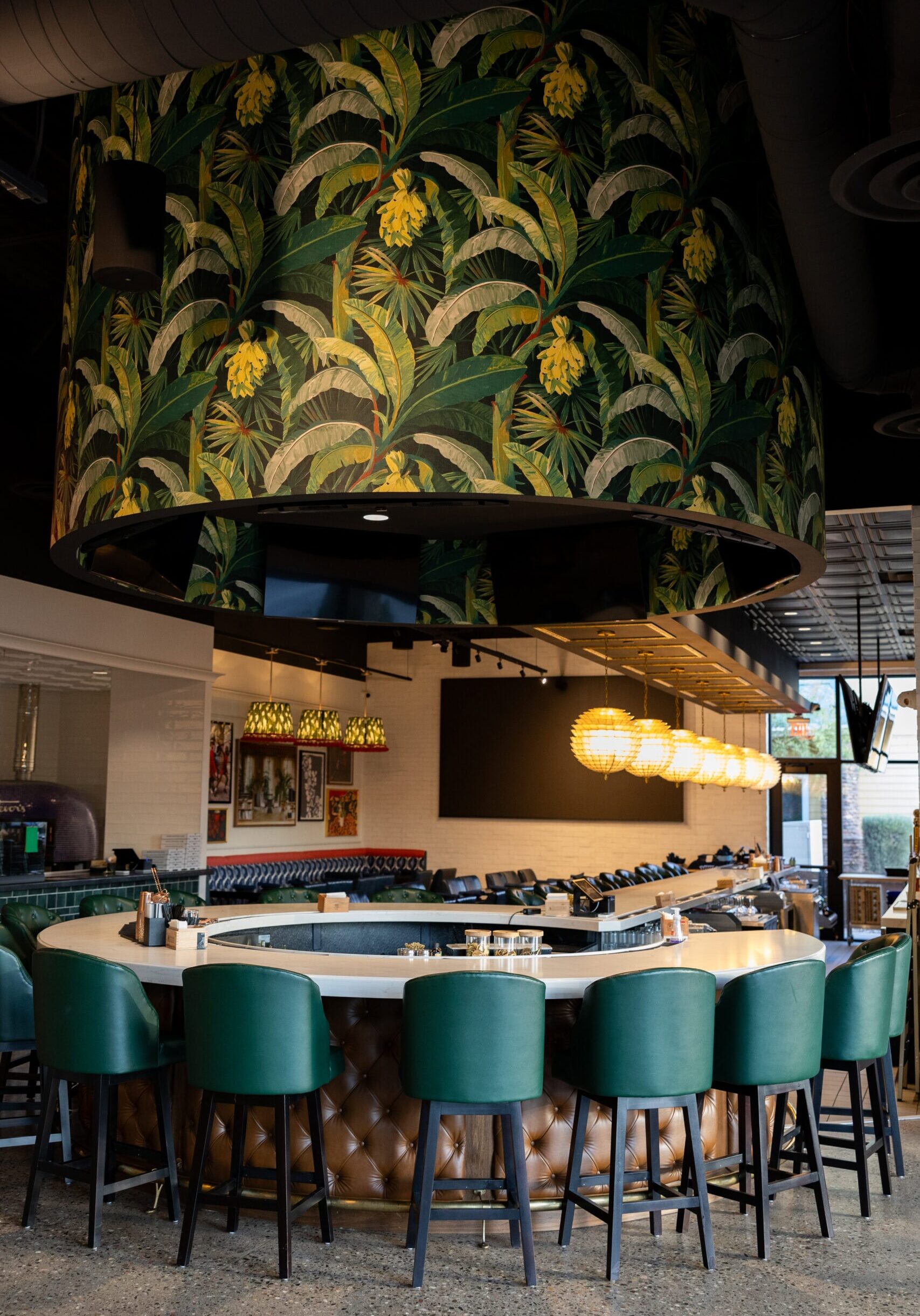
A round bar with green chairs is centered under a large, leafy patterned canopy in a modern restaurant with globe pendant lights and framed photos on the wall.
By the time Trevor’s expanded into Scottsdale, the concept had already proven itself. The challenge here wasn’t whether the model worked, it was whether it could rise to meet a more competitive, design-conscious audience without losing personality that defined the brand.
Crimson approached the Scottsdale location as a natural evolution of the original Trevor’s experience, aiming to elevate the look and feel while maintaining the same sense of approachability, energy, and hospitality. The result is a space that feels confident and composed. 


The Vision


Refine the Trevor’s experience for a more elevated market, without sacrificing energy, warmth, or accessibility.

The Scottsdale location was envisioned as a more polished expression of the Trevor’s brand. While the original location introduced the concept, this space needed to demonstrate its versatility, showing that the experience could scale into a higher-end environment while remaining inviting and lively.

The Approach

Dial up refinement, maintain identity, and let design do the quiet heavy lifting.

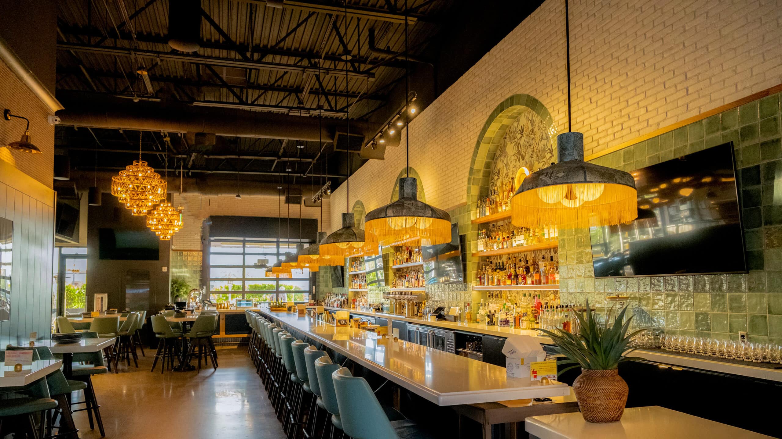
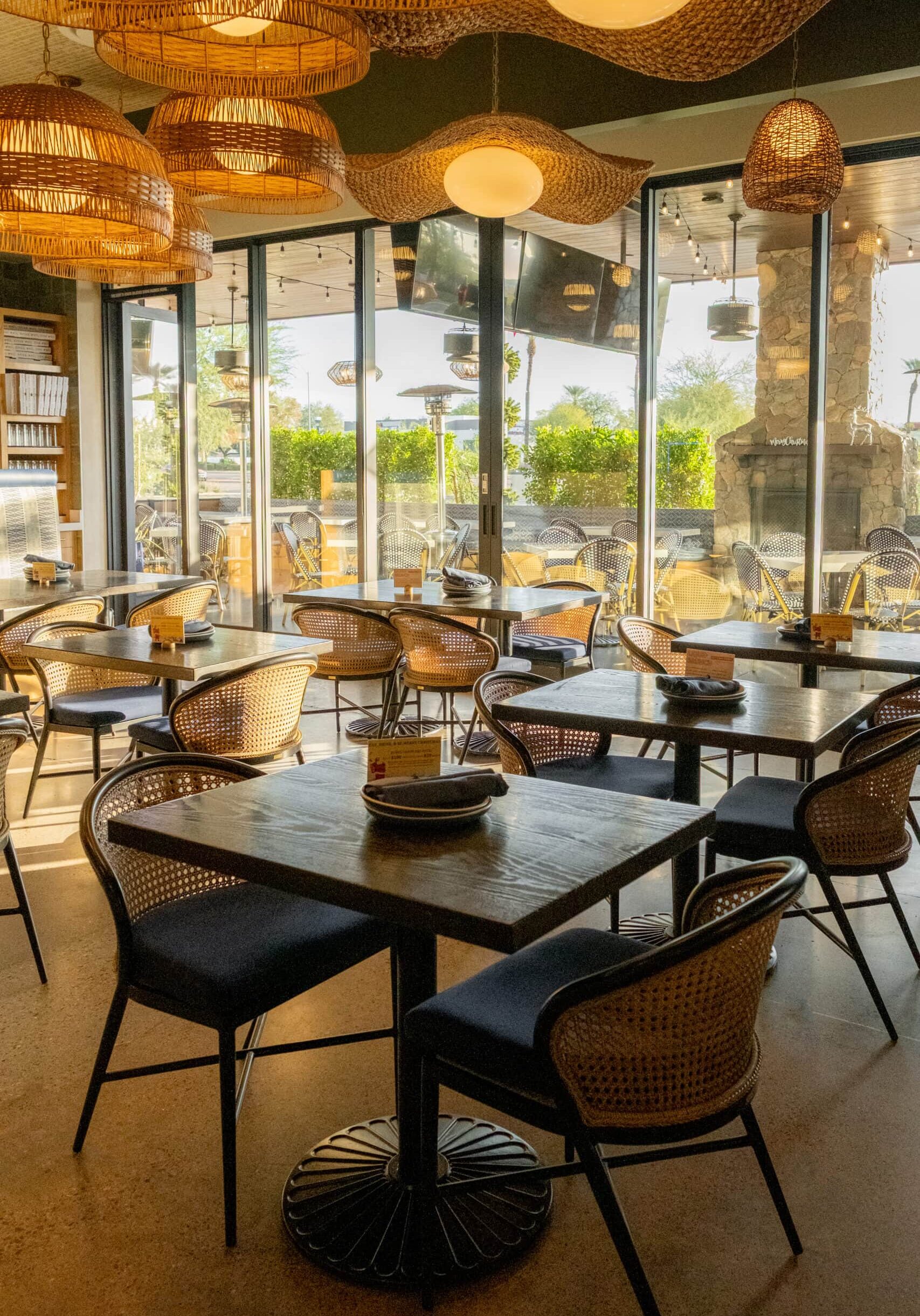
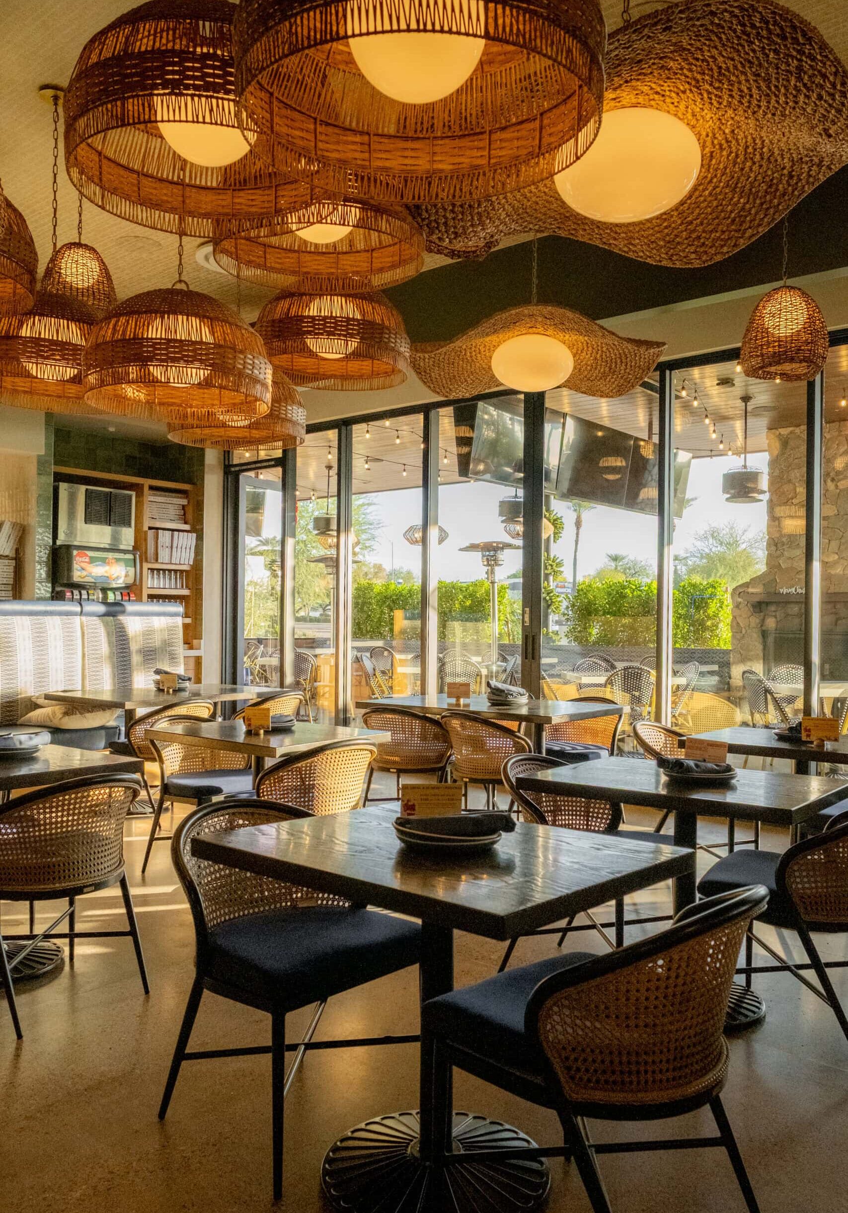
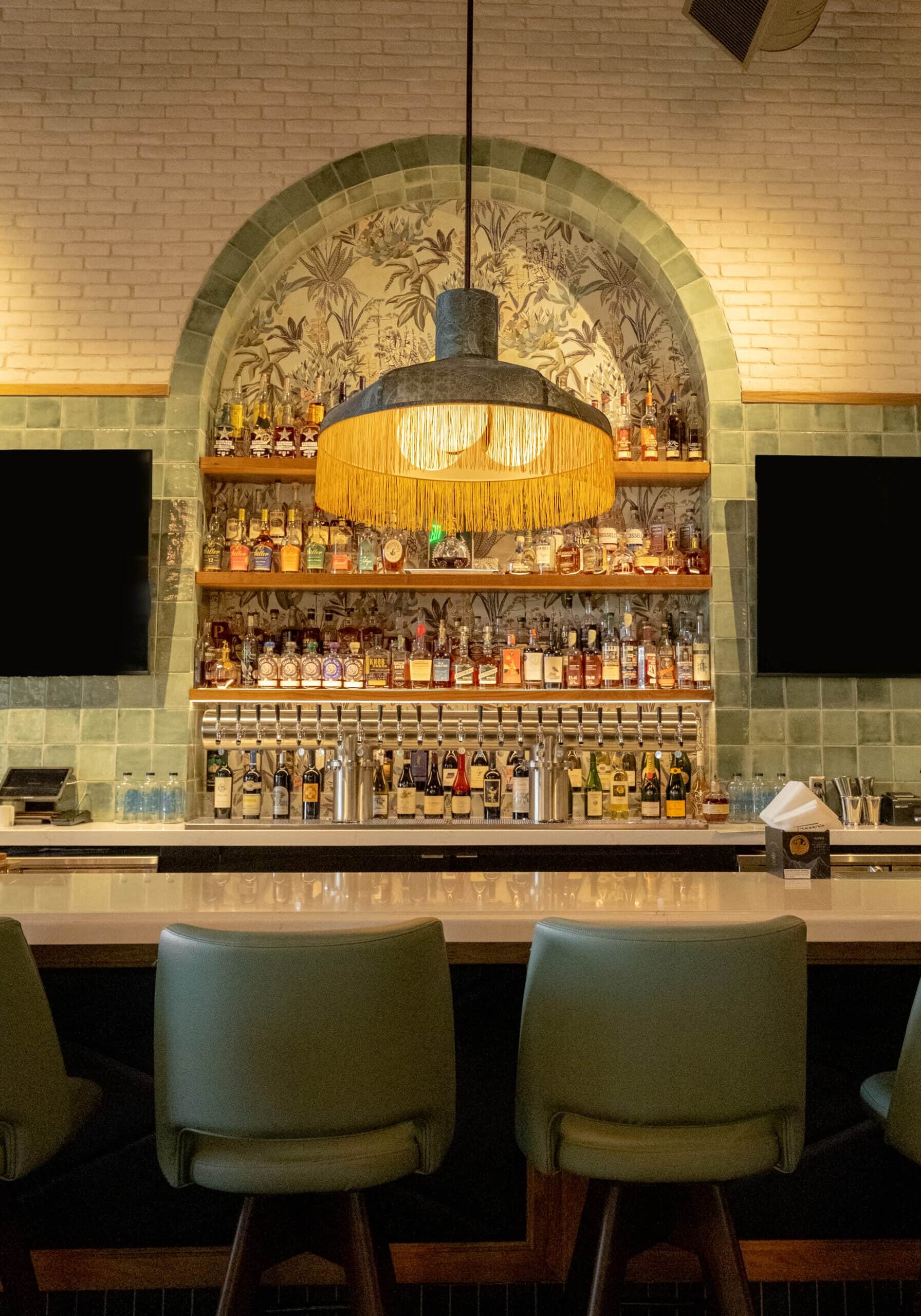
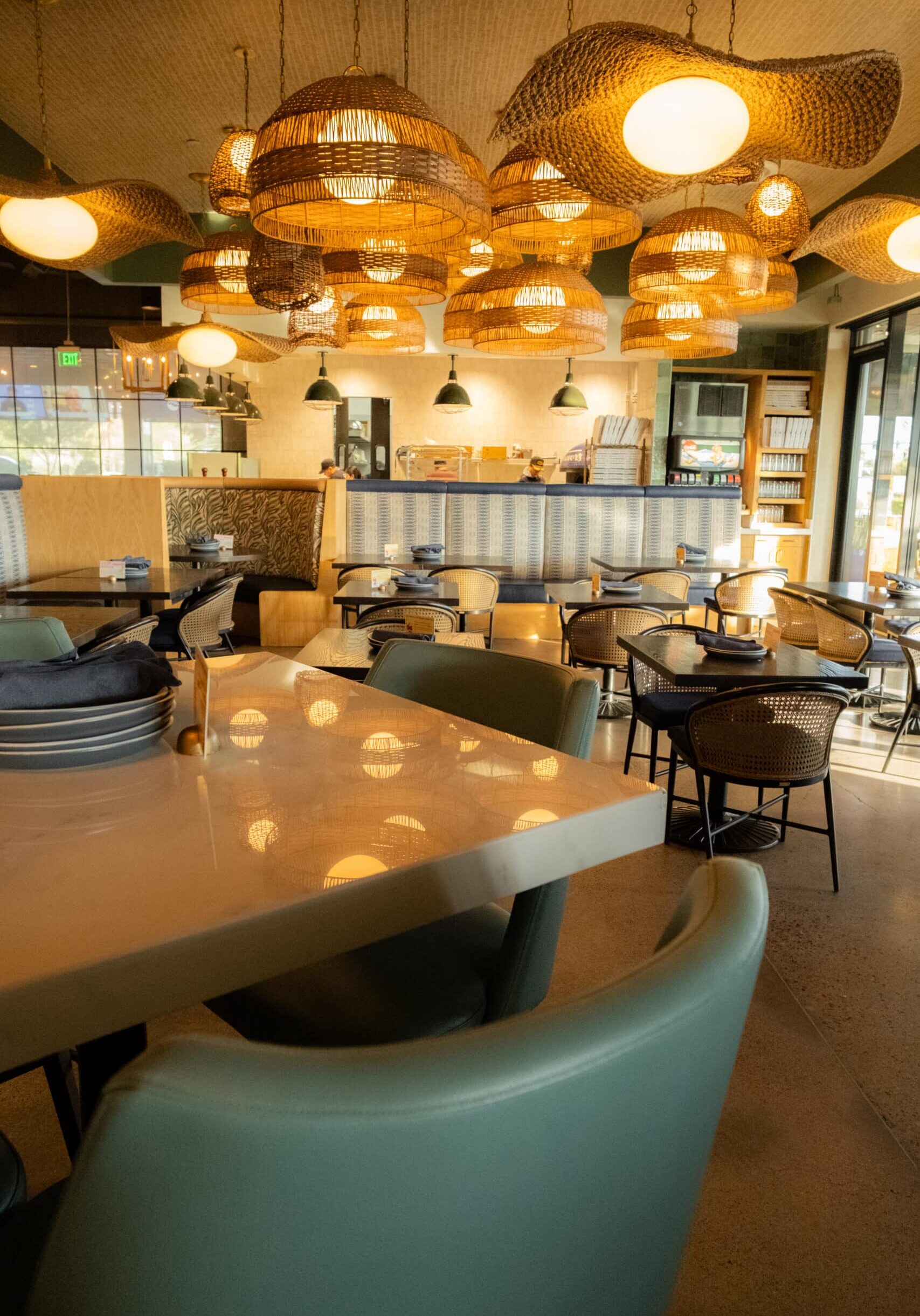
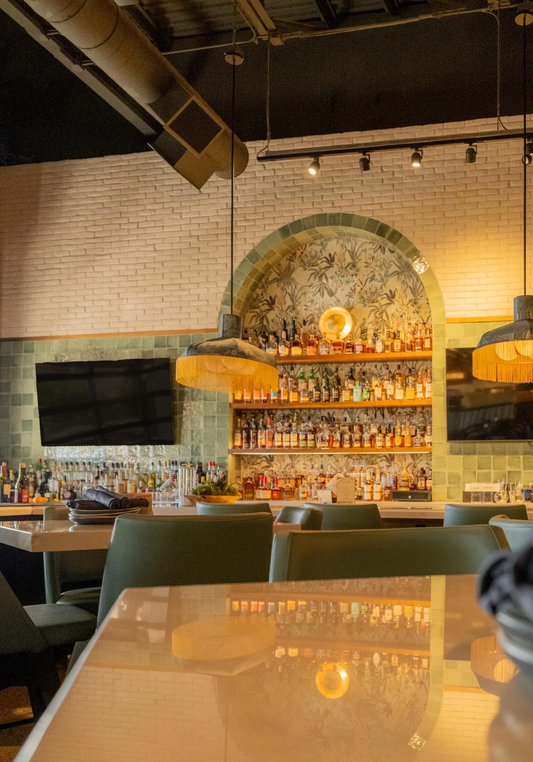
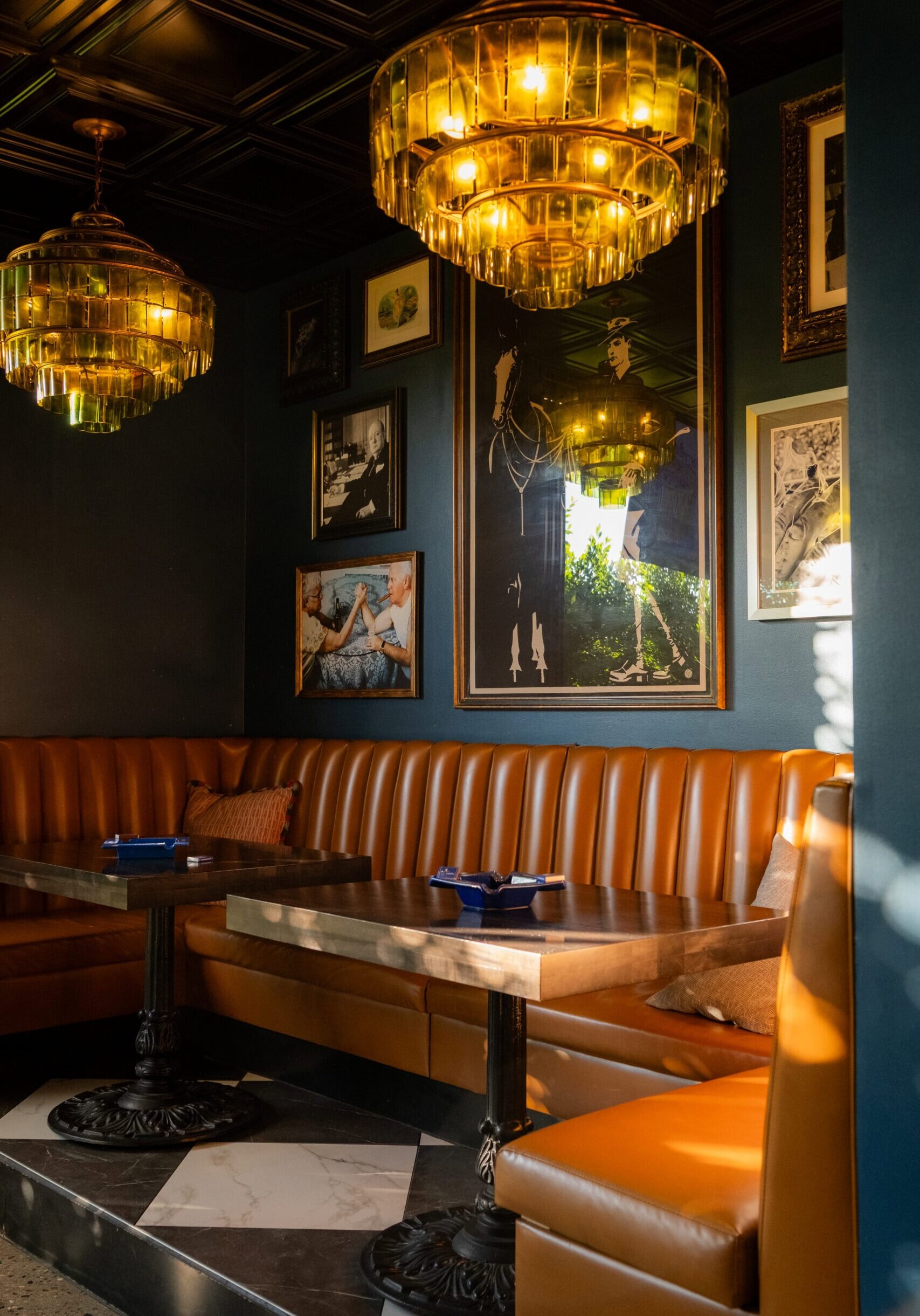
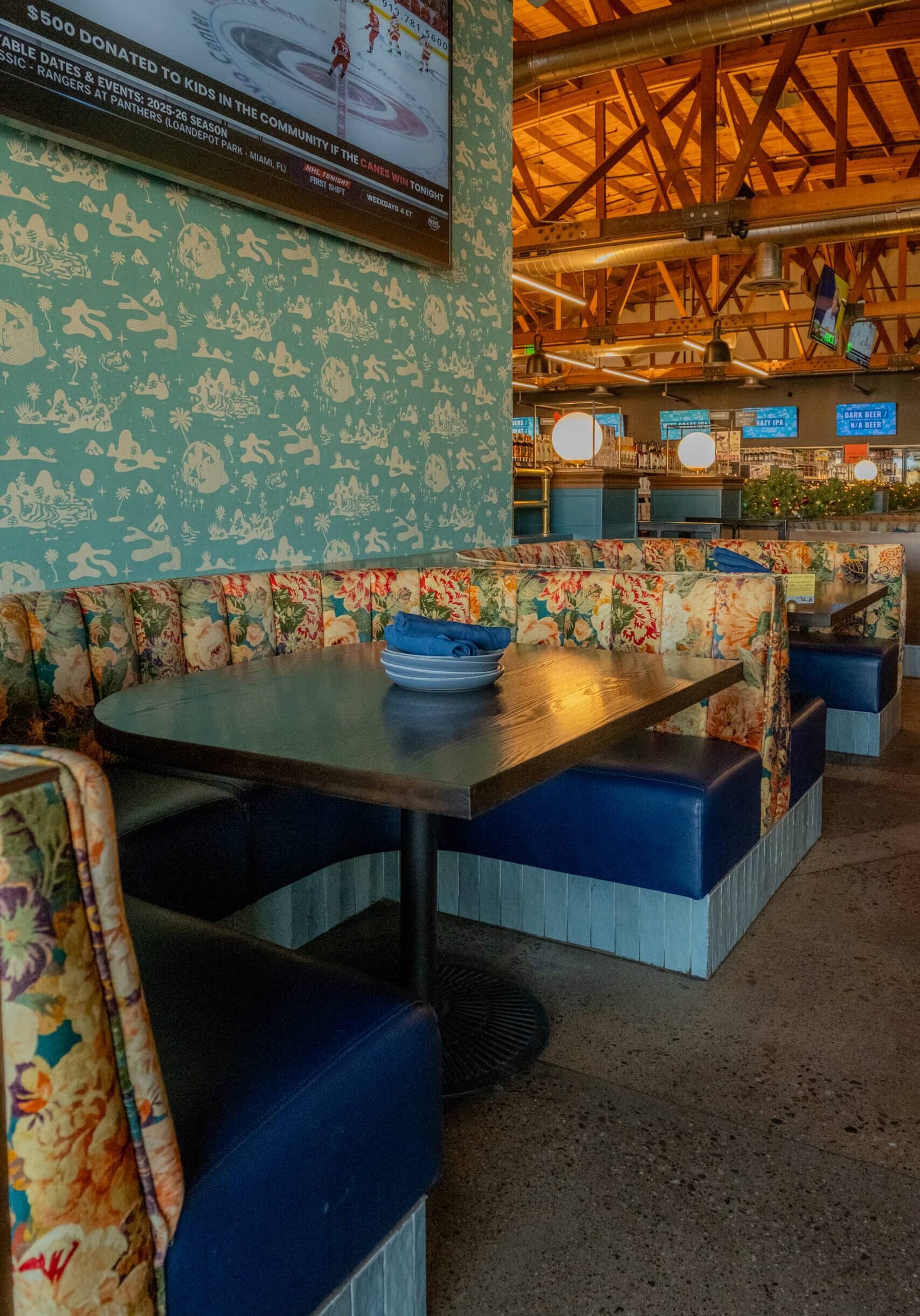
Crimson refined the core design language for Scottsdale, leaning into cleaner lines, elevated finishes, and a more composed material palette. Lighting plays a central role, setting a warm, inviting tone while highlighting key moments throughout the space.

Spatial planning was carefully adjusted to support both browsing and social interaction, ensuring the store functions seamlessly during peak hours without feeling crowded. The result is a space that feels effortless. It’s expressive without being overwhelming, and confident without feeling exclusive.

The Impact

A destination that feels right at home in a competitive, design-savvy market.

The Scottsdale location reinforced Trevor’s position as more than a liquor retailer. Customers respond to the atmosphere as much as the product, often describing the space as welcoming, elevated, and enjoyable to spend time in — a place that feels intentional rather than transactional.

For investors and developers, the Scottsdale location stands as clear evidence that thoughtful design can flex across demographics while maintaining consistency and performance.

“Scottsdale challenged us to refine the concept, not reinvent it. The result feels elevated, confident, and completely authentic to the brand.”

DSCF4834

Services Provided:

Concept Adaptation + Design Refinement

Full Interior Design

Space Planning + Layout

Material + Finish Selection

Custom Millwork Design

Lighting Design Coordination

FF&E Specification + Coordination

Installation Oversight

Our Expertise

Our Favorite Details

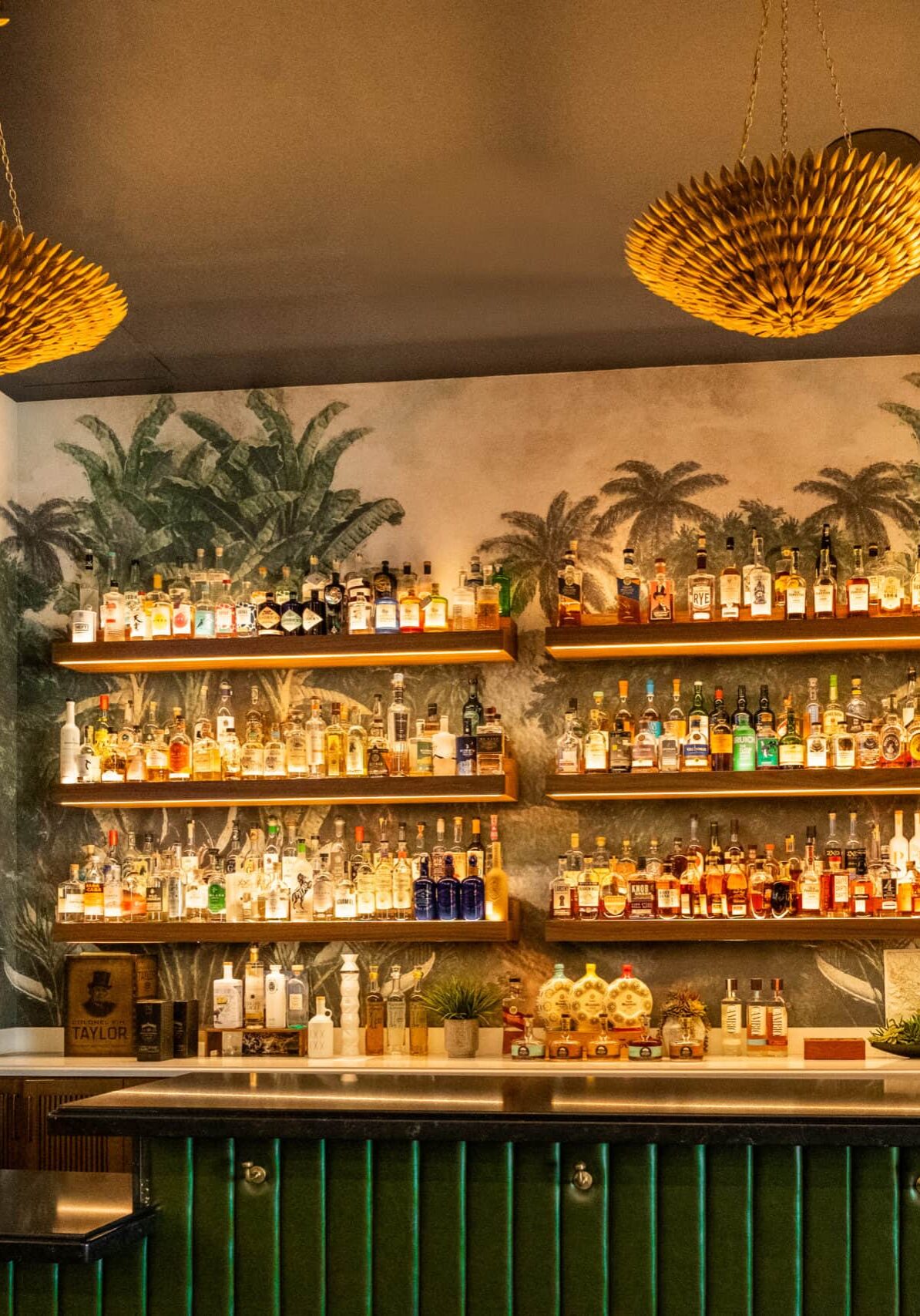
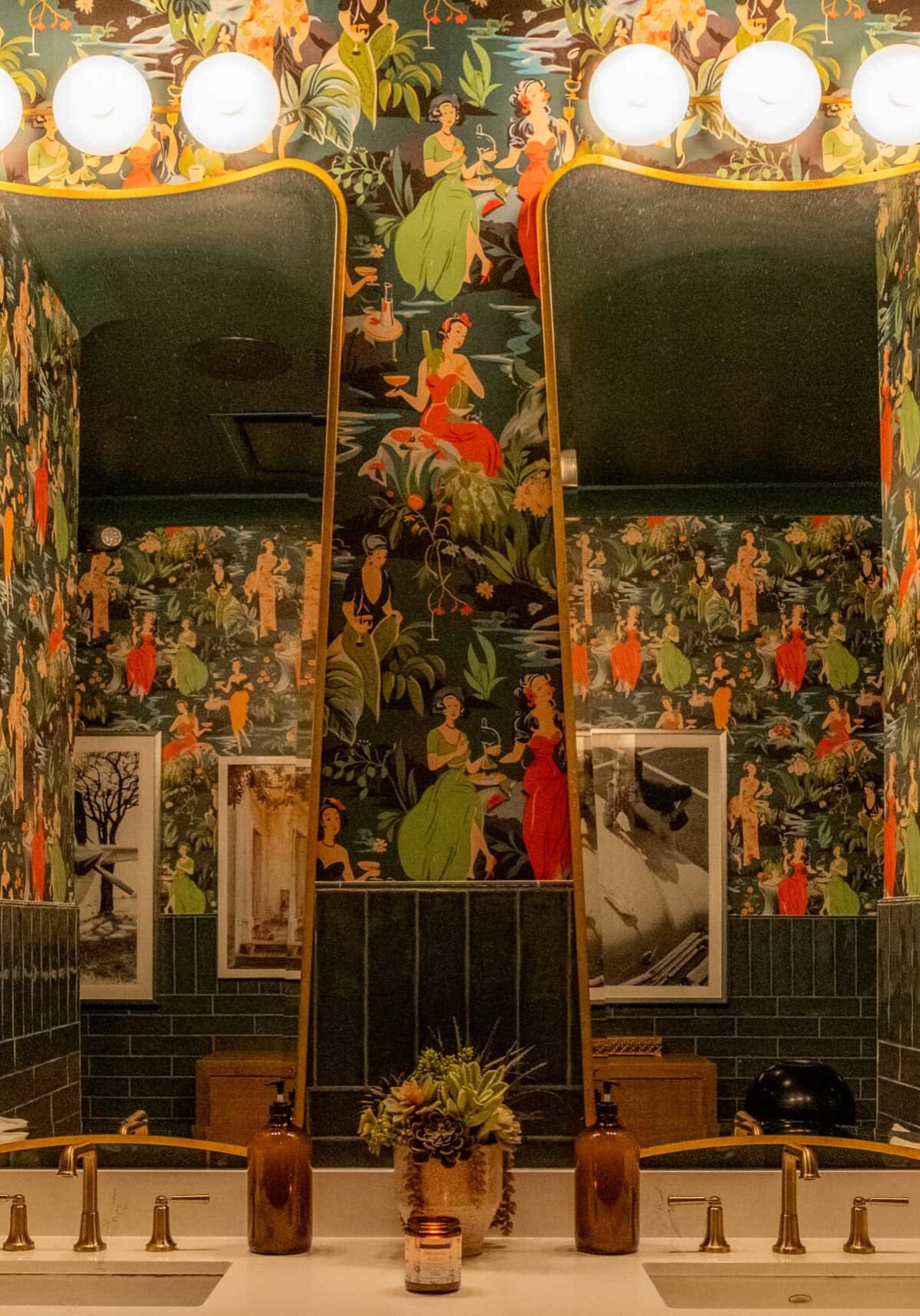
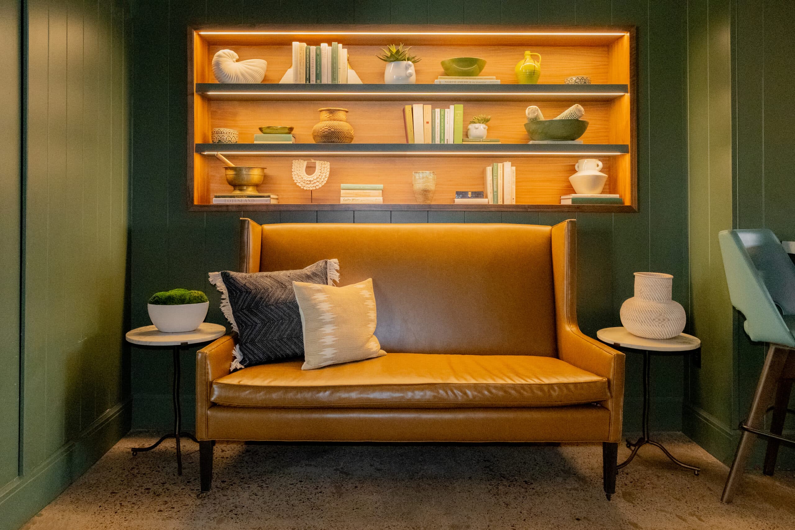
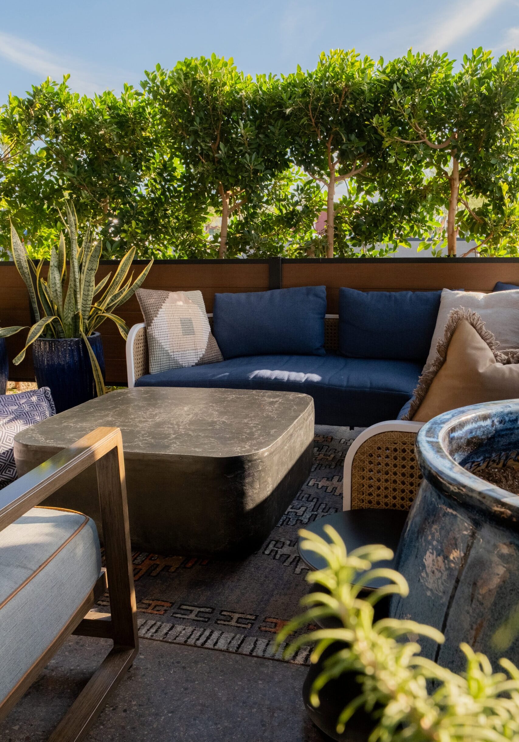
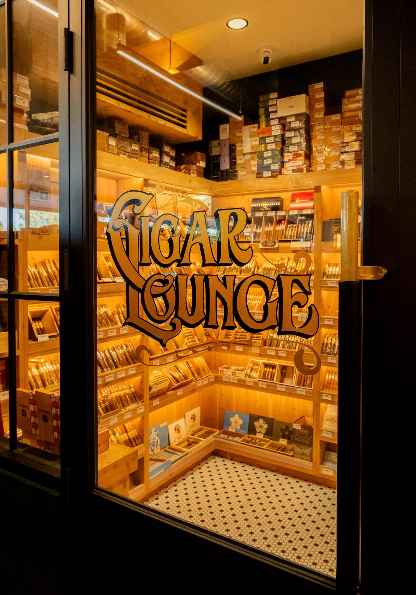
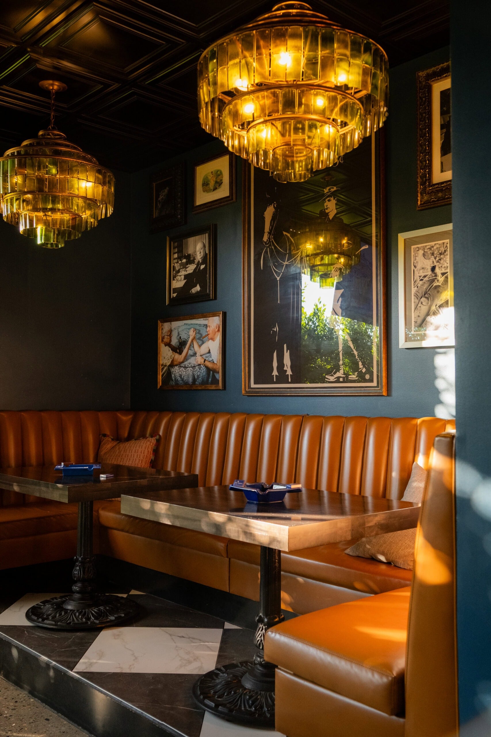
Elevated finishes, thoughtful lighting, and carefully chosen textures create a space that feels layered without feeling busy. Subtle moments, from tailored shelving details to seating areas that invite you in.

Bold.
Unexpected.
Memorable.

DSCF4841

Notes from the Design Team

Scottsdale was about confidence. The concept was already strong, but this location asked us to be more precise and to refine rather than add. That meant editing thoughtfully and trusting that fewer, better moves would carry more impact.

What we love most about this space is how natural it feels. Nothing is trying too hard, yet every detail is intentional. It’s a reminder that great design isn’t about louder ideas, it’s about clearer ones.

Adapting the Experience for an Urban Rhythm

January 15, 2026 by Cheryl Beachy Stauffer

Adapting the Experience for an Urban Rhythm

CommercialHospitalityRetail
DSCF4592
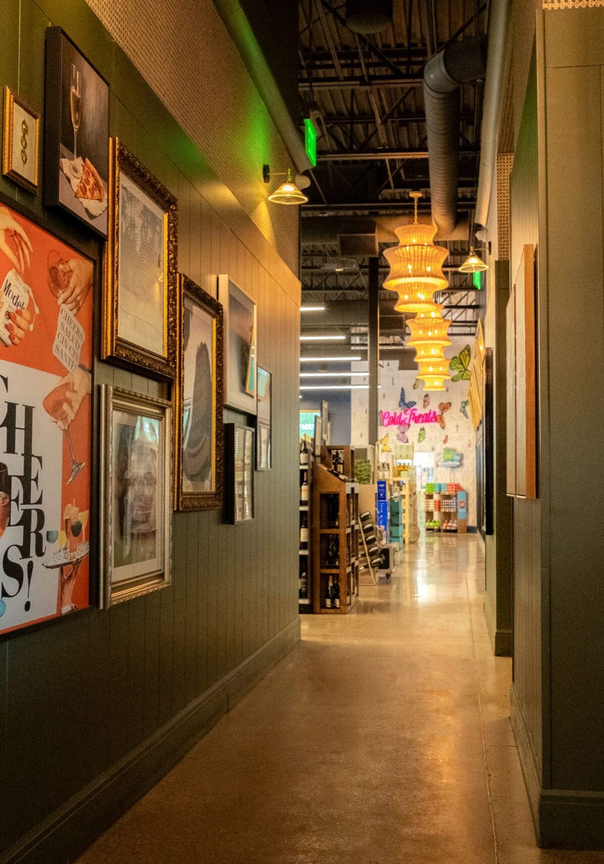
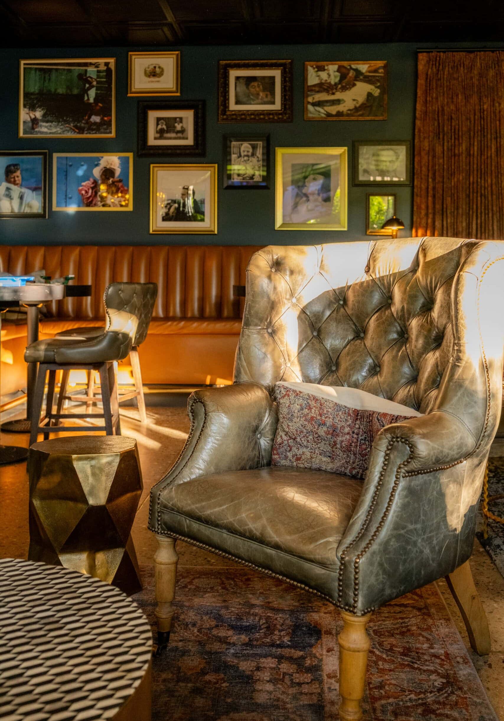
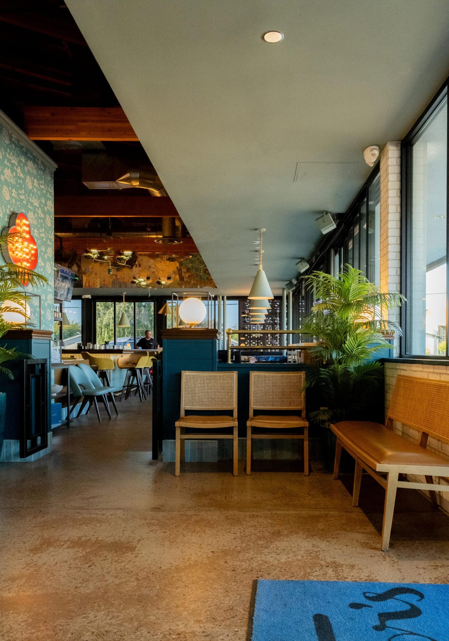
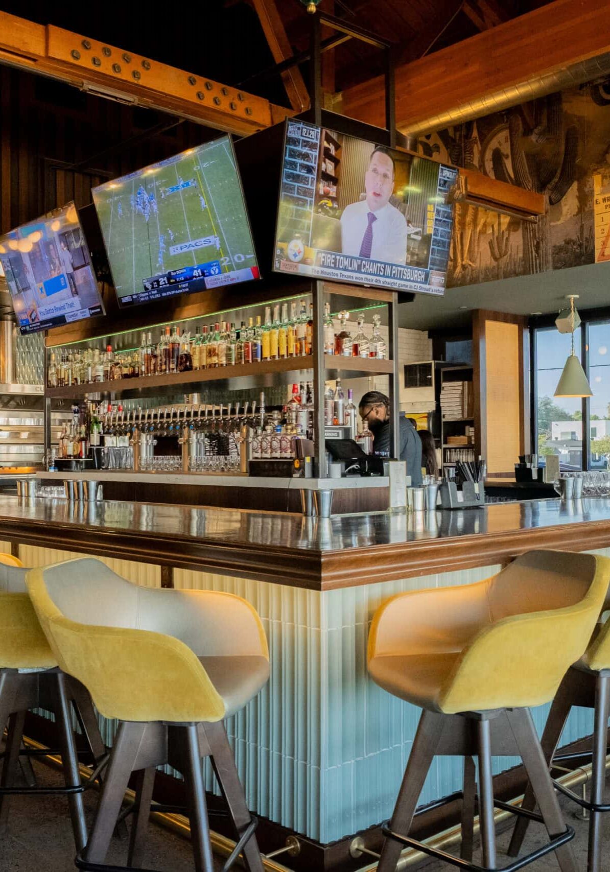
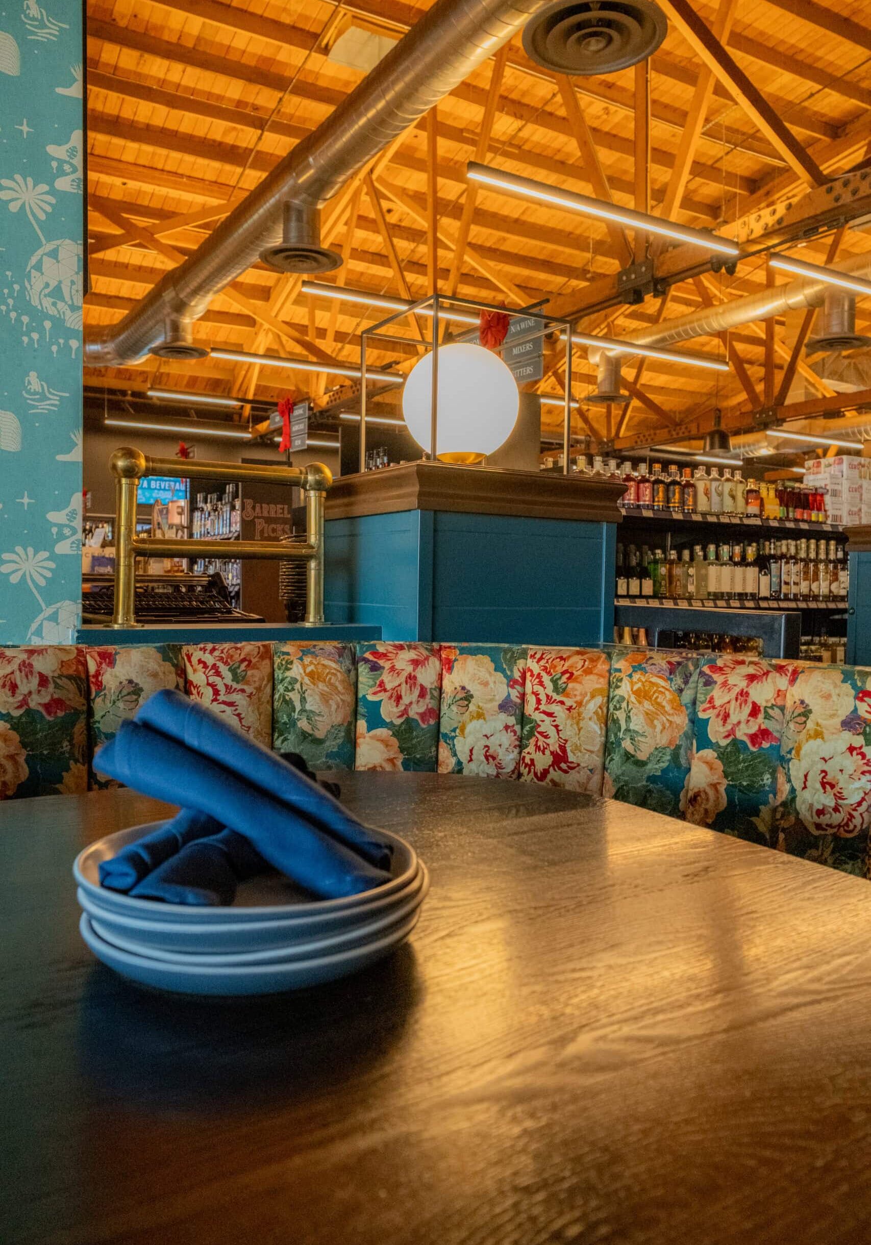
Crimson Design Group's urban retail and hospitality interior design for Trevor's Liquor in Arcadia, Phoenix — high-energy concept built for a tighter footprint.
DSCF4529

Adapting the Experience for an Urban Rhythm

A flexible, high-energy interpretation of the Trevor’s concept designed for an urban footprint.

Category

Commercial, Hospitality, Retail

Location

The Arcadia Phoenix location adapted the brand’s DNA within a tighter urban footprint — inside a vibrant community hub with high pedestrian energy.

Community Context

Urban setting with high daily traffic, frequent repeat visits, and varied customer needs

Year

2024

DSCF4577

As Trevor’s continued to expand, the Phoenix urban location presented a new kind of challenge. Unlike earlier sites, this space required the brand’s signature experience to adapt to a tighter footprint, faster pace, and more diverse daily traffic — all without losing the sense of discovery and atmosphere that made Trevor’s distinctive.

Crimson Design Group approached this location as an exercise in precision. The goal was to translate the Trevor’s DNA into an urban environment where flow, visibility, and efficiency matter just as much as mood. The result is a space that feels energetic and intuitive and built to perform at peak hours while still encouraging customers to slow down and engage.


The Vision


Maintain the immersive Trevor’s experience while optimizing for speed, clarity, and flow.

The vision for the Phoenix location centered on balance. The space needed to feel vibrant and expressive, yet operate efficiently within an urban context. Customers might be stopping in quickly or spending time exploring — the design had to support both behaviors seamlessly.

Crimson focused on preserving the warmth and personality of the Trevor’s brand while ensuring the environment felt intuitive and easy to navigate. Every design move was measured against how the space would actually be used, day in and day out.

The Approach

Design with intention, edit with discipline, and let flow lead the experience.

Spatial planning played a central role in this location. Clear sightlines, strategic product placement, and well-defined zones help guide customers naturally through the space, reducing friction without sacrificing character. Lighting was carefully layered to create moments of energy and pause, even within a compact footprint.

Material selections leaned durable and hardworking, supporting heavy traffic while maintaining the layered, eclectic feel that defines Trevor’s. The result is a space that feels lively but controlled — expressive without being chaotic.

The Impact

A concept that proves it can flex without losing its identity.

The Phoenix urban location demonstrates the strength of the Trevor’s concept at its core. Customers experience the same sense of atmosphere and hospitality found in other locations, even as the space responds to a faster-paced environment.

For developers and investors, this location reinforces a critical point: the Trevor’s model is not dependent on one type of site or footprint. Thoughtful design allows the experience to adapt, perform, and remain profitable across varying conditions.

“This location pushed us to be incredibly intentional — every square foot had to work harder without feeling overdesigned.”

DSCF4583

Services Provided:

Concept Adaptation for Urban Context

Full Interior Design

Space Planning + Circulation Strategy

Material & Finish Selection

Custom Millwork Design

Clubhouse, fitness center, co-working space, and lounge areas curated as resident destinations.

Lighting Design Coordination

FF&E Specification + Coordination

Installation Oversight

Our Expertise

Our Favorite Details

What stands out most in this space is how effortlessly it moves. Shelving, lighting, and circulation work together to guide customers intuitively, while layered textures and warm finishes prevent the space from feeling purely functional.

Subtle design moments — from integrated lighting to thoughtfully placed gathering zones — create pockets of interest that invite engagement, even during quick visits.

Bold.
Unexpected.
Memorable.

DSCF4518

Notes from the Design Team

This location required restraint. With less room to work, every decision carried more weight. We focused on clarity first — how people enter, move, browse, and exit — and then layered in personality where it mattered most.

What we love about the Phoenix location is how adaptable it feels. It proves that the Trevor’s experience isn’t tied to scale. With the right design strategy, it translates anywhere.

The Original That Started It All

January 15, 2026 by Cheryl Beachy Stauffer

The Original That Started It All

Retail
Trevor's Flagship

Worthington Gardens

January 14, 2026 by Cheryl Beachy Stauffer

Worthington Gardens

Multi-Family
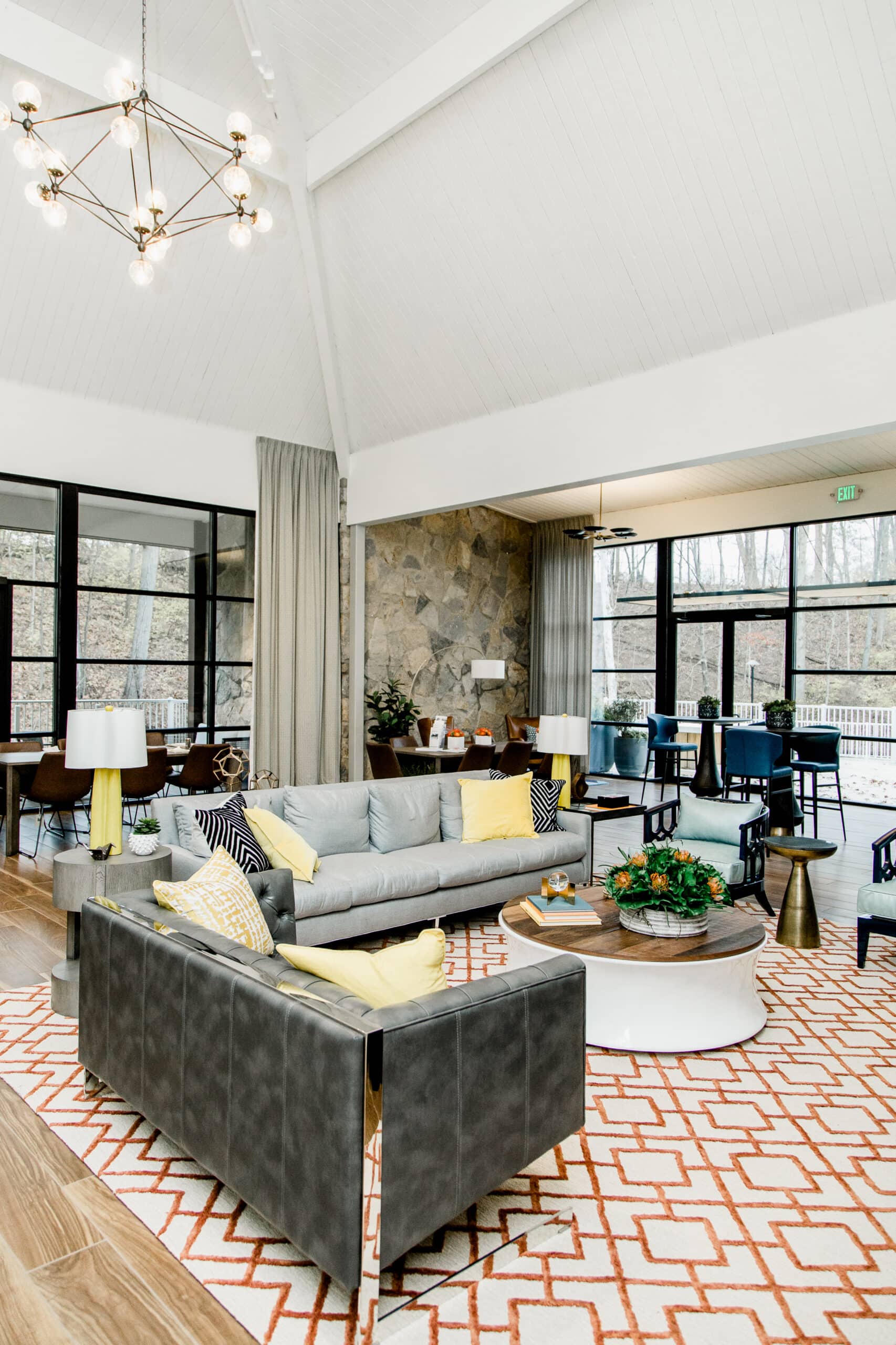
Modern living room with high vaulted ceiling, grey sofas, yellow cushions, a patterned rug, round coffee table, and large windows overlooking an outdoor area with trees.
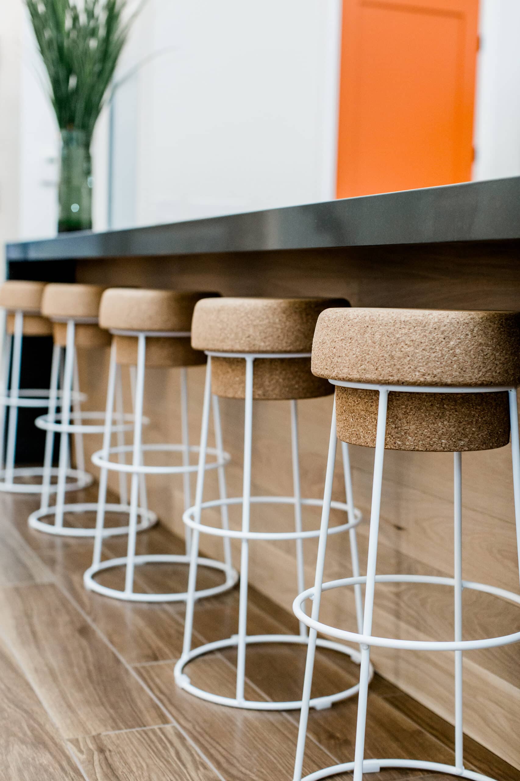
Four modern bar stools with cork seats and white metal legs lined up at a wooden counter; an orange door and a vase of tall green plants are visible in the background.

Mid-Century, Brought Forward

This remodel started with a building that already knew who it was. Set into a wooded hillside, the exterior clearly reads mid-century modern. Crimson’s goal wasn’t to reinvent that identity, we discovered new ways to preserve and celebrate it.

We kept critical original elements like the stone wall and V-groove ceiling and these details became the foundation for the interior design, grounding the space in its architectural roots.

Next, classic mid-century forms were refreshed with color, geometric patterns, and a thoughtful mix of metals. Wood, stone, and metal were layered to keep the space feeling warm, textured, and relevant for today’s clientele. No other combination of materials says mid-century modern better!

Project Partners:
Upholstery: Fortner Inc.

Station 73

January 14, 2026 by Cheryl Beachy Stauffer

Station 73

Multi-Family
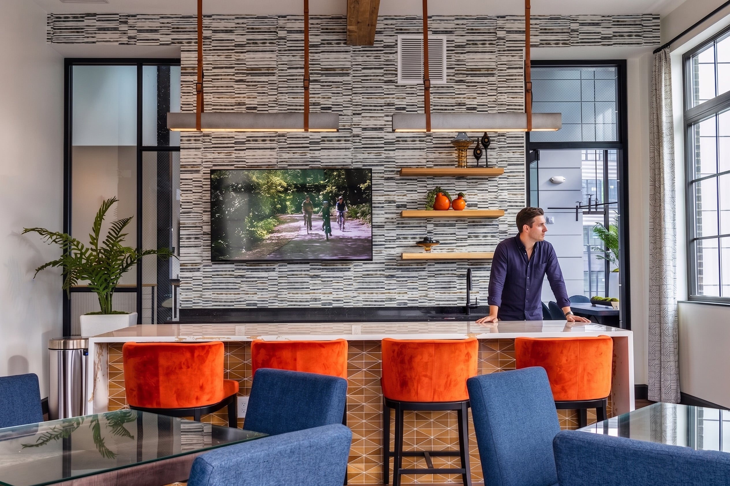
A man stands at a kitchen island with orange barstools in a modern, well-lit room featuring a TV, open shelves with decor, and large windows.
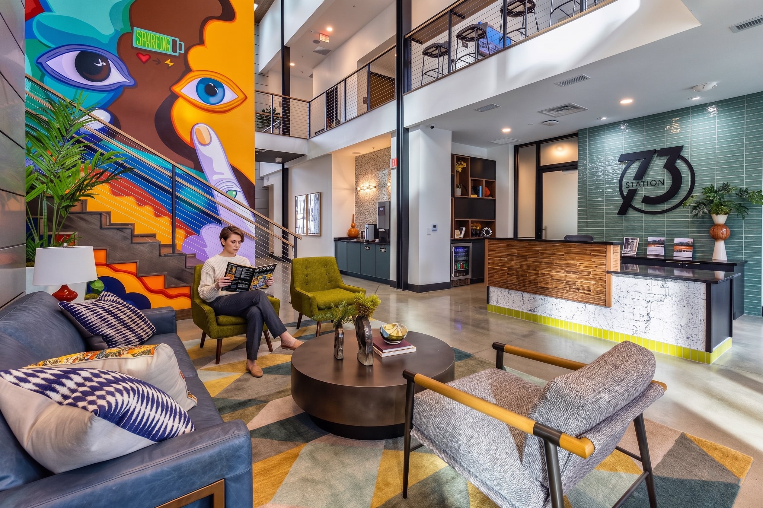
Modern lobby with colorful wall mural, contemporary furniture, and a reception desk. A woman sits reading a magazine on a sofa.

Bridging Industrial Legacy with Bold Modern Form

A large-scale, destination-style multifamily amenity experience that fuses industrial character with contemporary design.

Category

Multi-Family

Location

Cleveland, Ohio

Community Context

Station 73 sits in the Detroit Shoreway neighborhood near Battery Park, close to Gordon Square, the Art District, Edgewater Beach, and other cultural destinations that define Cleveland’s west side. The property offers a mix of residential comfort and vibrant urban amenities, with panoramic views and easy access to trails, entertainment, and lakefront activities.

Year

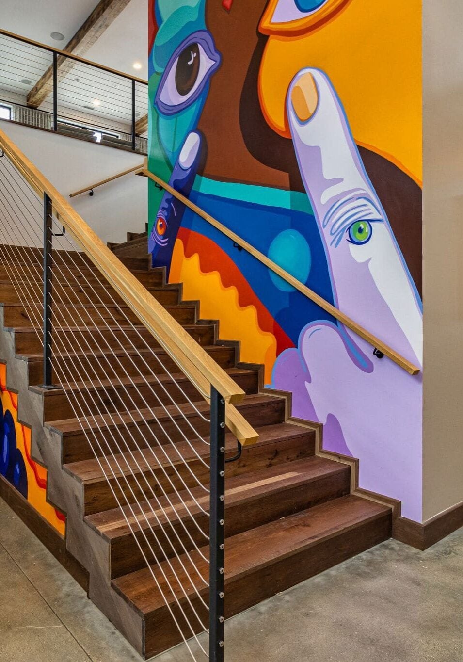
A modern indoor staircase with a vibrant, abstract mural featuring faces and hands on the adjacent wall; potted plants are placed nearby.
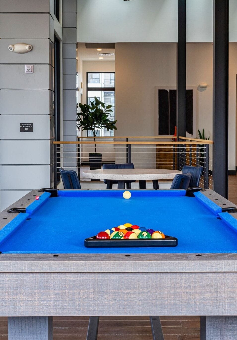
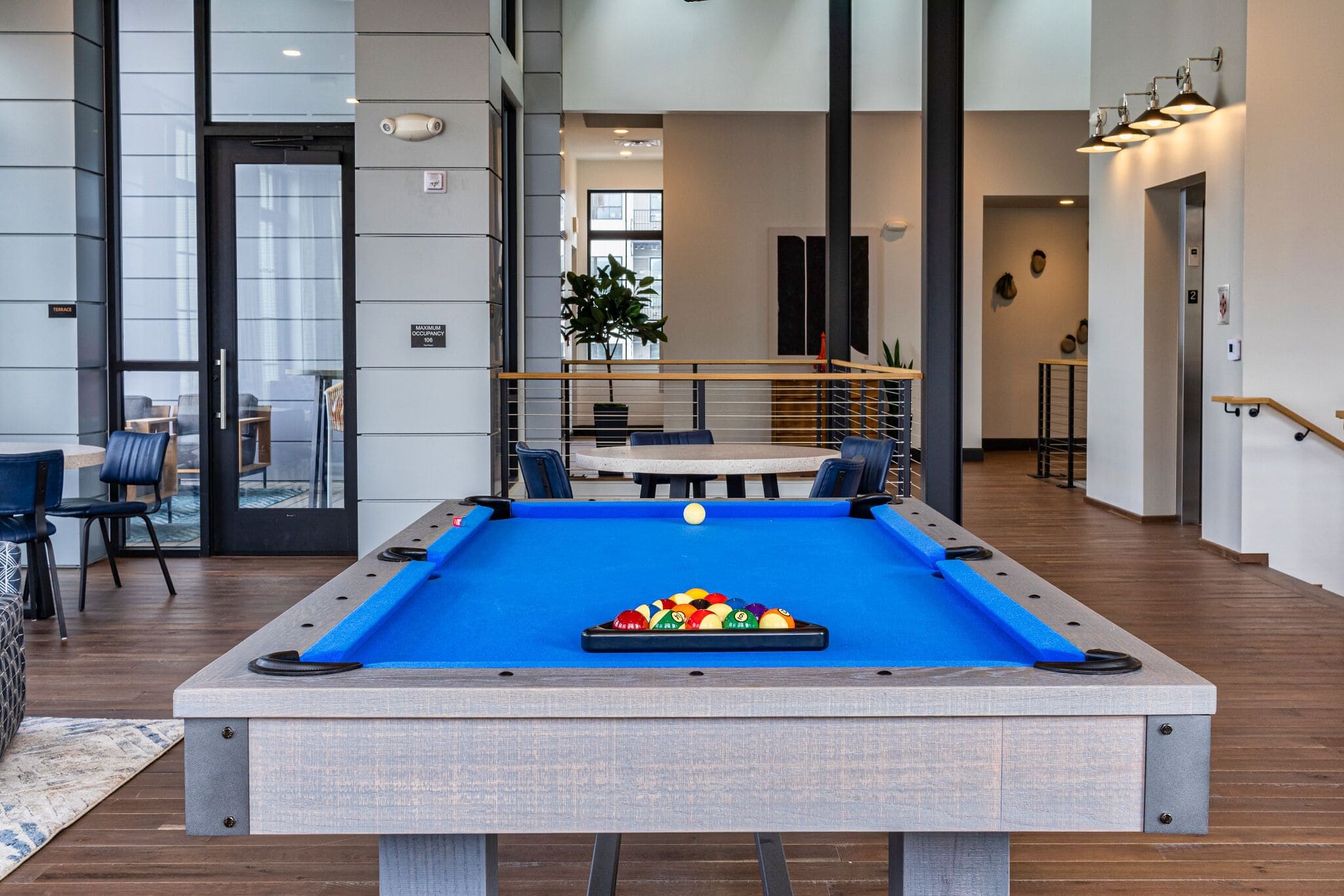
A blue pool table with a rack of balls and a cue ball stands in the center of a modern, open lounge area with wooden floors and contemporary furnishings.
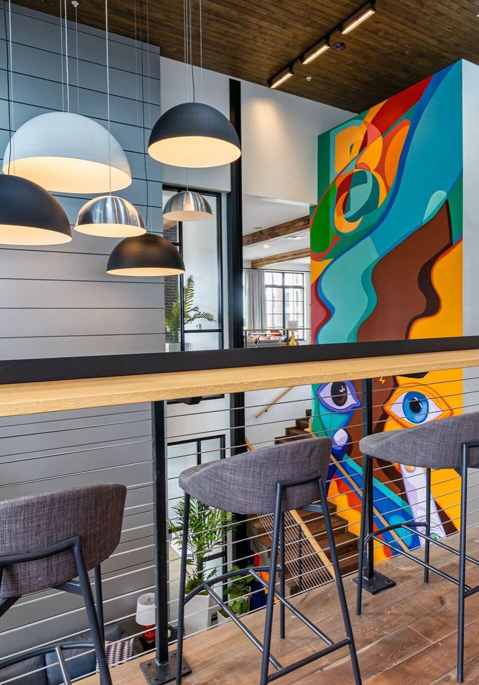
Modern office lounge with high chairs, wooden floors, pendant lights, and a colorful abstract mural on the far wall. Large windows provide ample natural light.
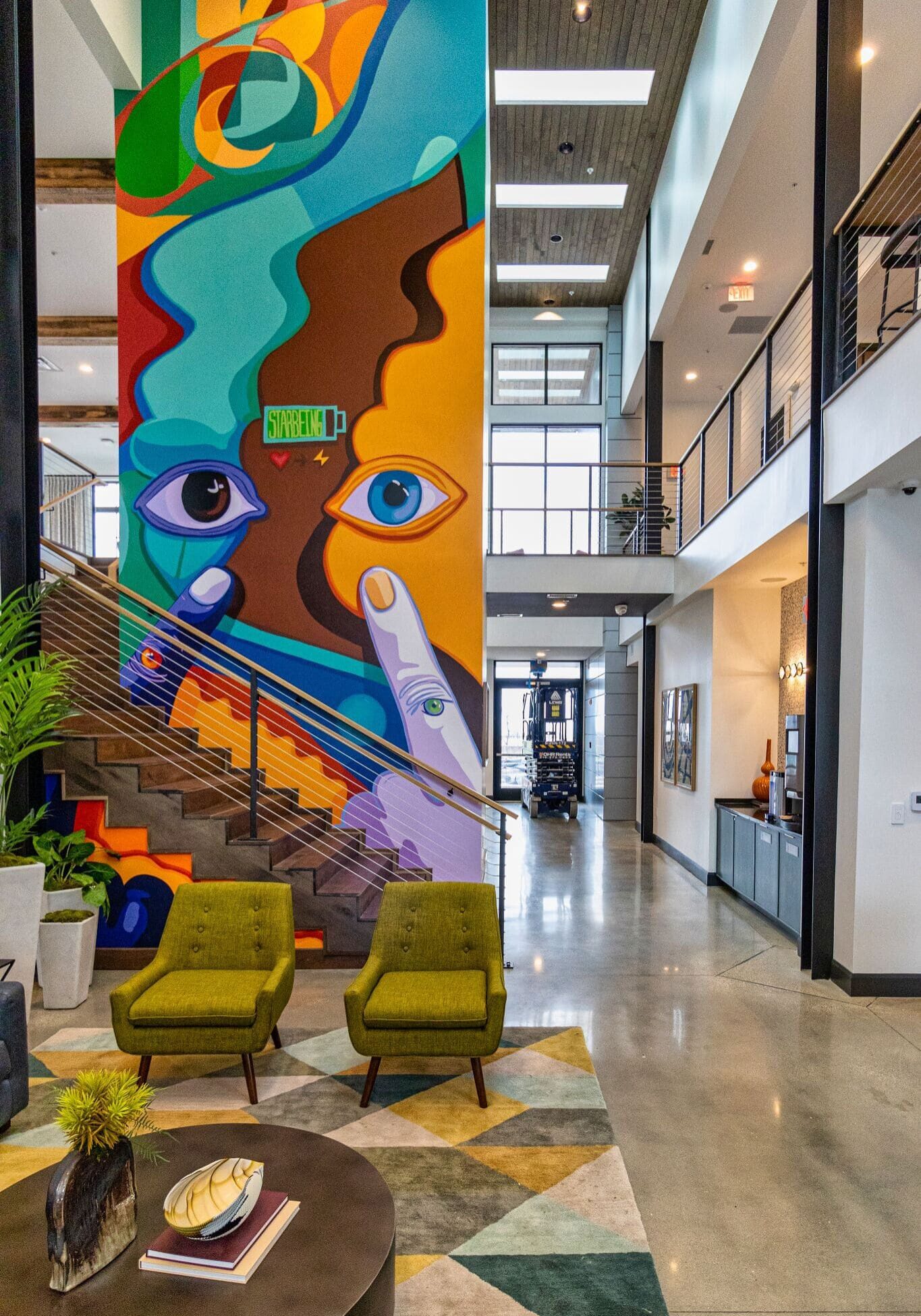
A modern lobby with green chairs, a round table, and a colorful abstract mural featuring faces on a tall wall by a staircase.

Station 73 at Battery Park presented an opportunity to create something unique in Cleveland’s Detroit Shoreway neighborhood — a place where old industrial heritage meets fresh, confident modern design. At the heart of the community is a purpose-built amenity building conceived to feel like a new landmark: part warehouse spirit, part bold contemporary structure.

Crimson Design Group partnered with the developer to bring this vision to life, crafting a multi-component amenity program that supports lifestyle, community, and everyday living. The result is a clubhouse and amenity suite that anchors the property while elevating resident experience through intentional materiality, artful moments, and a cohesive design language that bridges past and present.


The Vision


Merge industrial legacy with bold modern expression.

The amenity experience needed to do more than just provide programming; it had to tell a story. The design goal was to honor the rugged industrial character historically associated with the area while introducing a modern, confident architectural gesture that makes Station 73 feel contemporary and memorable.

This vision was about balance: respecting industrial cues without imitation, and pairing them with fresh elements that reflect the lifestyle aspirations of today’s residents.

The Approach

A design strategy rooted in authentic contrast and experiential sequencing.

Crimson’s approach embraced the duality inherent in the project brief. The main amenity building draws visual inspiration from heavy industrial typologies — expressed through tectonic massing and material texture — while a modern “intercepting” form cuts through with clarity, crisp detailing, and a confident new identity. Exposed structural gestures nod to industrial roots while contemporary lines and finishes signal progress.

A key design move was the integration of a custom two-story mural by a local artist for a dramatic graphic that wraps the stair wall and injects an edgy, urban vibe into the interior circulation. This artistic gesture serves both as a wayfinding anchor and as a cultural touchpoint, reinforcing the property’s connection to local creative energy.

Station 73’s amenity suite was also thoughtfully distributed across multiple buildings:

  • A large standalone amenity building with two stories of lounges, club rooms, and a yoga/fitness space
  • Outdoor pool courtyard with terrace and amenities
  • A dedicated dog wash facility
  • Multiple shared amenity floors across other residential buildings with lounges, business centers, conference rooms, fitness, and game/entertainment areas. These spaces were planned to feel integrated yet distinct, supporting a complex resident flow that encourages casual interaction as well as intentional gathering.

Despite the logistical complexity — including staggered installs across four buildings, coordination during maternity leave, and the challenge of commuting to a non-local site — the execution remained seamless, showcasing strong collaboration and Red-Glove oversight.

The Impact

A contemporary amenity experience that amplifies lifestyle and brand identity.

Station 73 at Battery Park delivers an amenity experience that resonates with the property’s context and its residents’ expectations. The intentional fusion of industrial and modern aesthetics gives the community a visual presence that stands out in the Detroit Shoreway neighborhood, while the robust suite of amenities — including co-working spaces, fitness, pool, terraces with lake views, and gaming/social zones — supports a full spectrum of daily life.

Feedback from residents highlights functionality, design quality, and the seamless integration of indoor/outdoor spaces as key strengths. The design approach not only reinforces the community’s identity but also enhances long-term value by creating spaces that are memorable, comfortable, and tailored to how people actually live.

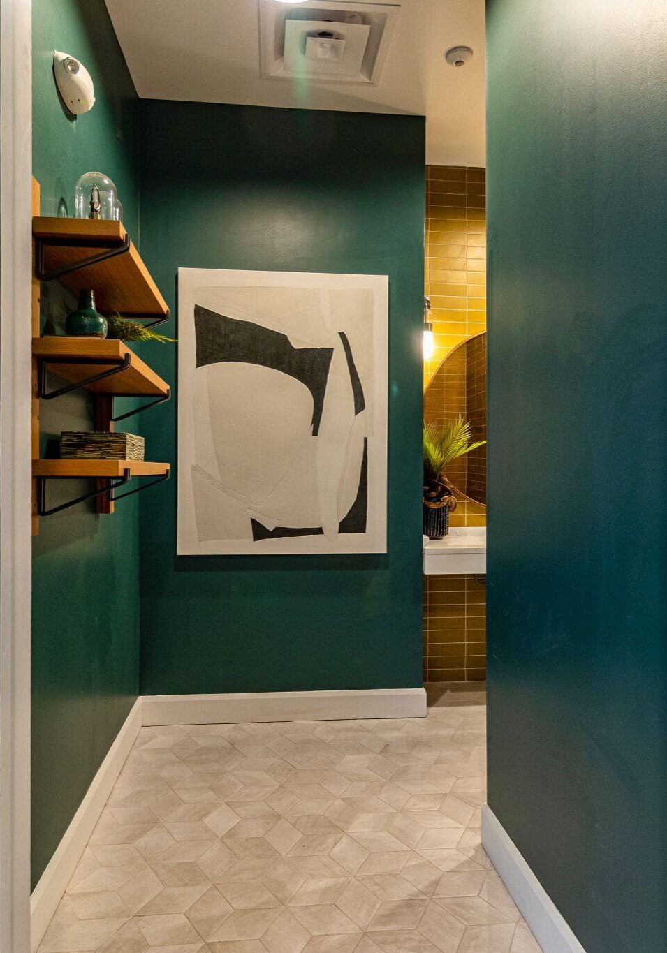
Entrance to a men's restroom with green walls, a black-and-white abstract painting, shelves with decor, and a glimpse of a sink and mirror inside.
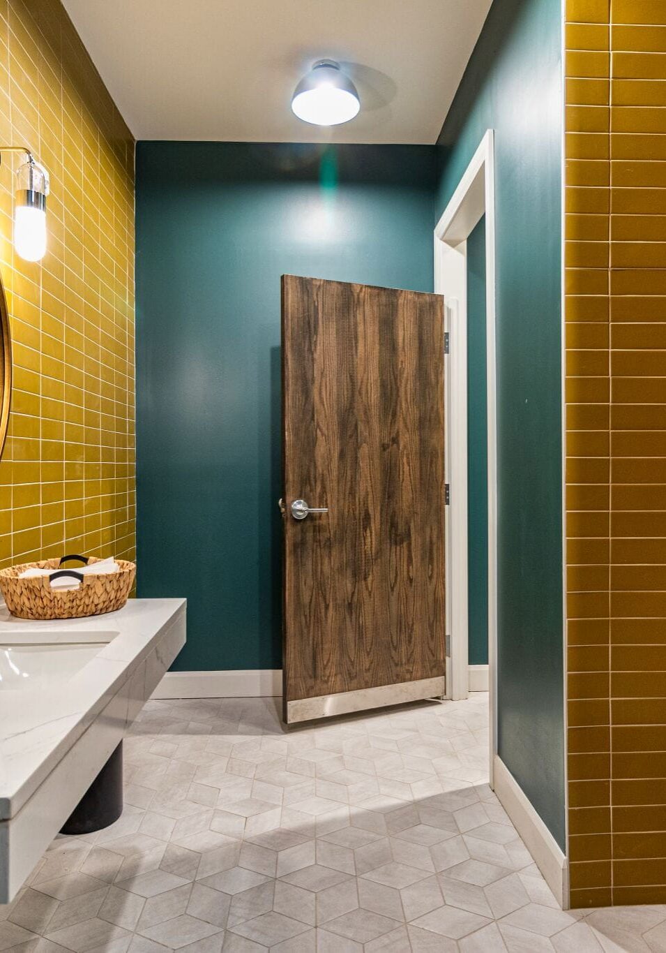
A modern bathroom with yellow tiled walls, dark green painted sections, a wood door, a floating sink with a mirror, and geometric light gray floor tiles.
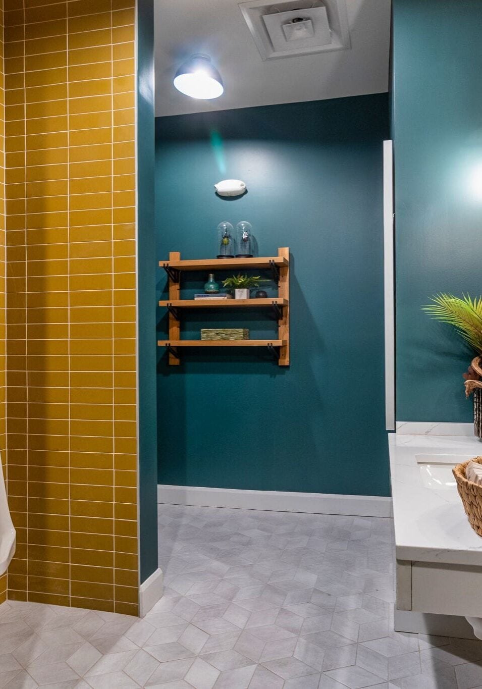
Modern bathroom with teal and mustard yellow walls, a round mirror, double sinks, decorative plants, and a basket on the counter. A wall-mounted shelf and urinal are visible in the background.

Our Favorite Details

  • Industrial + Modern Fusion: The interplay between old-world structural references and bold contemporary forms creates a distinct visual identity.
  • Two-Story Custom Mural: A standout graphic feature that elevates the stair experience and brings an urban artistic sensibility indoors.
  • Layered Amenity Program: From indoor lounges to outdoor pool and terrace spaces, the amenity areas support a variety of resident needs — social, fitness, business, and leisure.
  • Cohesive Transitions: Thoughtful material and lighting choices help unify disparate volumes and building types into a consistent design language.

Bold.
Unexpected.
Memorable.

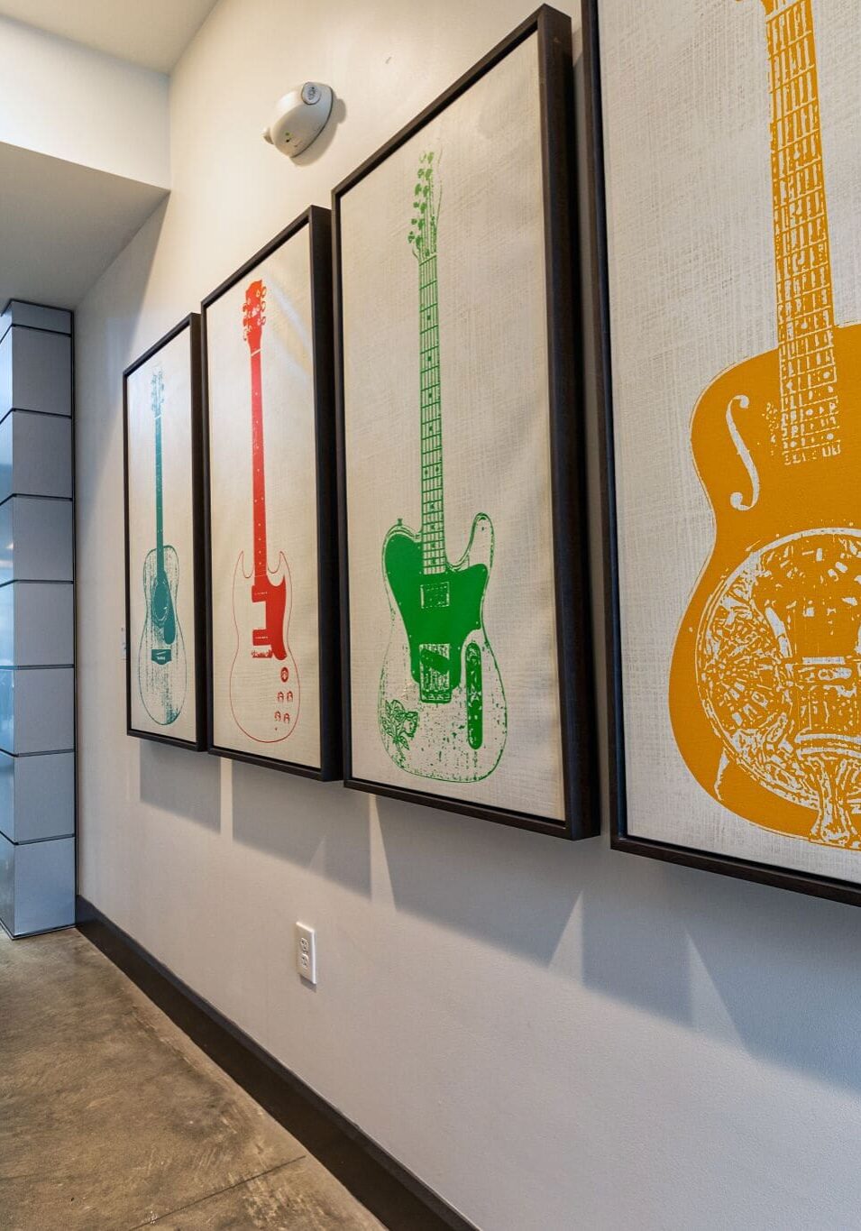
A hallway with concrete floors and framed colorful guitar artwork on the wall; modern office spaces are visible in the background.
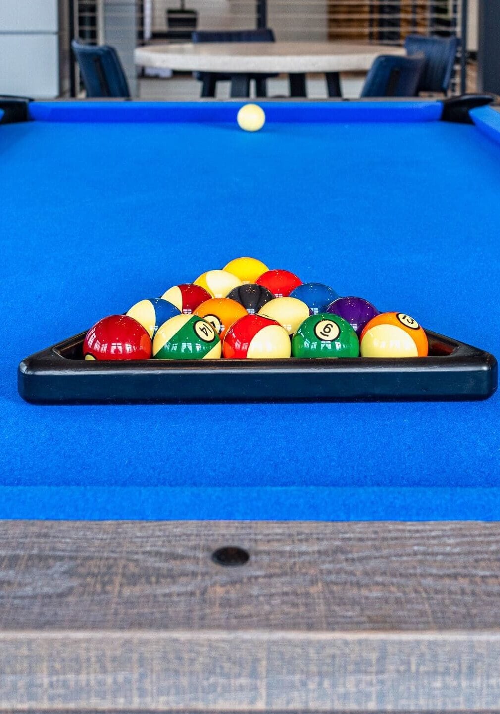
A blue pool table with racked billiard balls in the center and a cue ball positioned at the far end.

Services Provided:

Amenity Planning & Spatial Strategy

Clubhouse & Building Design

FF&E Procurement & Coordination

Sourcing, specification, procurement, and installation of furniture, fixtures, and finishes.

Material & Finish Selection

Custom Artwork Integration

Lighting & Fixture Specification

Installation Oversight + Remote Coordination

Our Expertise

Notes from the Design Team

Station 73 was a reminder of what strong coordination and clear vision can accomplish on a large, multi-component project. The scale and geographic distance introduced challenges, but careful planning allowed installations to proceed smoothly across seasons and team transitions. The mural, in particular, became a cultural anchor and a way to bring local identity into the architectural narrative, aligning with both aesthetic and community values.

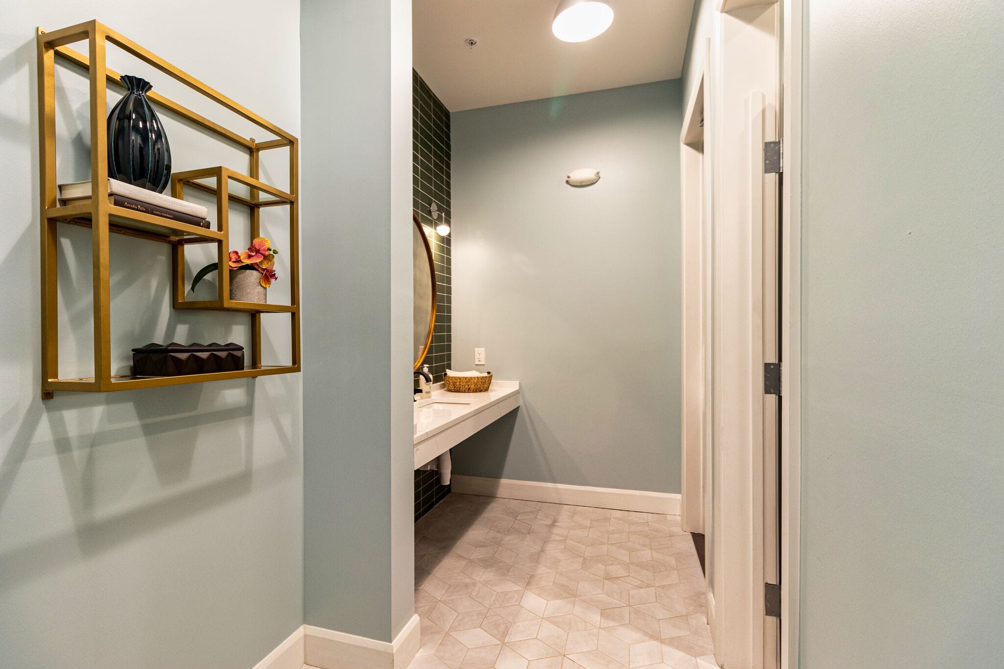
Modern bathroom with light blue walls, geometric floor tiles, a large round mirror above a white counter, and a gold wall shelf holding decor items.
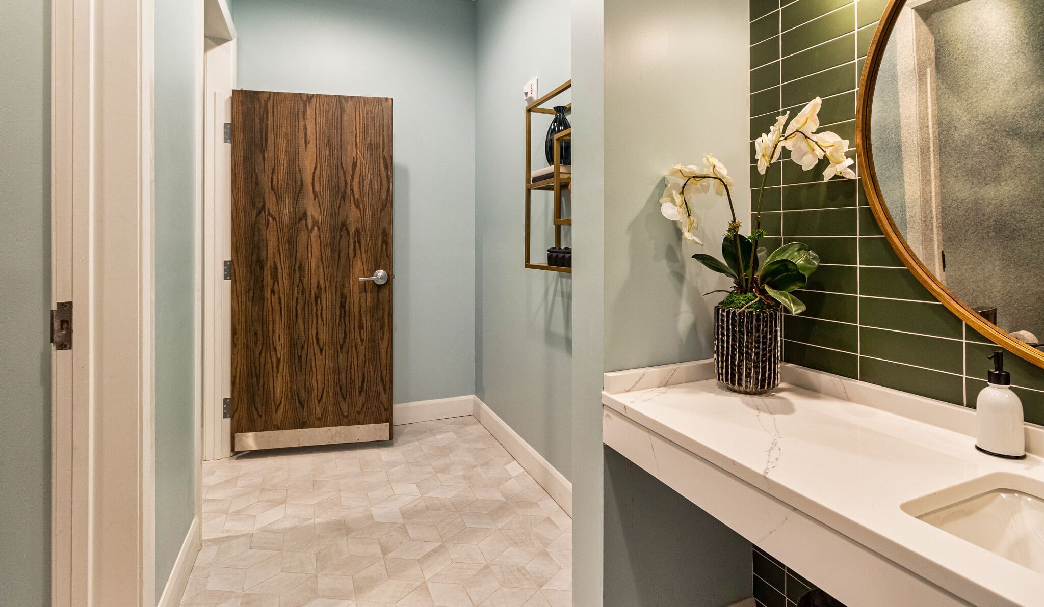
A modern bathroom with a wood door, hexagonal tile floor, a vanity with a white countertop, a round mirror, and a potted orchid.
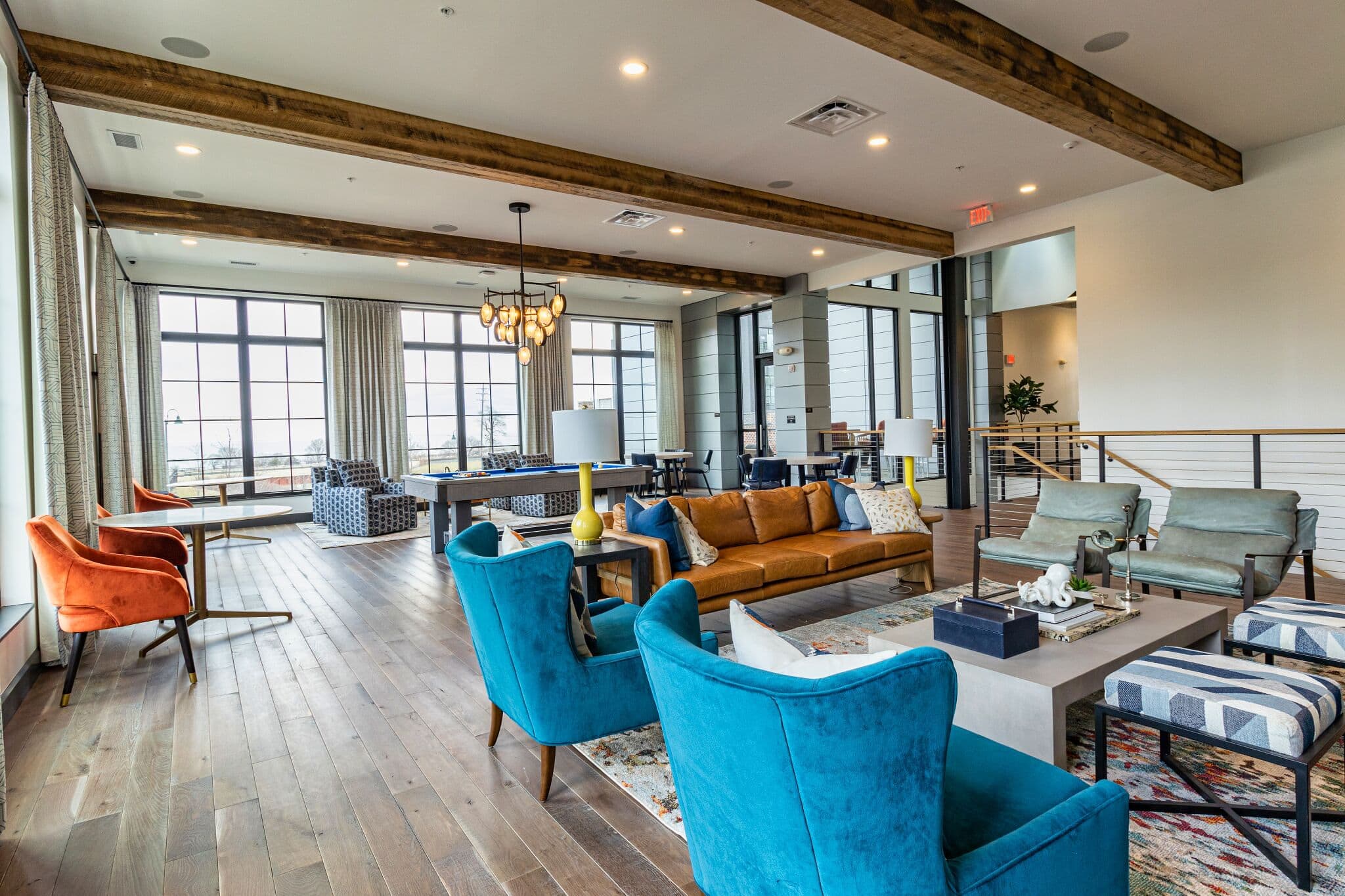
Spacious modern lounge with wooden floors, colorful chairs, couches, large windows, exposed beams, and decorative lighting.
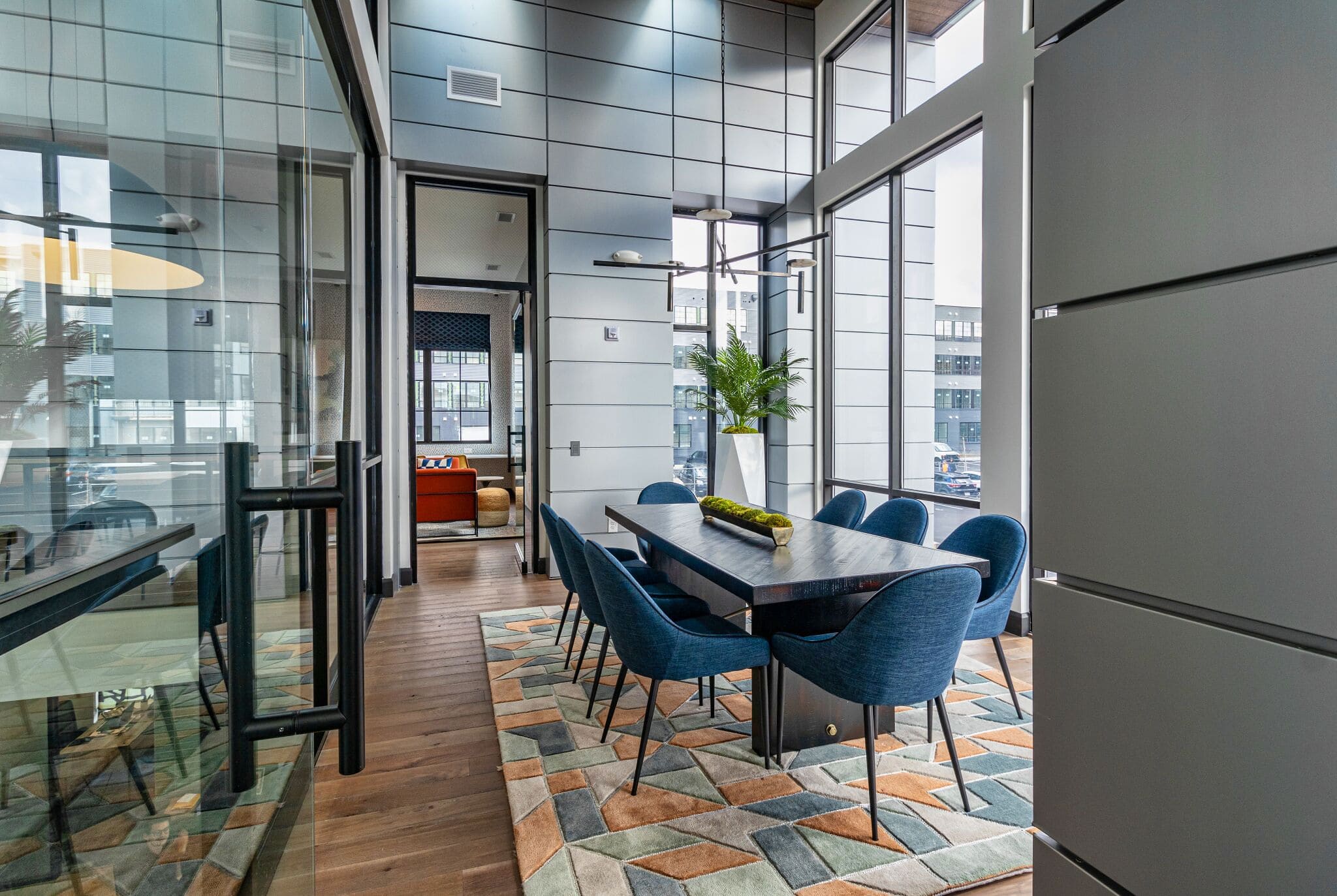
Modern conference room with large windows, blue chairs around a black table, geometric rug, and a plant centerpiece; adjacent office visible through glass wall.
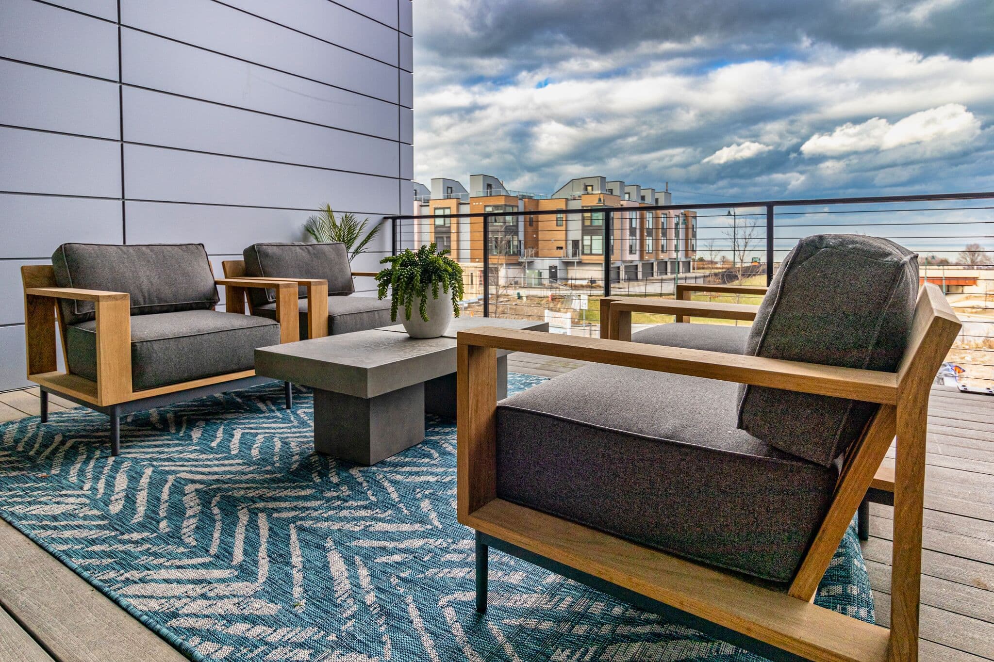
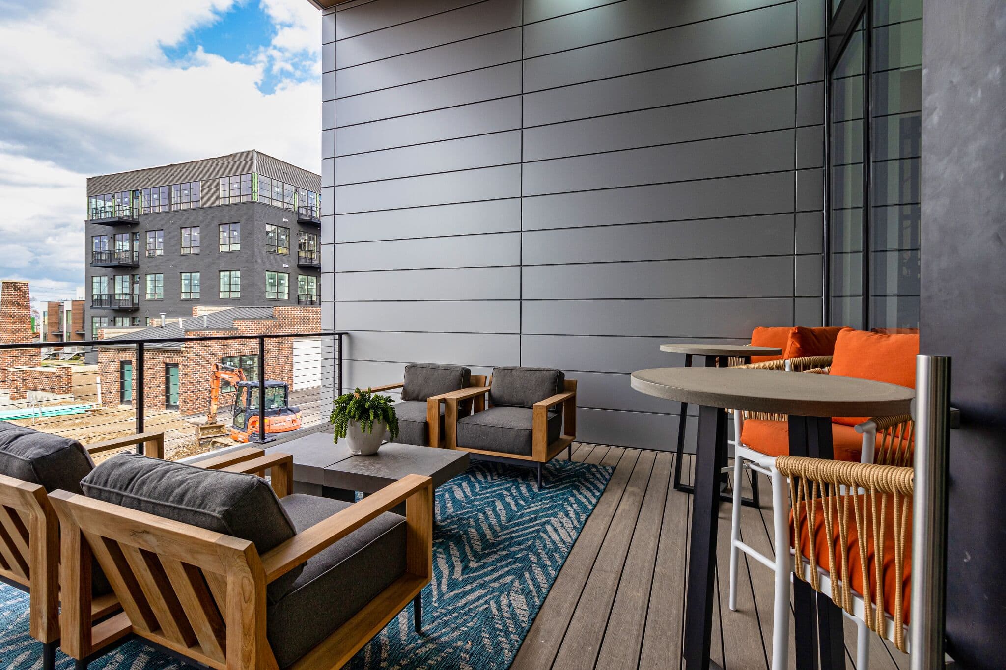
Modern outdoor patio with gray cushioned chairs, a concrete table, and a blue patterned rug, overlooking buildings and cloudy sky in the background.
Modern outdoor balcony with wooden furniture, gray cushions, orange pillows, a potted plant, and a blue rug; urban buildings are visible in the background.
A modern indoor space featuring a blue pool table set up for a game, with chairs and tables in the background and large windows letting in natural light.
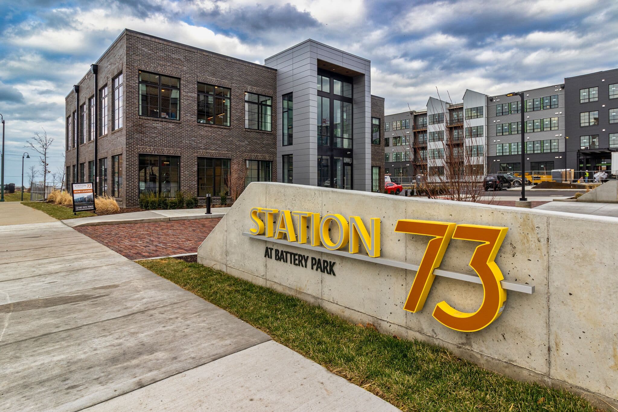
Modern commercial building with large sign reading "Station 73 at Battery Park" on a concrete wall; multi-story apartments visible in the background under a cloudy sky.
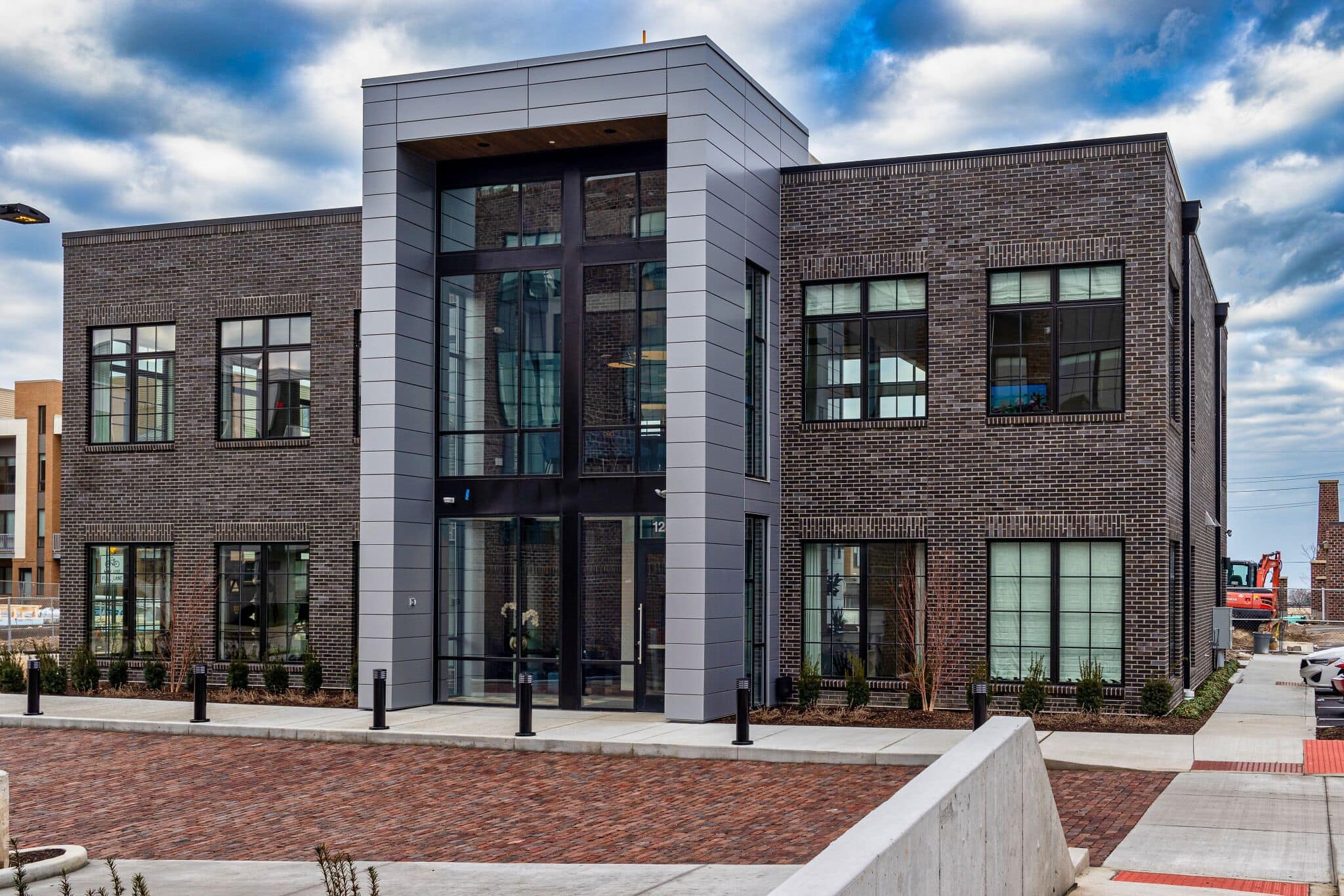
Two-story modern commercial building with dark brick exterior, large windows, and a central glass entrance, set on a paved street under a partly cloudy sky.

Elevated Living, Thoughtfully Designed

January 14, 2026 by Cheryl Beachy Stauffer

Elevated Living, Thoughtfully Designed

Multi-Family
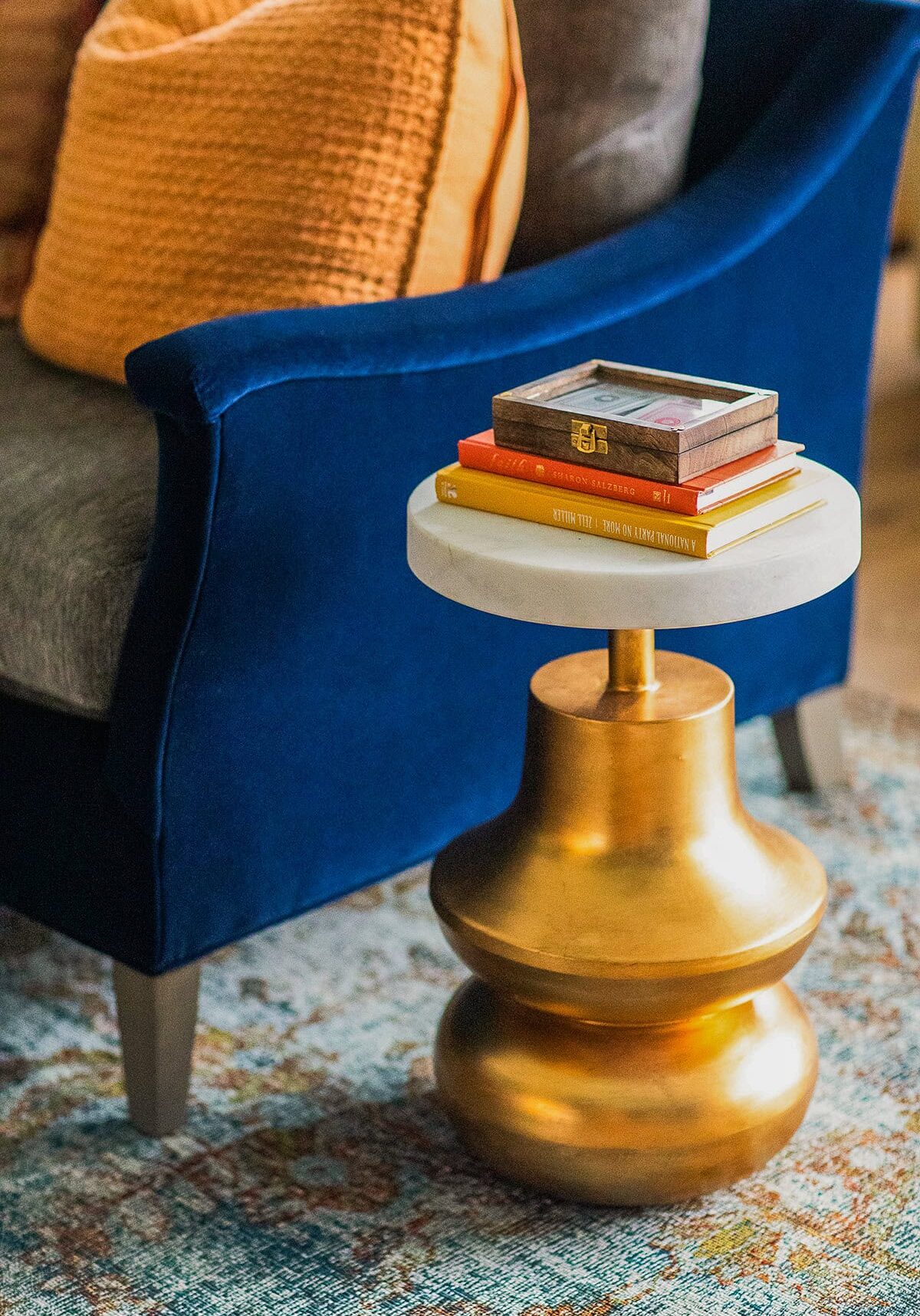
A round gold side table with a white top holds stacked books and a wooden box, positioned next to a blue upholstered chair with an orange pillow.
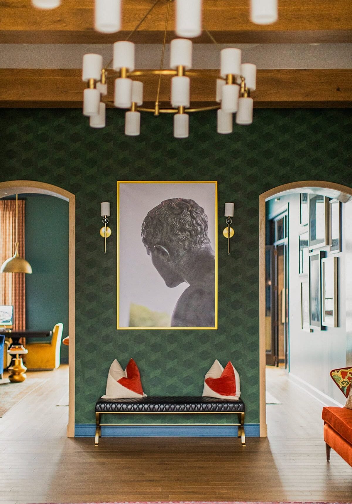
A hallway with green patterned walls features a large framed sculpture photo, a bench with red and white cushions, and a modern chandelier overhead.
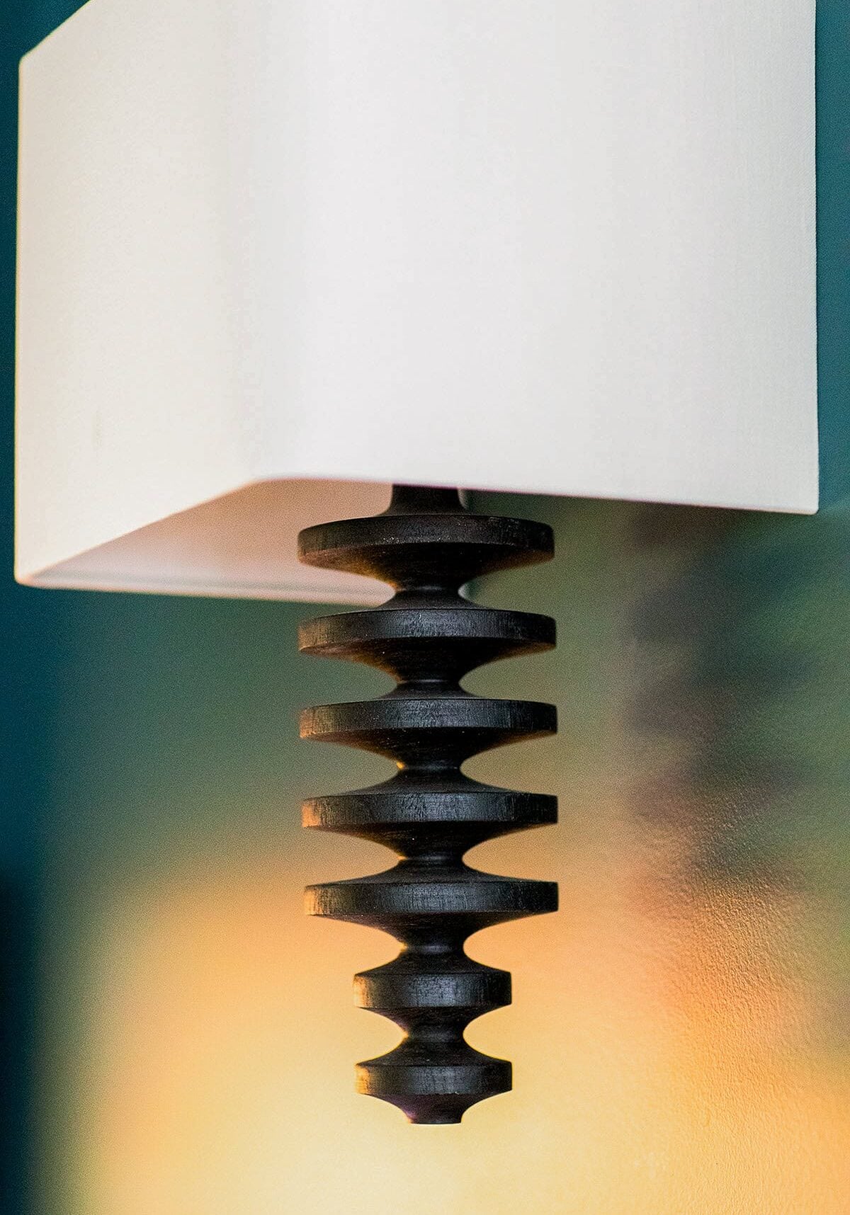
A modern wall-mounted light fixture with a white rectangular shade and a spiral, ridged black metal accent casting shadows on the wall.
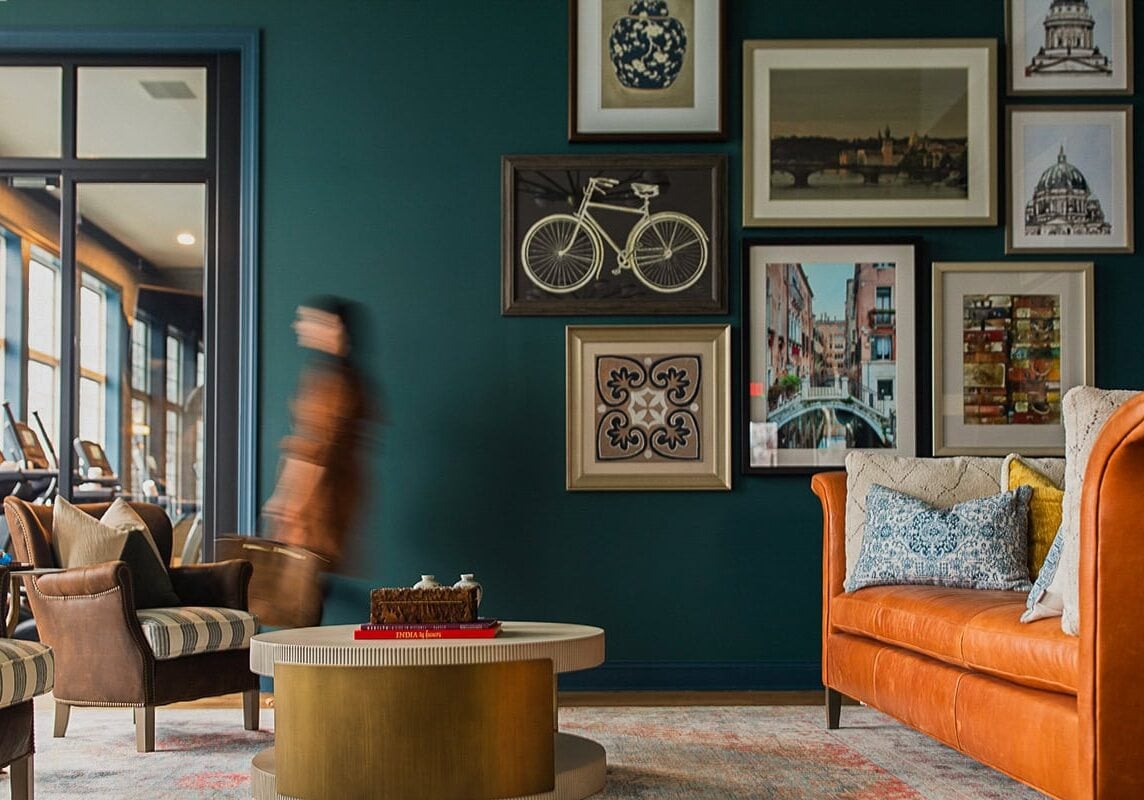
A blurred person walks in a modern living room with a green wall, leather chairs, a round coffee table, and framed art including a bicycle and cityscape.

Sheldon Park was designed to feel refined, welcoming, and versatile. It’s an amenity experience that supports the elevation of everyday living. Crimson Design Group designed a full suite of clubhouse and amenity spaces that would appeal to a wide resident base and reinforce the community’s position as a high-end multifamily offering.

The design leans transitional, striking a balance between warmth and polish. From the entry and reception areas to the club room, coffee bar, and business center, each space was planned to feel connected and intuitive, encouraging residents to move easily between work, relaxation, and social time. Thoughtful layouts and layered furnishings help the clubhouse feel active and engaging throughout the day.

Amenities were programmed to support how residents actually live. Dedicated areas for fitness, gaming, entertainment, meetings, and quiet focus ensure the clubhouse works hard for the community, while the model apartment reinforces the overall design vision and helps prospects imagine themselves at home.

Completed in April 2023 after a year-long design and build process, Sheldon Park delivers a cohesive, polished amenity experience — one that feels current, comfortable, and well-suited to its Columbus setting.

Project Partners:
Upholstery: Fortner Inc.

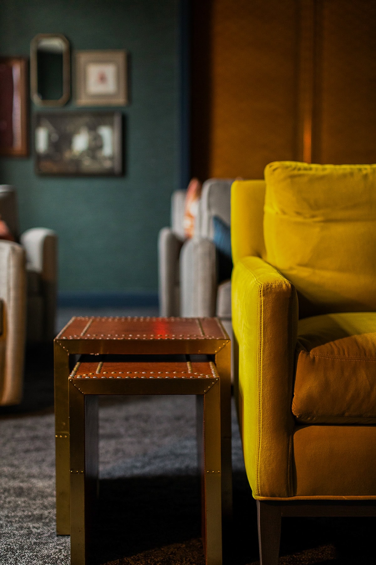
A yellow armchair is positioned next to two nested wooden tables with brass edges; grey armchairs and framed wall art are visible in the background.
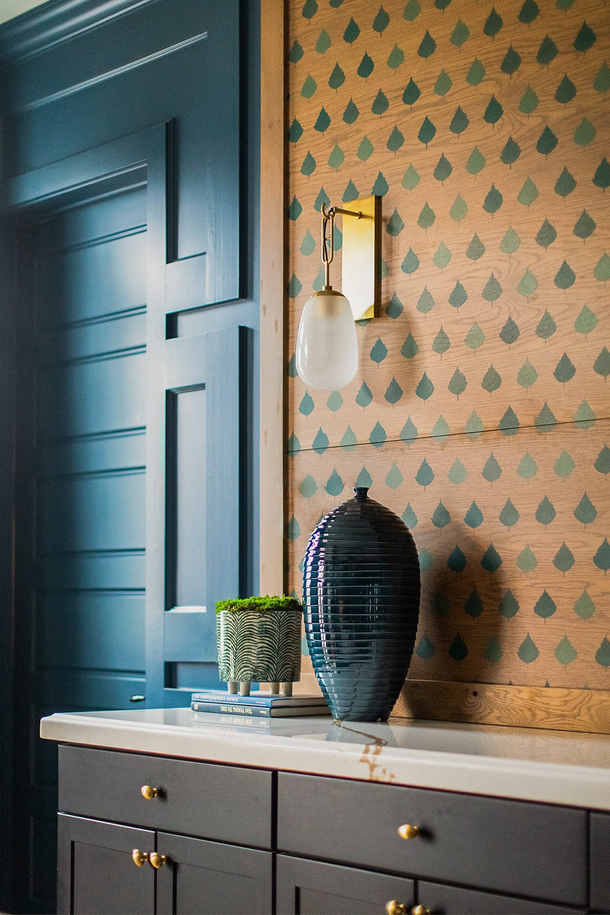
A modern interior features a navy cabinet with gold hardware, a white countertop, a blue vase, a small plant, patterned wallpaper, and a wall sconce with a frosted glass shade.
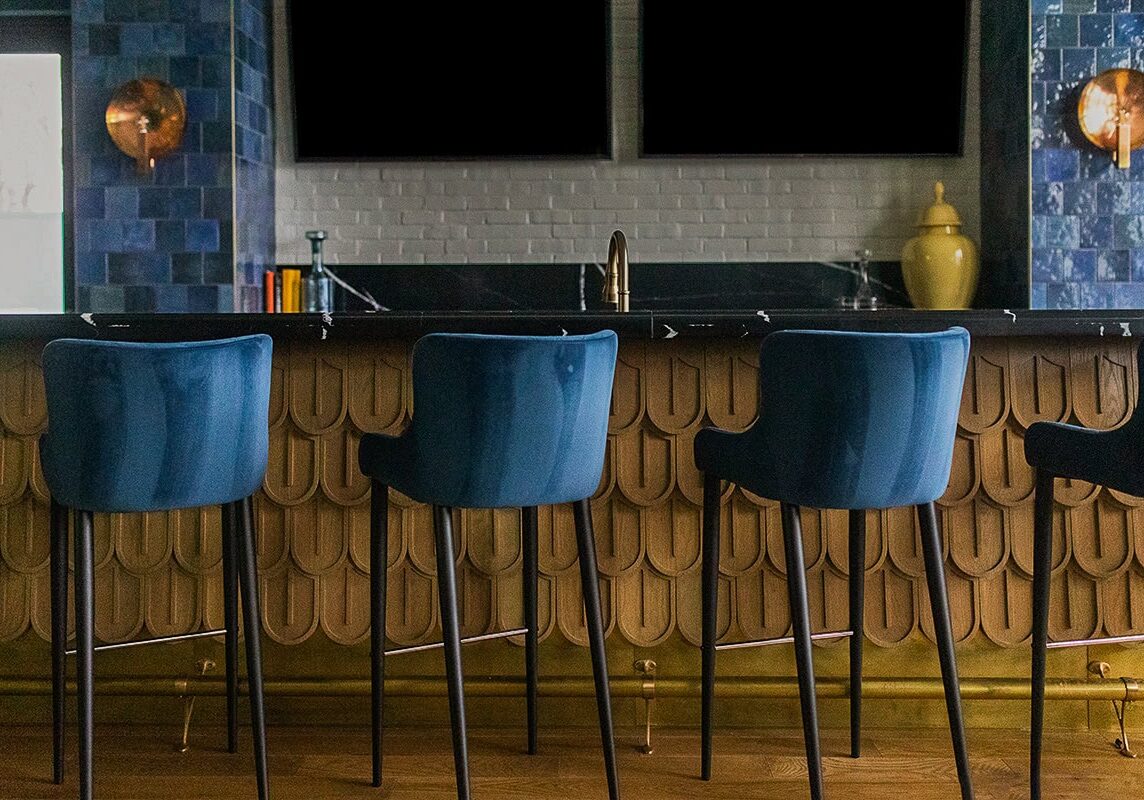
Four blue barstools are lined up at a bar with a patterned front panel; the bar area features blue tiles, wall sconces, and a white brick backsplash.

Urban Living, Boutique Feel

January 14, 2026 by Cheryl Beachy Stauffer

Urban Living, Boutique Feel

Multi-Family
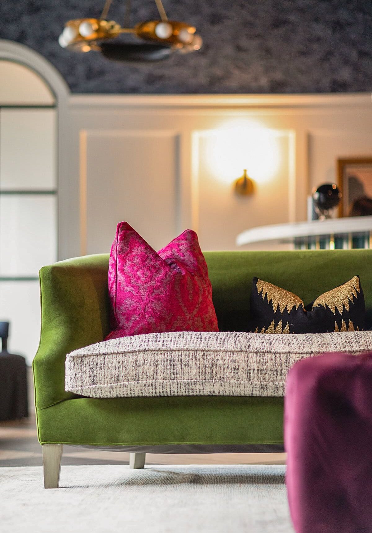
Green sofa with textured seat cushion, two accent pillows—one bright pink and one black with gold pattern—sits in a modern, elegantly decorated room.
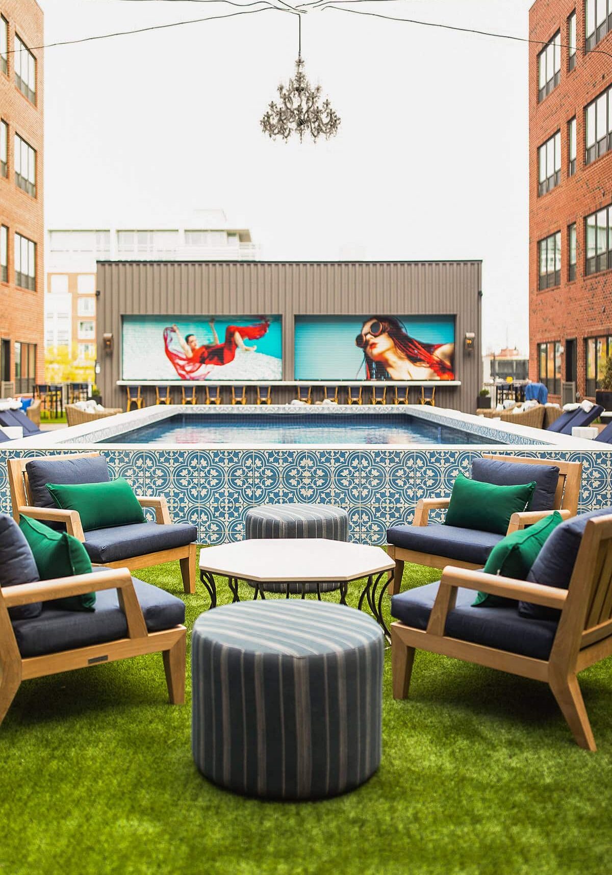
Outdoor lounge area with cushioned chairs and ottomans on artificial grass, facing a tiled pool and digital screens displaying images of women swimming.
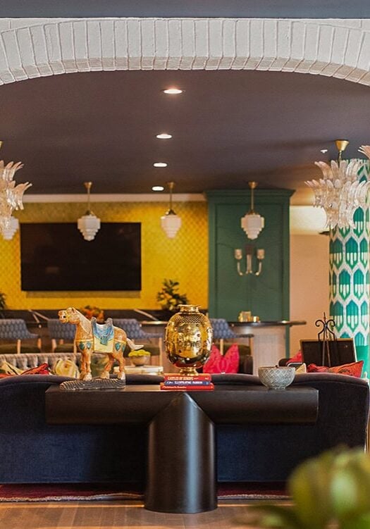
A modern lounge with eclectic decor, featuring a black sofa, ceramic vases, decorative objects, and green chairs under ornate light fixtures and patterned walls.
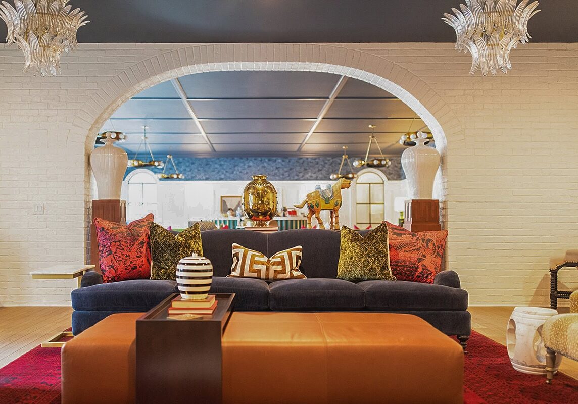
A chandelier with gold metal arms and clear, leaf-shaped glass pieces, viewed from directly below against a dark background.
A living room with a blue velvet sofa, colorful patterned pillows, a camel figurine, and a gold vase, set under a white brick archway with modern chandeliers overhead.

Urban Living, Boutique Feel

This multifamily project on High Street was about making a clear statement in a dense, highly competitive urban market. The developer wanted to establish their own point of view by creating a community that felt more like a boutique hotel than a standard apartment building, while still offering the comfort and familiarity residents look for in a place to live.

Crimson leaned into bold material and color choices to help the building stand apart from neighboring properties. The amenity spaces were designed to feel memorable and inviting, encouraging residents to actually use them and connect with one another. Even though the clubroom footprint was modest, thoughtful planning allowed for multiple zones and types of programming, making the space feel layered and purposeful rather than cramped.

Behind the scenes, coordination played a major role. With retail and restaurant tenants occupying the ground floor, access to the second-floor clubhouse required careful planning and sequencing during install — a challenge Crimson handled quietly to keep the project moving smoothly.

Once complete, the results spoke for themselves. The property leased up quickly, with residents responding positively to the elevated unit finishes and the contrast between the urban setting and the warm, residential feel of the amenity spaces.

Project Partners:
Upholstery: Fortner Inc.

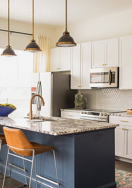
Modern kitchen with white cabinets, a blue island, marble countertop, three pendant lights, brown chairs, stainless steel appliances, and a large window with beige curtains.
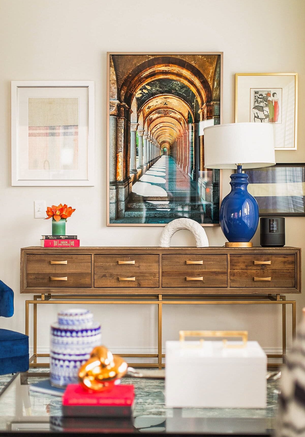
A mid-century modern console table with brass accents sits against a wall, topped with books, a blue lamp, and decor. Framed artwork, including an arched hallway photo, hangs above.
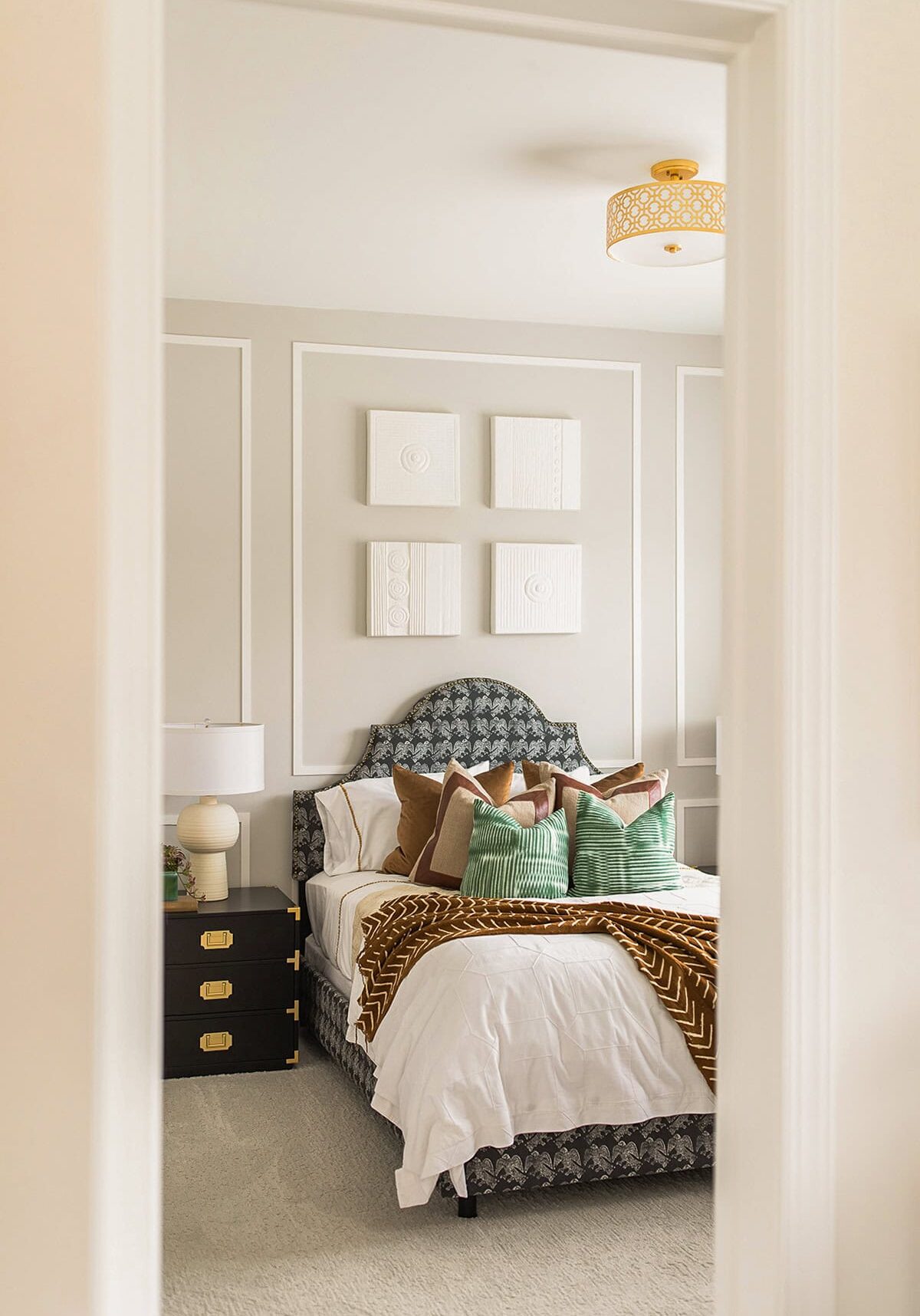
A neatly made bed with patterned pillows and a brown blanket is centered in a modern bedroom with white walls and minimalist wall art.
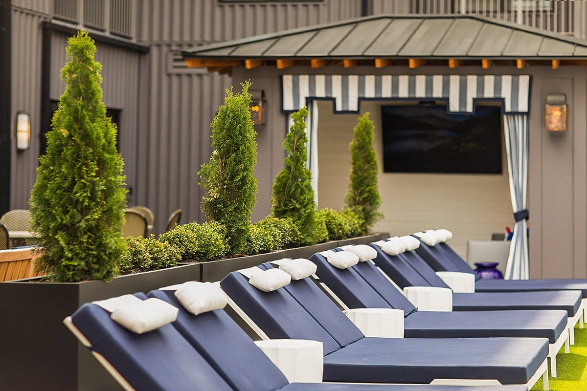
A row of navy blue lounge chairs with white headrests is arranged beside tall potted shrubs, in front of a cabana with striped blue and white curtains.
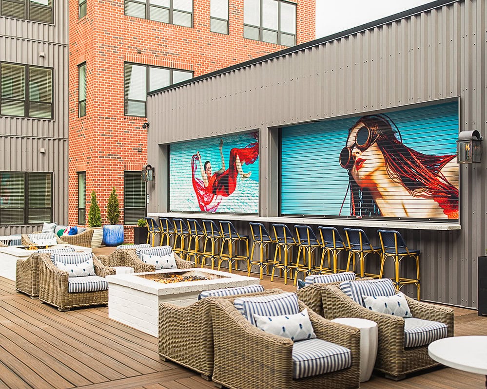
Outdoor patio area with wicker lounge chairs, a bar lined with stools, and colorful murals of women on a metal wall. Brick building with large windows in the background.
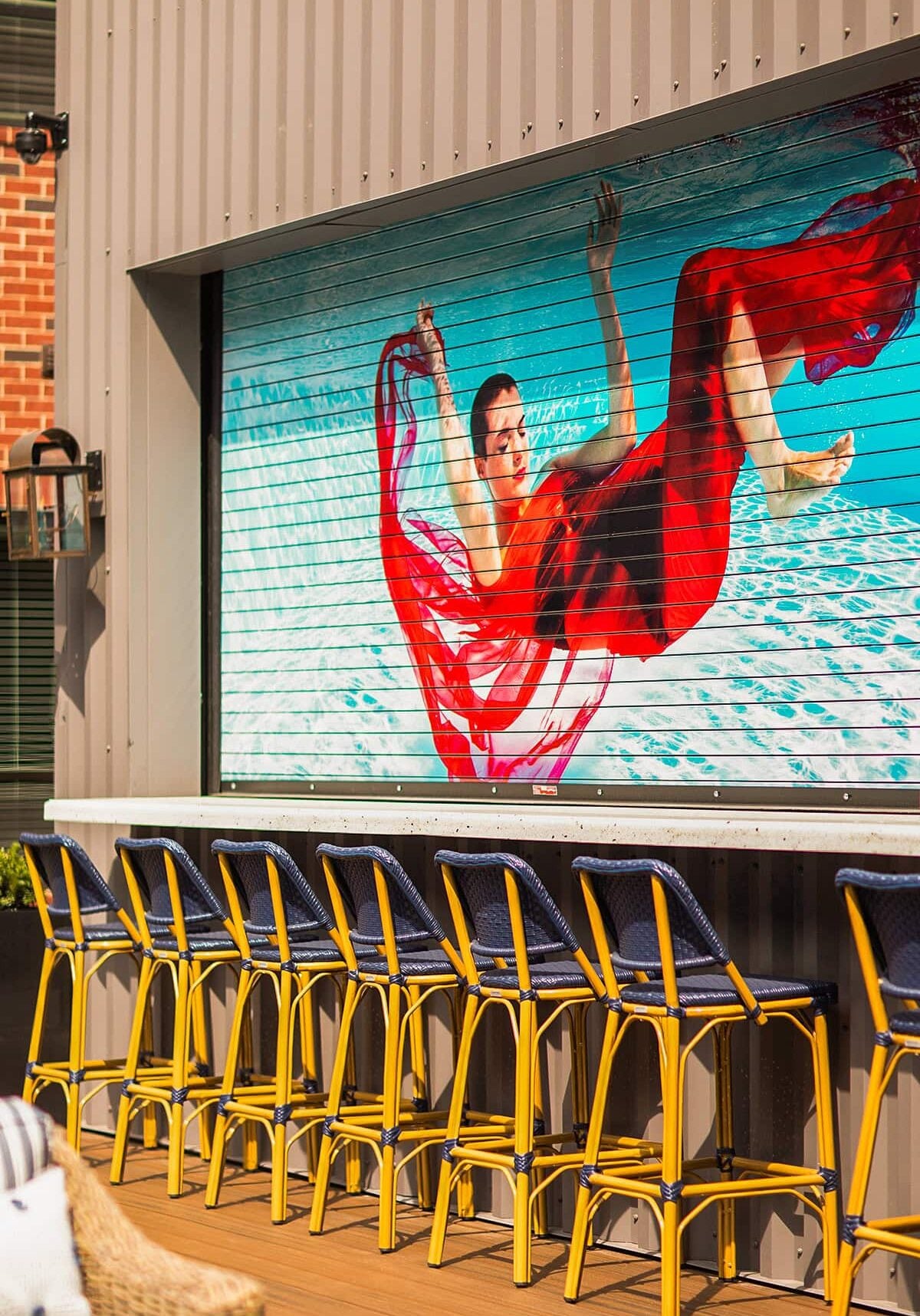
A mural of a woman in a red dress underwater decorates a wall above a row of yellow and blue barstools at an outdoor seating area.
Colorful mural of a woman with red braids, wearing large round goggles and red lipstick, painted on a corrugated metal surface against a bright blue background.
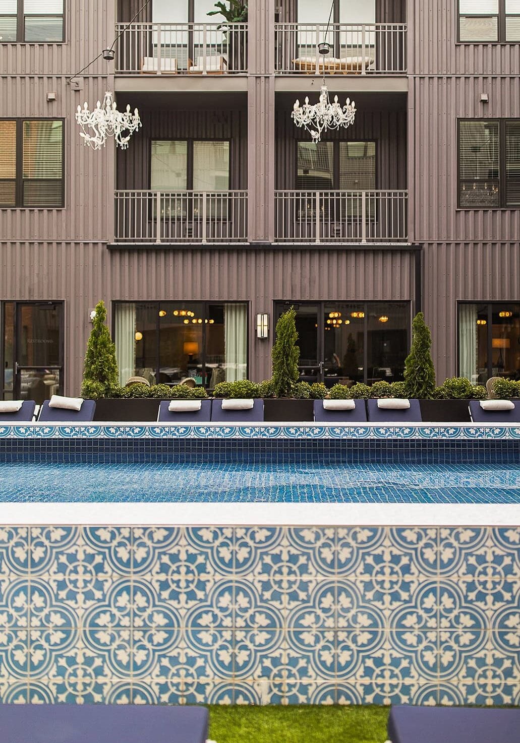
A patterned tile swimming pool with blue lounge chairs, in front of a modern building with balconies and hanging chandeliers.

Bringing the Outdoors In

January 13, 2026 by Cheryl Beachy Stauffer

Bringing the Outdoors In

Multi-Family
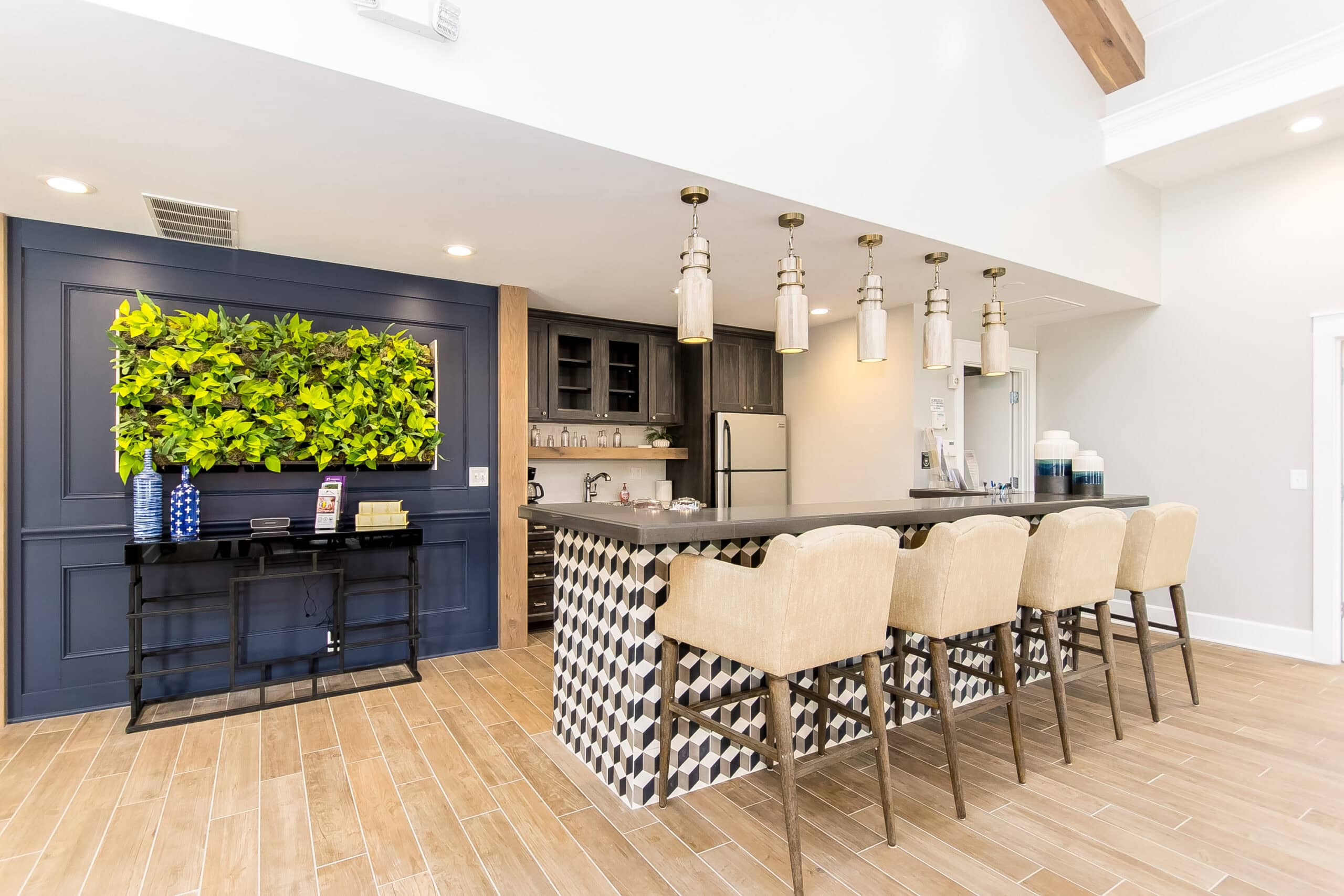
Modern kitchen area with a patterned island, four beige barstools, hanging pendant lights, a vertical plant display, wood flooring, and a table with water dispensers.

Bringing the Outdoors In

Gardens at Easton was designed to reflect the client’s brand from the moment residents step inside: playful, bright, and grounded in nature. The goal was to create amenity spaces that feel easy and welcoming, while still offering moments of surprise and personality.

Crimson anchored the interiors with natural elements to give the space a calm, lived-in quality. Live green walls, a palette of greens, blues, and soft neutrals, and organic textures work together to bring the outdoors in, creating an environment that feels refreshing and familiar at the same time. 

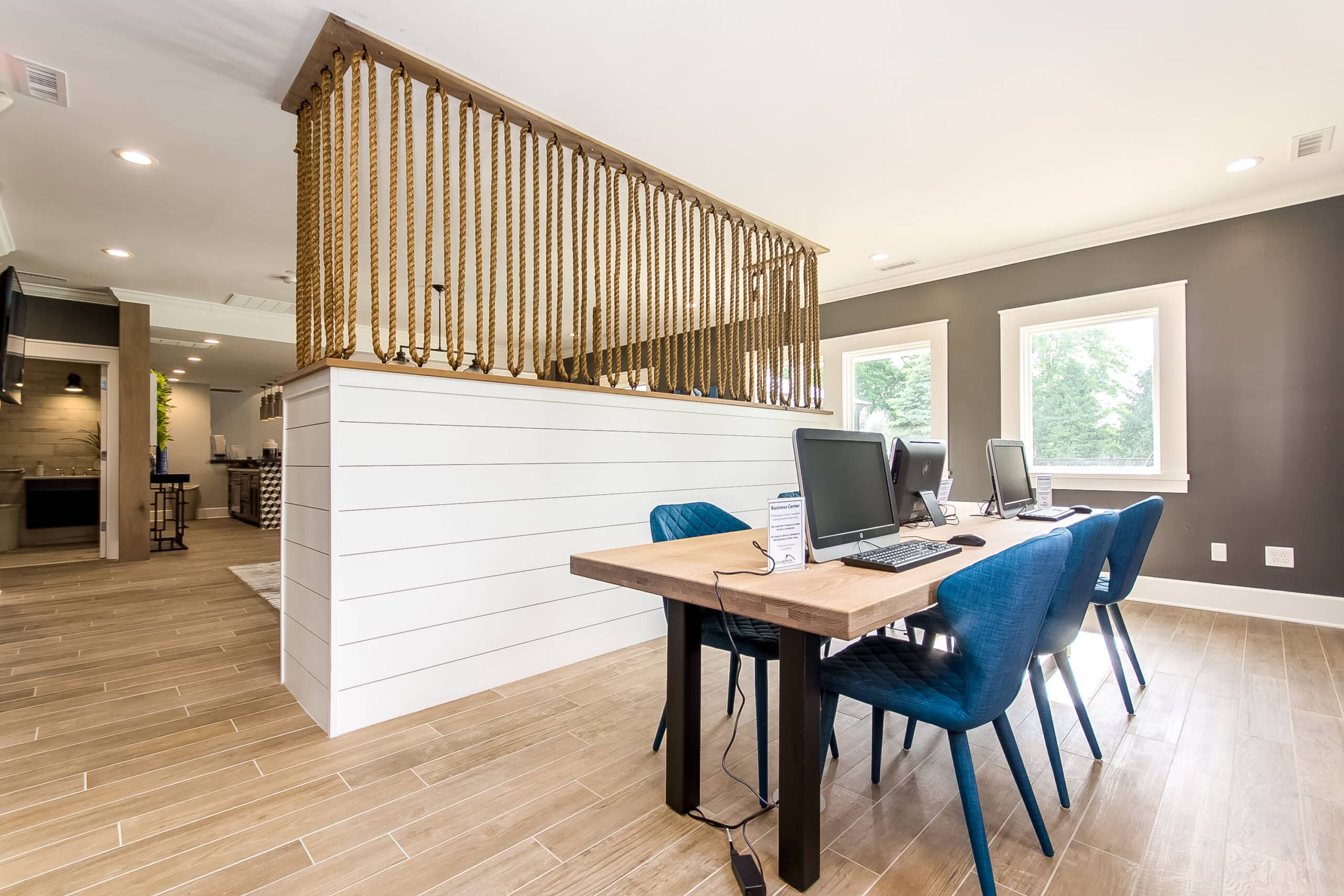
To keep things from feeling too serene, modern geometric patterns and a whimsical rope accent wall add contrast and energy. These unexpected details inject personality and movement, reinforcing the community’s identity while keeping the overall experience light and approachable.

The finished spaces strike a thoughtful balance: grounded, inspiring, and just playful enough to feel memorable.

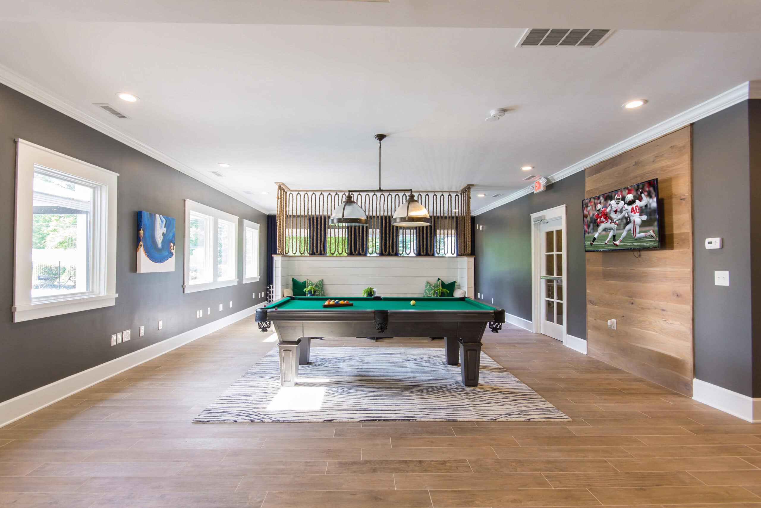
A modern game room with a pool table in the center, a TV on the wood-paneled wall showing a football game, and large windows providing natural light.
A modern workspace with three computers on a wooden table, blue chairs, light wood flooring, and large windows letting in natural light.
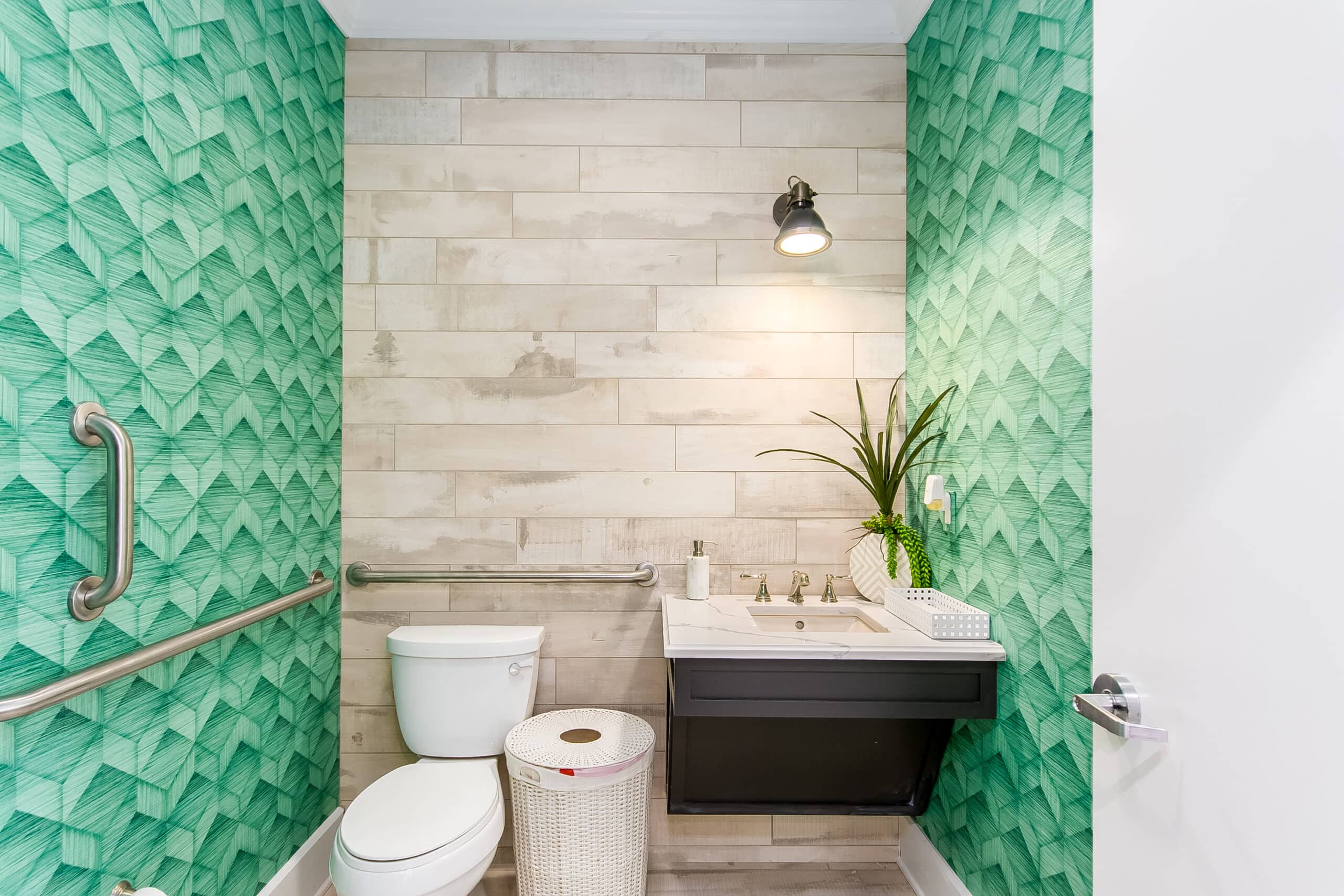
Small bathroom with green textured wallpaper, a white toilet, wicker laundry basket, wall-mounted sink with decor, and a single light fixture above.
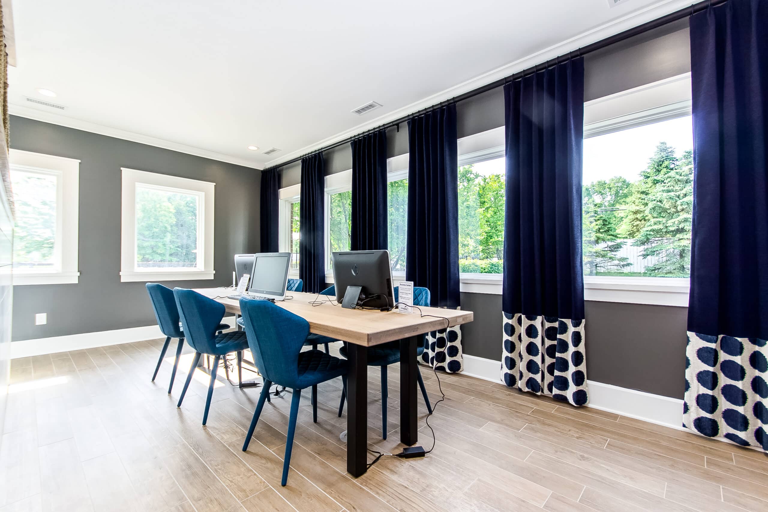
Modern office space with three blue chairs, a wooden desk with two computers, and large windows with dark blue curtains overlooking greenery.

Belmont House

January 13, 2026 by Cheryl Beachy Stauffer

Belmont House

Multi-Family
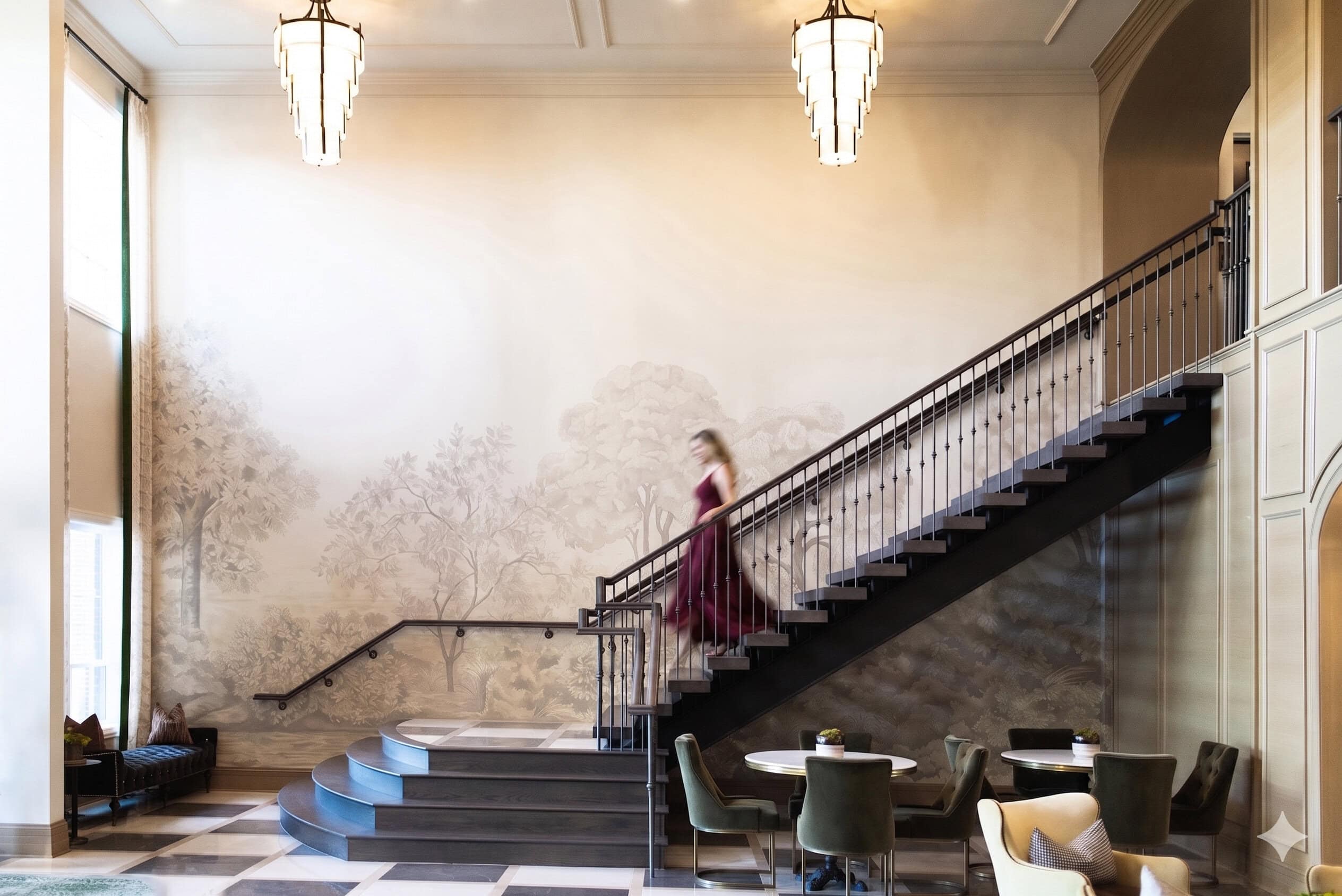
A woman in a long red dress descends a grand staircase in an elegant, spacious room with high ceilings, large wall art, and modern furnishings.

New Palette, Hotel Soul

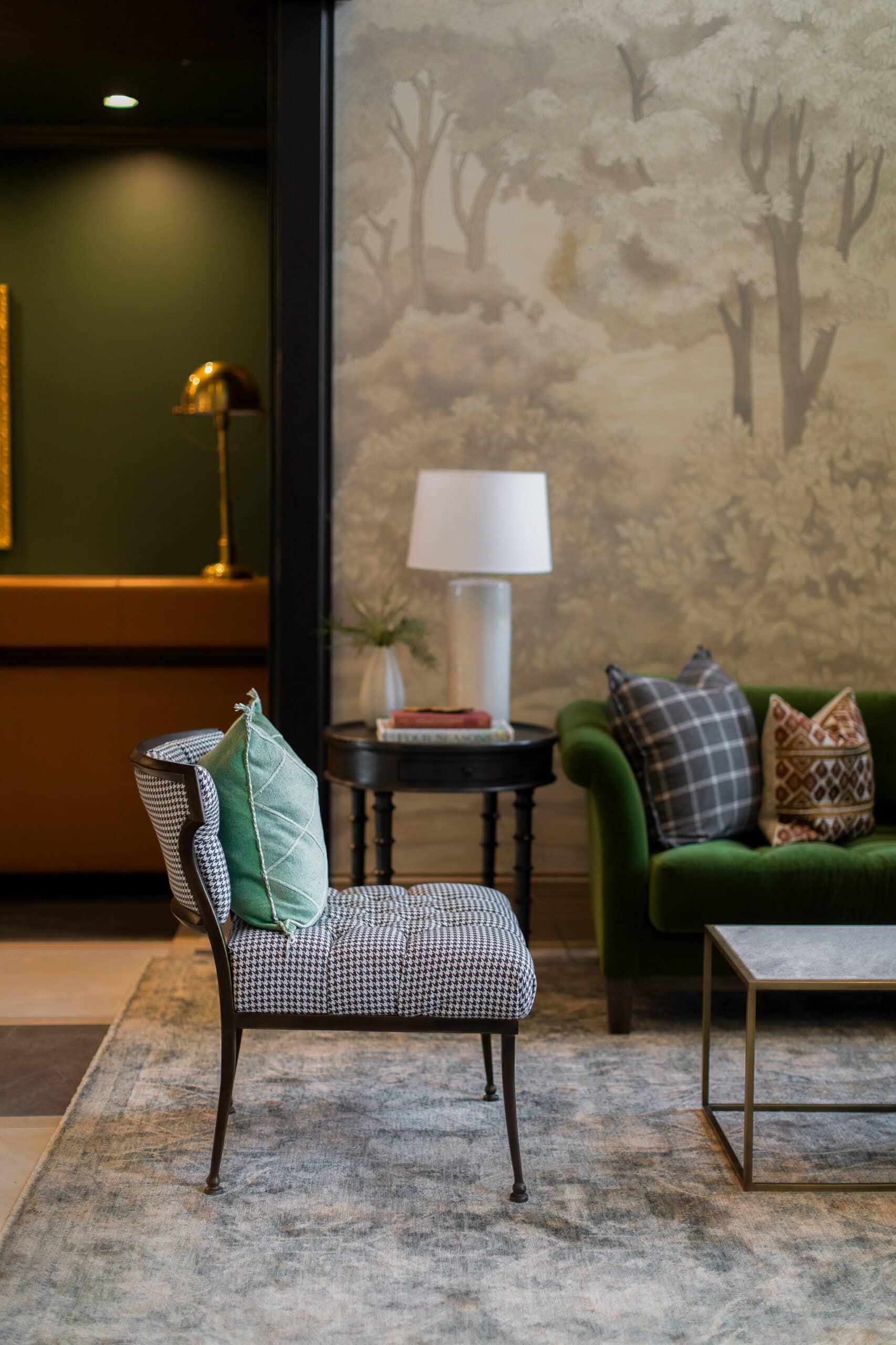
When Preferred Living brought Crimson in on Belmont House, the brief carried two challenges that didn't usually travel together. This was a luxury PL community on Columbus's west side, at the corner of Trabue and McKinley, and it had to read unmistakably as Preferred Living. But Belmont was also the first PL clubhouse where Crimson stepped off the brand's signature navy and built a new palette from the ground up with deep greens in Sherwin-Williams Billiard Green and Dard Hunter Green, warmed with golden yellows and red-orange accents. And the clubhouse wasn't meant to read as amenity space at all. It was meant to read as a boutique luxury hotel, every room feeling like a property a resident might check into for a long weekend, not just pass through on the way home.
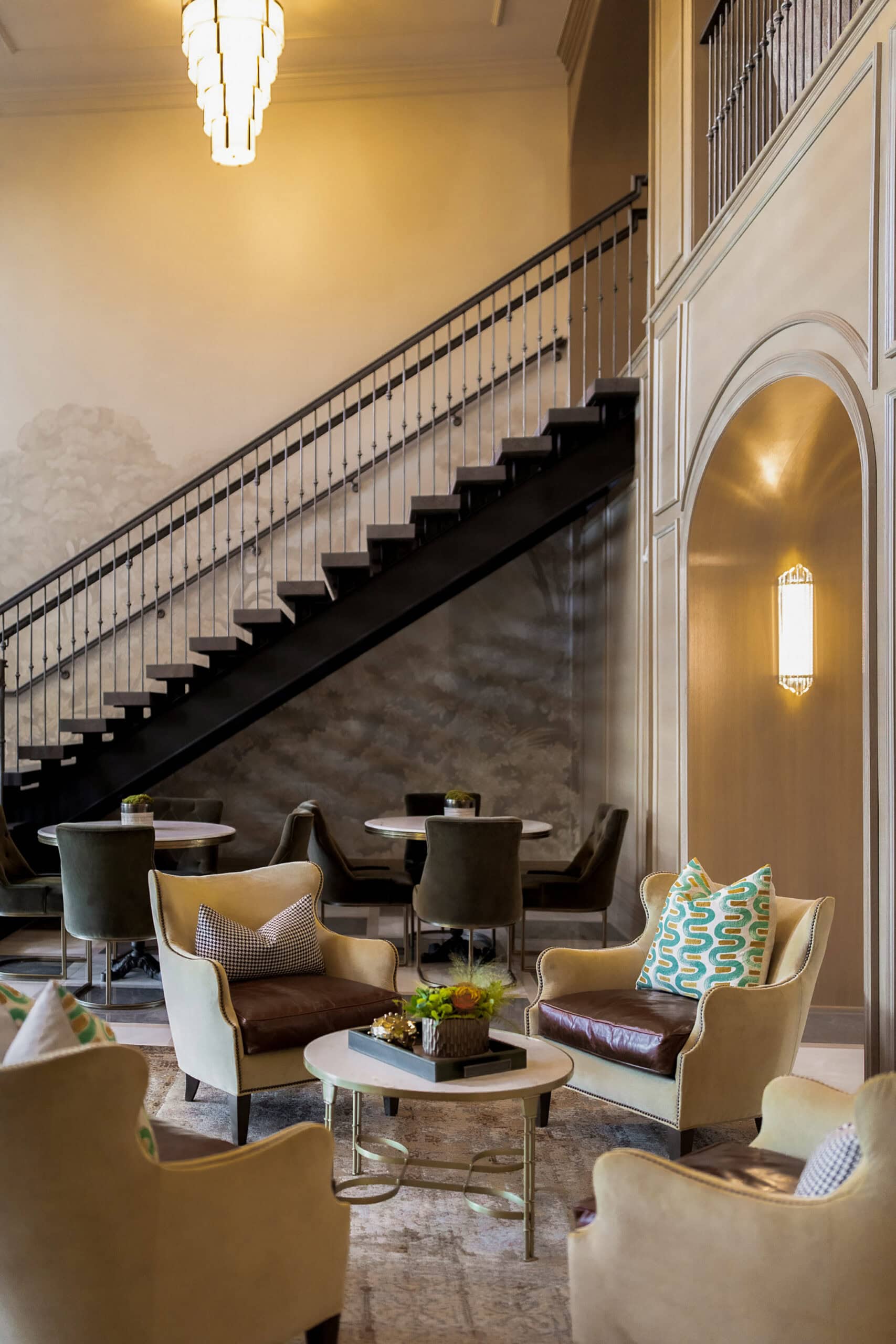
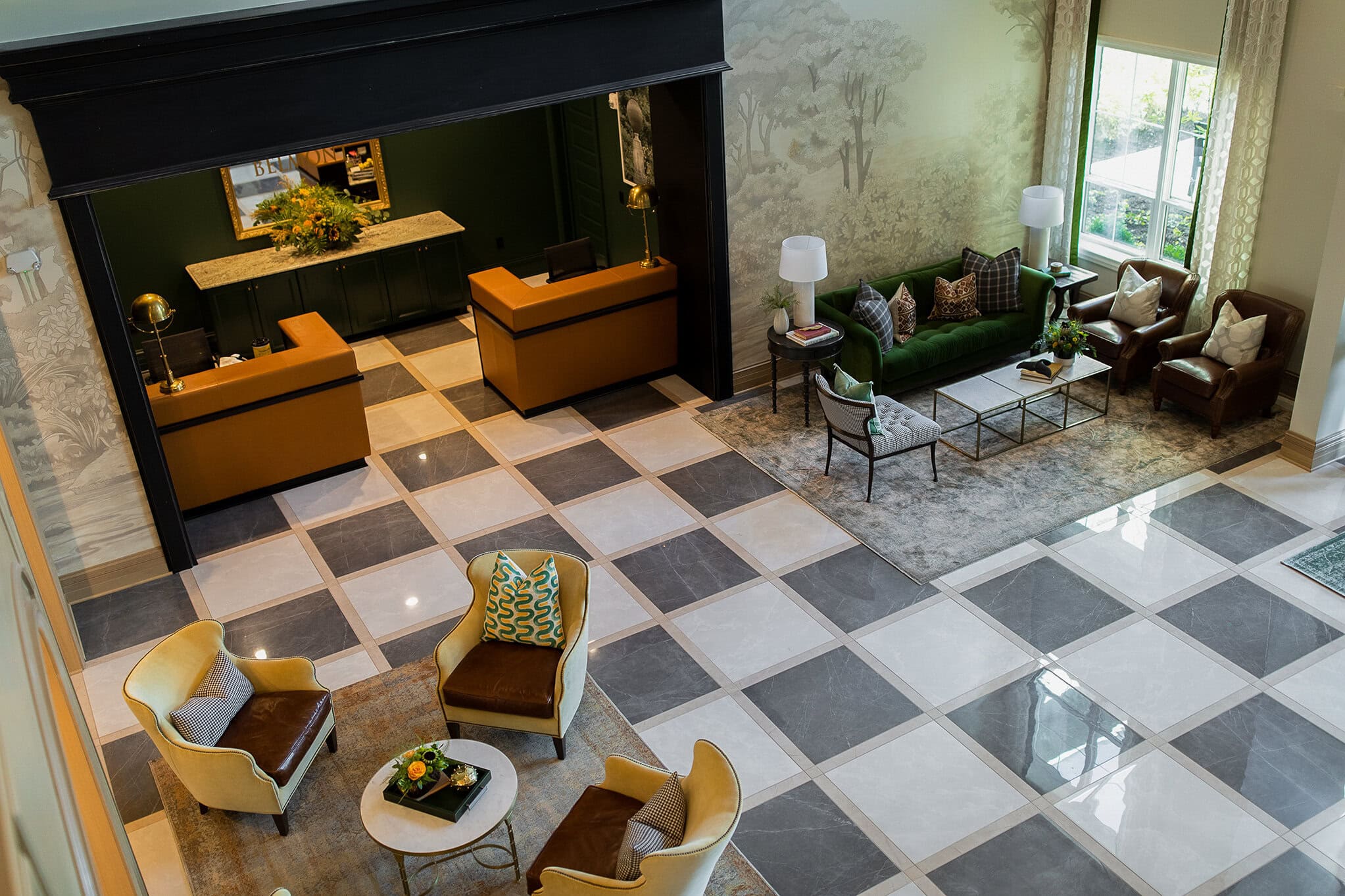
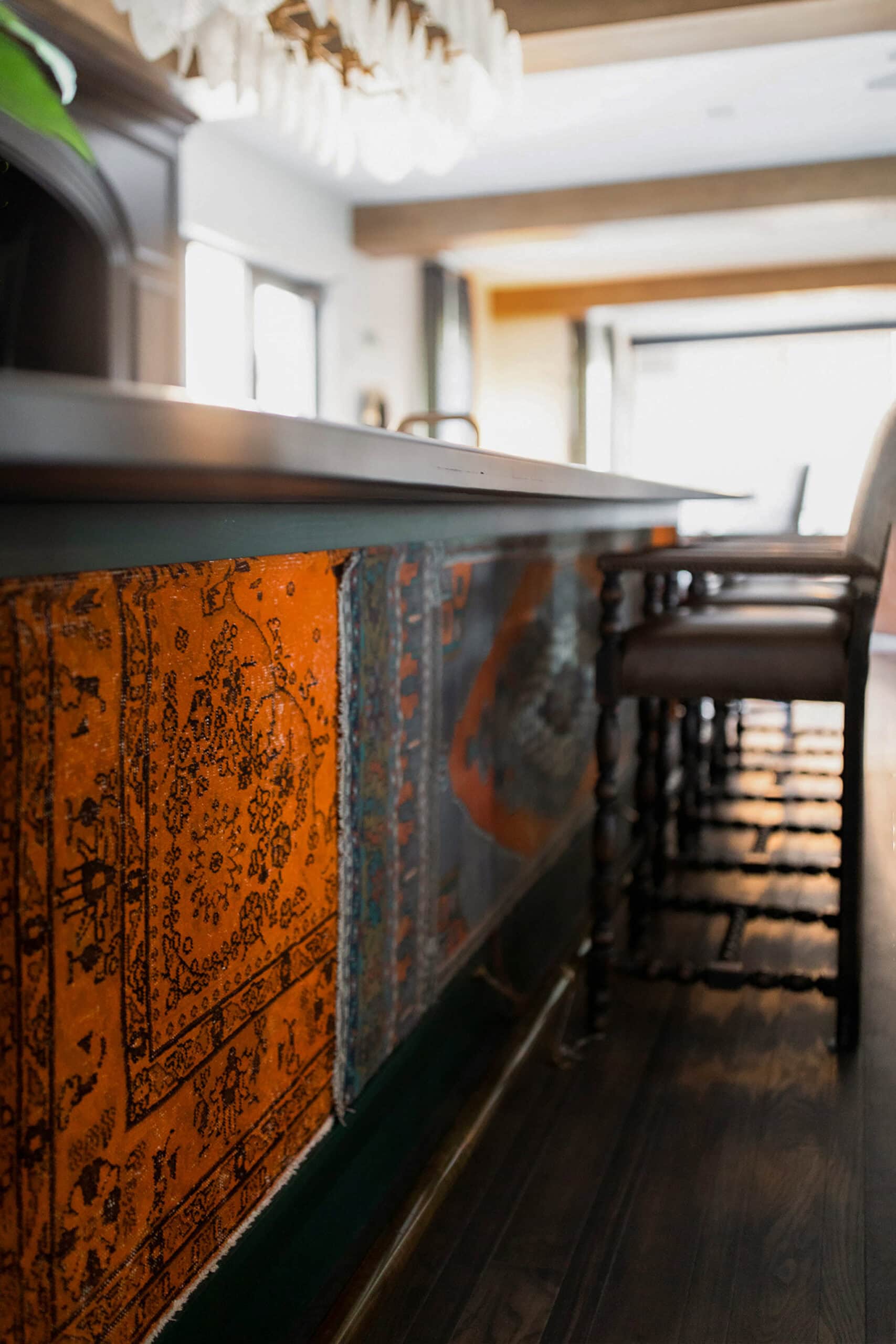
The key design move was the two-story lobby. Crimson designed a grand wall punctuated by five arches in light, natural-oak-toned wood with applied moulding — built, like the bar, by Fairfield Woodworks — anchored by a sweeping open staircase and a checkerboard marble floor in soft gray and deep onyx, bordered in warm beige (Hamilton Parker's Atlas Marvel). Across two of the walls, muralist Sarah DeAngulo Eberly, a longtime Crimson collaborator, hand-rendered black-and-white nature scenes that reimagine an earlier sepia landscape and turn a traditional architectural moment into something distinctly modern. Custom resin-and-metal pendants by Spike Lighting fill the void overhead, and the open staircase carries the curve language through. Off the lobby, the bar takes its cue from Soho House New York, long admired by Crimson's principals and Preferred Living for the rug-fronted millwork at its front desk — and the Belmont version is fronted in vintage-style rugs that Cheryl sourced piece by piece and hand-cut to fit, their rounded edges echoing the arches above. Inside, custom U-shaped banquettes by Fortner define the social zones. Fifteen-plus custom pieces in all make Belmont feel less like a clubhouse and more like a hotel floor that happens to have apartments above it.
The Red Glove moment was the floor plan and the void. A two-story lobby is a designer's gift and a designer's trap because the height makes a room feel grand and also makes it easy for the eye to land nowhere. Crimson took the void as an opportunity instead of a problem, layering ceiling detail, lighting, the open staircase, the railing line, and the muralled wall so that every plane gives the eye somewhere to go. At the same time, the team rebuilt the brand: a new palette without the safety net of PL's navy, balanced carefully enough that Belmont still reads cleanly as a Preferred Living property. New plan, new palette, new category — all on one project, and the building still feels of a piece with its sister communities.
Client happy, residents happy, and a luxury-hotel clubhouse on Columbus's west side that opened the door for everything Preferred Living and Crimson have done together since. Belmont House is the project where the navy came off, the arches went up, and the brief got bigger and the building tells you so the moment you walk through the front door.


Project Partners:
Upholstery: Fortner Inc.

A modern living room features a patterned chair with green and gray pillows, a green sofa, a side table with a lamp, and a coffee table on a rug with a tree mural in the background.
A modern lounge area with beige armchairs, patterned cushions, small round tables, and a black metal staircase against a light-colored wall.
A spacious lobby with a checkered tile floor, reception desks, seating areas with chairs and a green sofa, large windows, and neutral-colored decor.
A close-up of a bar with upholstered orange patterned panels, wooden chairs, and sunlight streaming in from large windows in the background.
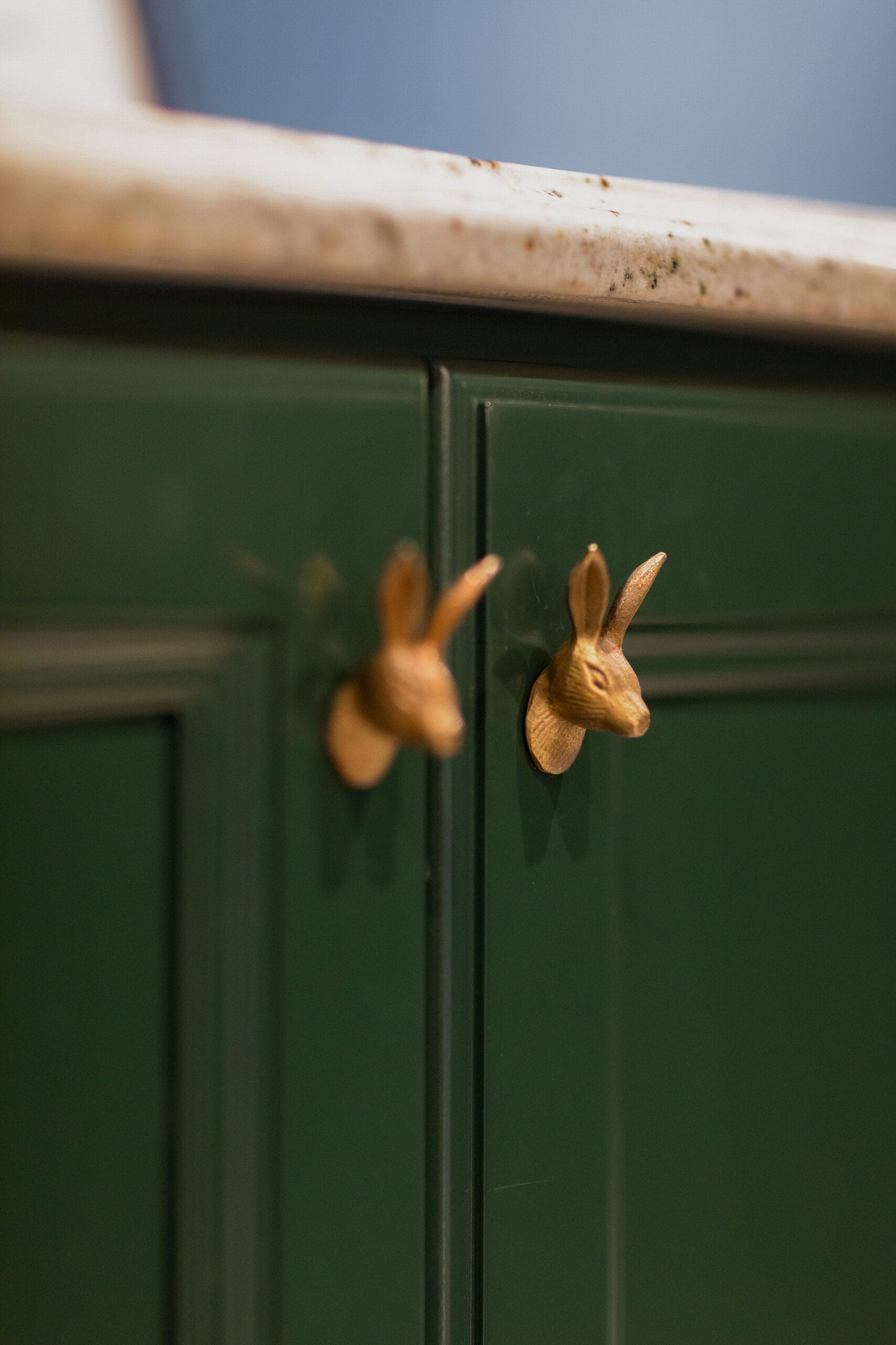
Two green cabinet doors with gold rabbit head-shaped handles and a light-colored marble countertop above.
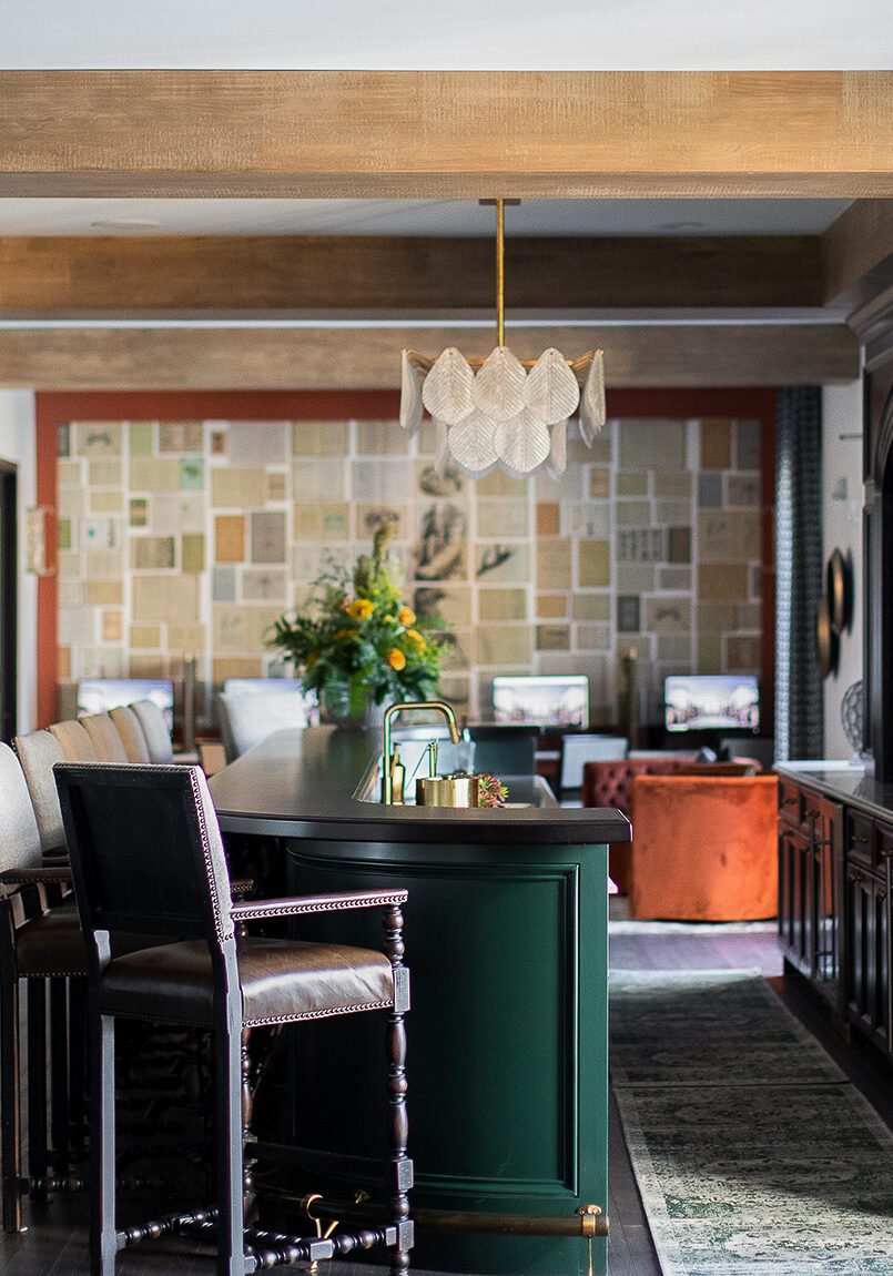
A modern, well-lit living space with a green bar, upholstered chairs, wood accents, a wall of art, and large windows allowing natural light inside.
A ceramic vase with a dark matte finish and geometric beige and orange patterns, featuring three ring-shaped handles on each side, standing on a dark surface.
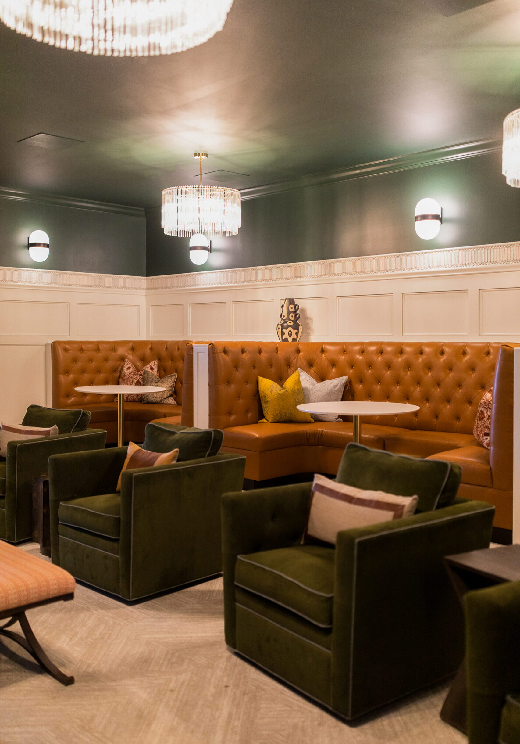
A lounge area with olive green armchairs, tan tufted banquette seating, pillows, small tables, and two ceiling chandeliers.
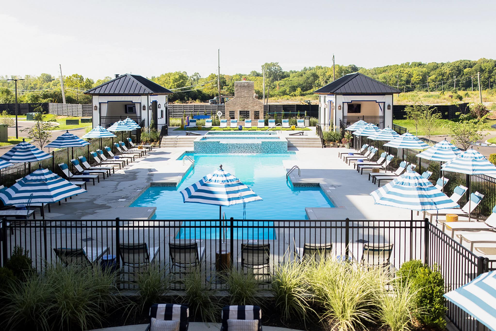
Fenced outdoor pool area with blue and white striped umbrellas, lounge chairs, two cabanas, and a central swimming pool surrounded by greenery.
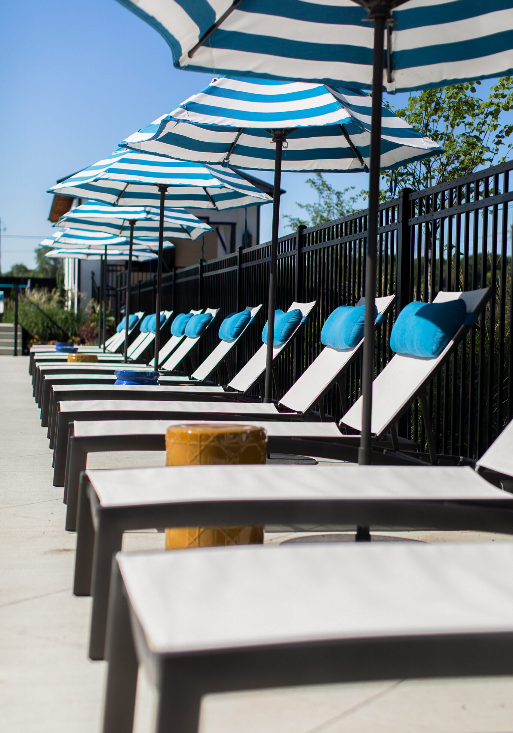
A row of empty lounge chairs with blue cushions and striped umbrellas beside a black metal fence on a sunny day.
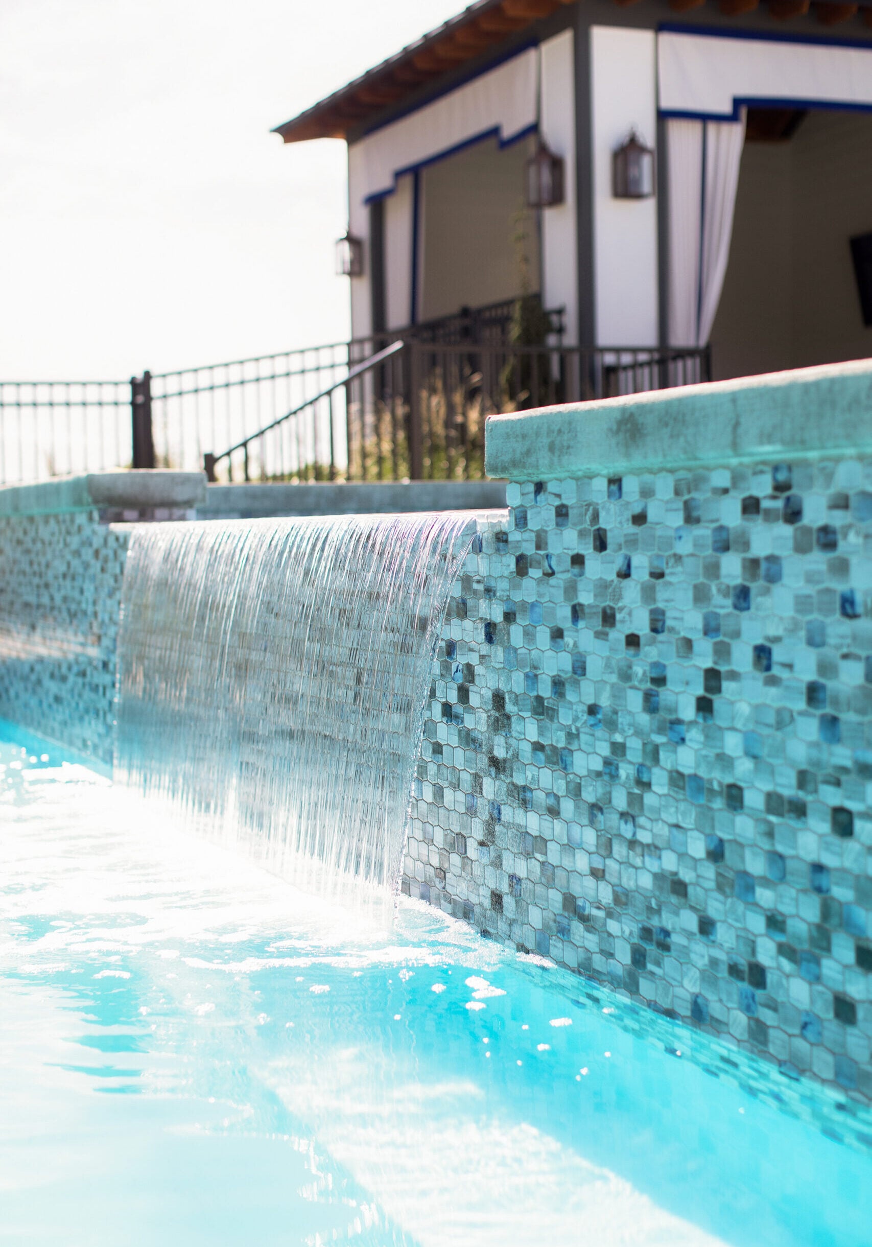
A close-up of a swimming pool with blue mosaic tiles, featuring a waterfall edge and a poolside cabana in the background.
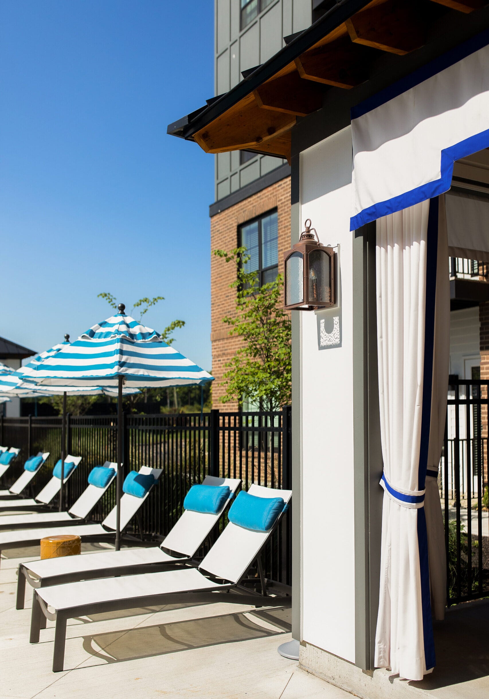
Lounge chairs with blue towels and striped umbrellas by a poolside cabana on a sunny day.

A Resident-Centric Clubhouse That Works Harder

January 13, 2026 by Cheryl Beachy Stauffer

A Resident-Centric Clubhouse That Works Harder

A decorative bar cart with a dark vase, yellow planter, and plant stands against glossy brown tiles; above hangs framed art of an ornate window. Sunlight from the right highlights this Westerville Ohio-inspired nook.
Modern luxury hotel lobby at Baxter Lifestyle with sophisticated seating and warm ambient lighting
A small marble-top table with a flower arrangement sits by a red upholstered corner bench, patterned pillows, framed wall art, and a single wooden chair in a cozy Westerville Ohio room.

A Resident-Centric Clubhouse That Works Harder

A thoughtfully designed clubhouse that elevates amenities to support rapid lease-up and resident engagement within a suburban multifamily community.

Category

Multi-Family

Location

Westerville, Ohio

Community Context

Multifamily | Clubhouse & Amenity Space Design

Year

2021

A modern brick building with large arched windows, metal gates, and a sign reading "Baxter" in front of the entrance.
Three workstations with brown chairs and desktop computers are set in pink alcoves, each with a framed light bulb print above and geometric wallpaper backgrounds.

The Vision

Draw residents into the clubhouse by creating spaces that feel both elevated and livable.

Crimson’s design for the clubhouse was rooted in the idea that amenity spaces should feel like destinations — places residents want to use, return to, and enjoy sharing with friends and neighbors. The clubhouse needed to support a range of social and functional activities while anchoring the community’s identity in a way that distinguishes it from other local rental options.

The Approach

Design intentional spaces — big on experience, smart in execution.

With a clear goal to activate the clubhouse, Crimson looked for ways to make every square foot matter. A standout move was rethinking the business center. Instead of a long desk array where users ended up staring at a blank wall, Crimson designed semi-private cubbies that offer designated workspaces while still feeling open to the larger clubroom. This not only improved function but sparked social interaction and comfort, a design choice that the developer adopted as a new standard for their properties.

The lobby space was also crafted with moments of impact in mind. A cloud mural anchors the back wall behind the leasing station, setting a tone of elevated warmth, while full-height bookcases filled with only cream and white books and accessories create stark, intentional contrast.

The Impact

Spaces designed to be used, not just looked at.

Once complete, the clubhouse delivered what the design intended: amenity spaces that feel special but accessible, elevated yet livable. The overall feel of the space was more refined than typical suburban clubhouse environments, thanks to the thoughtful use of color, finishes, and layout.

Baxter Park continues to compete well within its submarket — a community where residents enjoy not just the private residences, but the shared spaces that support connection, comfort, and everyday life.

Review sentiment highlights the community’s strong sense of community and proactive management, suggesting that the amenity experience is supported by resident satisfaction with staff and lifestyle offerings.

“This clubhouse was designed to be used — comfortable enough for everyday routines, vibrant enough for social gatherings, and full of details that make residents want to spend time here.”

Our Favorite Details

Design moves that make the clubhouse memorable and functional.

  • Semi-Private Work Cubbies: Redesigned work spaces that feel open but purposeful, offering both privacy and connection.
  • Grand Lobby Presence: The cloud mural and curated white bookcases make the lobby feel impactful and welcoming.
  • Material Strategy: Bold use of color and finish supports an elevated feel suitable for the suburban market context.
  • Programming Rhythm: Thoughtful adjacency of spaces allows casual lounging, work, and socializing to happen comfortably in one place.

Bold.
Unexpected.
Memorable.

A small round gold side table holds stacked books, a blue bowl with wooden beads, and tassels in a bright, modern living room with a green sofa and patterned pillows.
Modern living room and kitchen with a bar counter, four stools, two large pendant lights, patterned curtains, and eclectic seating arrangements.

Notes from the Design Team

This project was all about refining standard amenity typologies to better support resident behavior. The improved business cubbies are a great example because they came out of an early review of how residents actually use the space, rather than relying on a template solution.

Even small efforts, like sourcing cream-spined books for the lobby bookcases (which involved countless trips and a lot of online hunting), contributed to the overall elevated feel, showing how attention to detail matters even in areas residents might not consciously register.

Three navy blue bookshelves filled with white books and decorative items stand behind two gray armchairs with red pillows; a potted plant sits nearby on a patterned rug.

Services Provided:

Multifamily Amenity & Clubhouse Design

Space Planning & Layout

Material & Finish Selection

Custom Furniture & Styling

FF&E Specification & Procurement

Installation Oversight

Our Expertise
Two green doors with black handles against a vibrant, patterned, red and yellow rug or tapestry backdrop.
A white cabinet with gold handles sits below a framed bicycle artwork, flanked by potted plants on a patterned carpet in a bright, modern room.
Three navy blue bookshelves filled with white books and decorative items stand behind two gray armchairs with red pillows; a potted plant sits nearby on a patterned rug.
A gray leather armchair with red and striped pillows sits in front of a dark blue built-in bookshelf filled with books, vases, art, and decor items.
A modern kitchen with a marble countertop, three black barstools, a bowl of ferns, large windows, and patterned yellow curtains.

We are proud to say that this client has the pleasure of enjoying his unique space each and every day. (As do the sports cars!)


Project Partners:
Upholstery: Fortner Inc.

See Another Project
Start a Conversation
  • « Previous Page
  • 1
  • 2
  • 3
  • Next Page »
Woman sitting cross-legged on a chair, smiling and holding a white abstract bust sculpture, with a colorful blanket draped over the seat.
A high-ceiling multi-family amenity lobby featuring tall arched windows, deep green walls, velvet olive-green furniture, and geometric gold chandeliers.
Framed abstract painting with vibrant, colorful geometric shapes and swirling lines, hanging on a white wall.
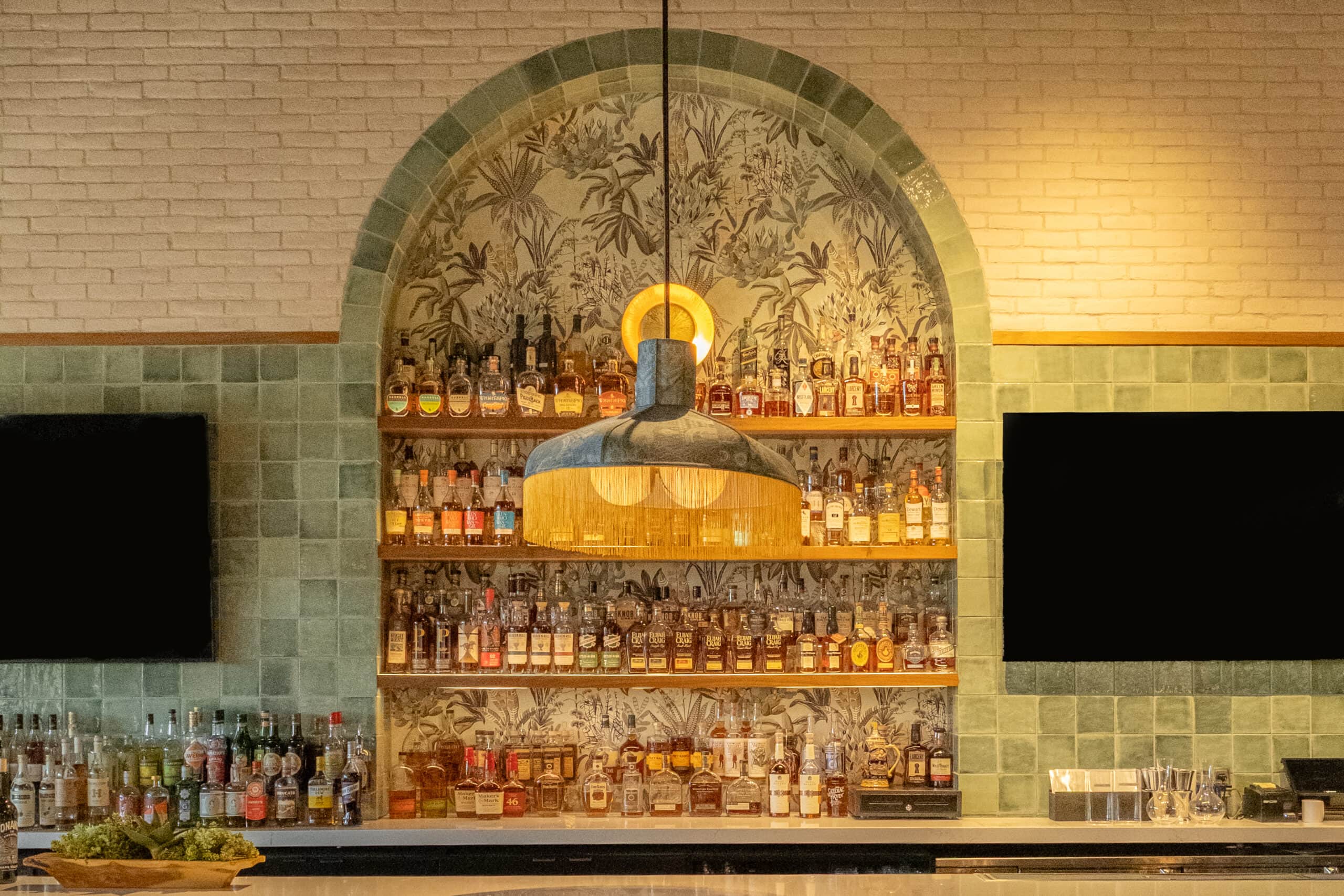
Contemporary bar interior with a long counter, hanging fringe lamps, shelves stocked with bottles, a wall-mounted TV, and decorative tiled arches.
A symmetrical maroon geometric pattern inspired by Crimson Design Group, featuring curved brackets and diamond shapes on a light gray background.
  • Expertise
  • Portfolio
  • Experience
  • Crimson World
  • About Us
  • Press & Awards
  • Contact Us
  • Careers
  • Instagram
  • LinkedIn
  • Pinterest
  • What Our Clients Say

Stay curious with Crimson

Subscribe to stay updated.

The word "CRIMSON" is displayed in large, elegant, maroon capital letters on a white background, reflecting the refined aesthetic of Crimson Design Group.

© 2026 Crimson | Privacy Policy | Cookie Policy | Terms of Use | Disclaimer | Accessibility | Site by Wonderly